- Overview
- Transcript
4.3 Laying Out the Main Grid
In this lesson, you will use what you’ve learned of Grid to set up the main grid for this project.
Related Links
1.Introduction2 lessons, 03:55
1.1Introduction00:40
1.2Using Firefox Nightly03:15
2.Project 1: Simple CSS Grid Layout3 lessons, 20:18
2.1Basic HTML Setup for Grid Layout02:37
2.2Creating a Simple Layout Using Column Spans09:21
2.3Creating a Simple Layout Using grid-area08:20
3.Project 2: Intermediate CSS Grid Layout4 lessons, 21:38
3.1Looking at the HTML04:43
3.2Nested Grids08:19
3.3Alignment and Justification06:06
3.4Finishing Up02:30
4.Project 3: Advanced Grid Layout5 lessons, 33:20
4.1What You Will Be Building09:26
4.2Flexbox Menu02:09
4.3Laying Out the Main Grid09:04
4.4Styling Cards09:49
4.5Laying Out the Archives02:52
5.Conclusion1 lesson, 00:31
5.1Final Thoughts00:31
4.3 Laying Out the Main Grid
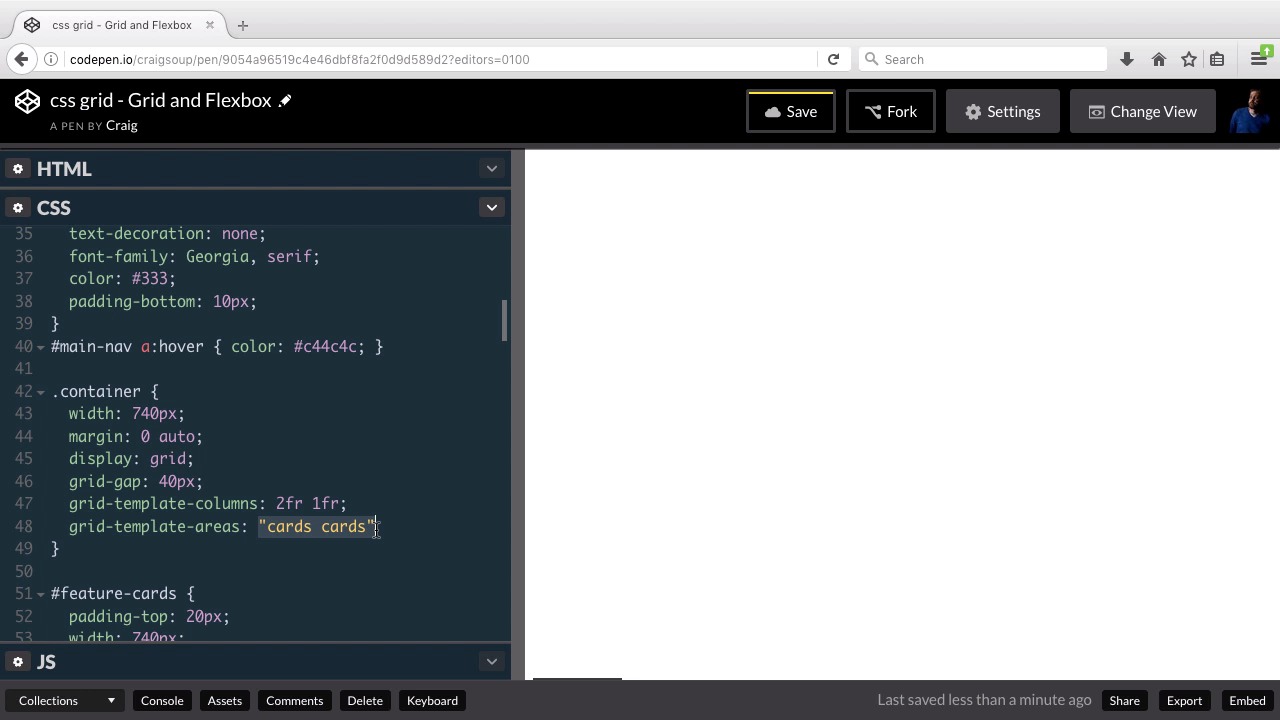
Hello and welcome back. Now that we've got our flex box menu in place. Let's move on to our main container which is gonna contain our outer grid. And then we'll move on to the inner parts after we do that. So as a quick review and first of all you can open up the starting pen and you can find a link for it in your course notes for this lesson. Once you open that up, let's go and click on fork so that we don't forget to do that. And so with our new forked version open, we'll get started. So again as a reminder, our main container is below our main header. So we're gonna scroll down past or main header and here's are div with the class of container. So this is going to be our grid container. And all direct descendants of that grid container are going to be the main grid areas. So first of all we have this section with an idea feature cards we can collapse that. And it's going to collapse all of the sections so that we can see them all together. So inside or container again we have this section with an idea feature cards. Then we have our feature articles which is gonna start with this puppy picture with the article below it, and there are two different articles here. And then just below that we have our sidebar. And this sidebar down here Is going to appear to the right of our feature article section. And then below the sidebar, we're going to have our archives section, which is going to have a three column grid of its own. And then outside of that grid container, we're going to have this footer section down at the very bottom. So let's layout our main grid and at least get it functioning before we move on to the inner parts. And for this particular layout, we're gonna be using named areas, named grid areas for our layout. So let's scroll down, let's first of all expand our CSS out and we're going to scroll down to the container rule which is right here for the container class. We've already set the width to 740, our margin to zero auto so that we can center it and now we're going to set up the grid. So we're gonna set its display to grid. We're pretty used to doing that by now. I'm also gonna set a grid gap here so that there's a gap of 40 pixels between all of the grid areas. So we'll just set that up grid-gap 40 pixels. And then, for our grid, I'm just gonna set up three columns. And the reason we're doing that is because this first section, here, it's gonna have, the section with all the cards, it's going to have a column set up of its own. So we don't have to worry about the columns inside that. So it's going to take up the full width of our column system. The only part where we need to worry about columns is going to be our feature article section and our side bar. And I want our feature article section to take up two-thirds of the width and then the sidebar to take up one-third of the width. So if we want two thirds and one thirds it's gonna be easiest to break this up in two thirds. So what we're gonna do is we're gonna set up our grid template columns. And we're gonna use three values here all of one FR. And having three columns like this keeps things pretty flexible. So if we wanted to create another section that maybe had something on the left side that took up one-third,and something on the right side that took up two-thirds, we would have that flexibility. Now for all intents and purposes here we could really just create a two column system for what we're doing here and just set it to two FR, one FR and that would assure that the left column is two times as wide as the right column. We can really do it either way, but putting three one FRS here gives us a little bit more flexibility if we wanted to add more columns later on. So again you could do that either way. I'm gonna go in simplified for now. So we'll have a wider column on the left and narrow column on the right. And all of our sections that take up the full width, they're just going to span both columns. And so let's set up the our grid here using grid template areas. And this is where we're going to enter in the names for each of our areas. So first we have our feature cards. Let's go ahead and set that up. Let's call it Cards. So we're gonna create our first template area inside quotation marks and we're going to type in the word cards twice. Remember we have two columns set up here. So for each of these template areas that we have inside quotation marks we need to make sure we include both of those columns. So our cards section is going to take up both of those columns. Let's go ahead and hit enter, jump to the next line and they'll tab over. And for our next row, our second row, that's gonna to contain our feature article section and our sidebar section. So let's call the article section article. And what's called the sidebar section sidebar. And remember these names that we give these here have nothing to do with class names or id names. These are specific names that we're going to give to the sections in our CSS. We haven't actually named them yet but we're going to in just a moment. So our first row is going to be the cards section which is going to take up the full width. Our second row is the articles section and since it's on the first column, it's going to be twice as wide as the right column as we defined up here. And then the right column is going to be the sidebar section, and then beneath that we're going to have our archive section in our archive section is going to take up the full with as well. So we're just going to set it up like this. We'll put archives archives because we want it to take up both columns, and then a semicolon at the end of our statement. So that, in a general sense, sets up our grid. But as we look over here on the right and start scrolling, we see that it doesn't know exactly what we want or what we want it to do with that definition. We see this large blank area here, and then down towards the bottom, we have this adopt a pet section, and we don't see our archives either. So let's start laying this out so that we can see each of those areas in the way we do that is we start naming those areas using the names that we supplied here. So first let's name or cards section which is going to be where our feature cards are. So we're going to jump into the feature cards rule and we're going to use the grid area property to give it a name. And we're gonna give it a name of cards, that name there has to match the name we gave it up here. And now our cards section doesn't change but all of a sudden our two columns below it show up. And the rest of the page almost seems to have laid itself out automatically. And that's one of the great things about the CSS grid system, is sometimes it knows where to put things. Now we still wanna be explicit to make sure it puts them in the right places. So let's name our feature articles section next. So, we'll just come below our feature cards section and here's alert individual cards. And here we have our feature articles section. And right now we just have the images inside those feature articles. Let's go before that and just create a rule for the feature articles ID by itself. So for that ID, we wanna give it a grid area name. To match the name we gave it up above, and the name we gave it up above was articles. And when we do that, you'll see that nothing changes. Everything stays in place because it already assumed that that's where that was supposed to go. And it assumes that correctly. The next thing we need to do is to jump down to the sidebar sections. So we'll skip all of the rest of this feature section and we need to create a new rule for this sidebar ID by itself. So, pound sidebar and in here we're going to set up this grid area and we simply called it sidebar. So once again nothing is going to change because it already made the correct assumptions about these two columns. Now where it made an incorrect assumption was about this bottom column down here. Because we've specified that we want the archive section to span both columns but it doesn't know that this is the archive section. So it just sticks it in the next available space which was the left column on the next row. So now we want to scroll down past the sidebar section here we see our archive cards. We're gonna create a new rule for the archives ID which is the ID we gave to that div that has those three items in it. And for this archives ID, we wanna give it a grid area name of archives. And when we do that you'll see that it's no longer just taking up one of these two columns, we see that this middle section of text here is now overlapping that second column because this is now taking up that full width. Now the items inside that archive section still need to be laid out but we're gonna get to that later on. Now that we've got the main grid set up, we can jump in and start laying out everything in our nested grids. So let's save our work and we'll move on to the next lesson. Thank you for watching.


