

- Overview
- Transcript
4.1 What You Will Be Building
In this lesson, you will become familiar with the HTML and the starting CSS that will be used for our third project. We’ll discuss how we’re going to use Grid to tackle a more complicated layout.
Related Links
1.Introduction
1.1Introduction00:40
1.2Using Firefox Nightly03:15
2.Project 1: Simple CSS Grid Layout
2.1Basic HTML Setup for Grid Layout02:37
2.2Creating a Simple Layout Using Column Spans09:21
2.3Creating a Simple Layout Using grid-area08:20
3.Project 2: Intermediate CSS Grid Layout
3.1Looking at the HTML04:43
3.2Nested Grids08:19
3.3Alignment and Justification06:06
3.4Finishing Up02:30
4.Project 3: Advanced Grid Layout
4.1What You Will Be Building09:26
4.2Flexbox Menu02:09
4.3Laying Out the Main Grid09:04
4.4Styling Cards09:49
4.5Laying Out the Archives02:52
5.Conclusion
5.1Final Thoughts00:31
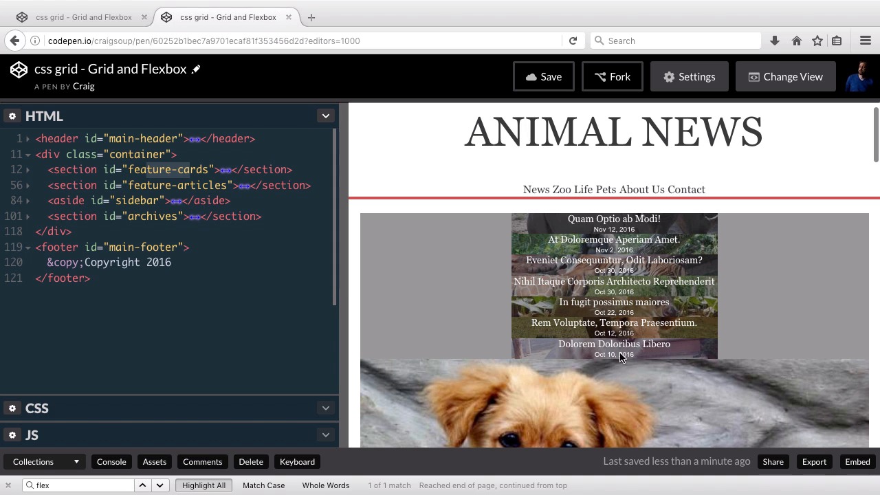
4.1 What You Will Be Building
Hello and welcome back. In this lesson, we're going to get started taking a look at our third and final project. This one is gonna be a little bit more advanced. It's gonna be a little bit more of a complicated layout. But we'll find if we take it step by step, it's gonna to be pretty easy to accomplish. Now we're going to be using a combination of the Grid Layout as well as flexbox. We'll be using flexbox in a couple of small areas. And usually when you're trying to figure out whether to use flexbox or the grid system, usually it just comes down to how complex it is. Usually you would use a grid system for the basic layout of your page. Whereas you might use flexbox for some of the smaller elements such as a navigation. We're gonna be using it, for example, for our main navigation at the top of the page. Also, flexbox usually works really well with just one-dimensional layouts where we just have, our navigation items for example laid out across one axis just from left to right. We don't have to worry about multiple rows, we're just dealing with a single row with multiple columns. Also you could use flexbox to do a single column with multiple rows, either way. But this is the basic layout that we're going to be building. And I wanted to show it to you first because it's kind of hard to explain where we're going if you can't actually see what the plan is ahead of time. So we're gonna have our header section here. And again, as I mentioned, we're going to build this navigation unit using flexbox, and then the main layout of the rest of the page is going to be using the grid layout module. So we have this first section of cards, and you'll notice the first row has three columns on it, the second row has four columns on it. And then below that we're going to have a two column set up, on the left we're going to have a few articles and on the right we're going to have kind of a sidebar with these adopt a pet links. And then below all of that we're gonna have one more section down here with three columns in it. And then below that we're gonna have a photo that takes up the full width. They'll notice, in addition to the footer taking up the full width, the header takes up the full width as well. And the only part of the header we really see that indicates that it's taking up the full with is gonna be this red border at the bottom of it. Everything between the header and the footer is going to be inside our grid container. The header and the footer themselves are not part of the main grid that we're going to be dealing with. So let's jump over to our starting pen. And you can find a link for this starting pen in your course notes for this lesson. And let's take a look at what our page looks like before we start applying all of our grid layout styles to it. So as you can see we have our header at the top and we have some basic styles applied everywhere, we just don't have the layout yet. So we have our header at the top. You can see the header already takes up the full width. And then below that we have our container which has all of our main content in it. And we still haven't laid out the grid yet, but that's the main content. And then, again, the footer at the bottom takes up the full width. So let's take a brief look at the HTML. Hopefully, you know enough about HTML to look through all of this yourself and figure out how it's structured. But again, in the context of dealing with this grid layout system, let's take a look at how we've structured things. So we have our main header here, we've already talked about that. It's not contained as part of our main grid. It's kind of just sitting here by itself. And we're gonna use flexbox for this main-nav section here. Let's go ahead and collapse that for now. And then we have our container beneath that. And in our CSS, we've already set the width for the container. We've set the margin to 0 auto so that that container is floating in the middle of the page here, it's perfectly centered horizontally. And it's been given a width of, I think it's 740 pixels. And so inside our container, remember, the direct descendants of your grid container are going to be your main grid areas. So if we collapse these sections, it will be a little bit easier to read. So here we have our div with the class of container. And inside that div you'll see we have four different grid areas. We have this first section with an id of feature-cards. And if we go back to our example layout, those feature cards are gonna be this section right here where we have one row of three columns and one row of four columns. So that's gonna be our feature cards section. Right now, as we can see, it's just a list of titles and dates. And we can sort of see the images behind them, but we haven't set up the sizes of these areas yet. So we're not gonna be able to see the entire image just yet. Then, beneath that we have our feature-articles and our sidebar, which are gonna be next to each other. Our feature articles are gonna be these large images with the articles below it, and there's two of those. And then we have our sidebar starting with this Adopt a Pet section. And then below our sidebar, it's gonna be below the feature articles and the sidebar, is this archives section which are just three more links to three more articles down here at the bottom, and that's going to be a three column set up. And then after that closing container tag here, we have our main footer which is not gonna be using the grid it's just gonna be taking up the full width at the bottom of our page. So we can then jump into our CSS, and look through all of that to see how everything is set up. We have some basic text styles here. We have this section-title and section-title span which is the CSS were using to set up this section here where we have this Adopt a Pet with a black background behind it, and then this border that goes all the way across the width of its container. So the section-title itself is just an h4 tag. And so this h4 since it's a block level element by default, takes up the full width of it's container. And so if we give that a border bottom like we did here, that border is gonna take up the full width. But then inside that h4, we put all of the text inside a span, and we've said that we want this span to have a background color of dark gray and a text color of white, which is what we see here. So by putting that span here, we were able to wrap that background color just around the text itself and not around the full width of the h4. So then we have our main header section which, again, is outside the div. And this one is just styling the placement and the text styles. And then we have our main navigation which we will be using flexbox for, as I've mentioned a couple times already. We've already styled the links themselves and the hover color for those links. And then below that we have our container, which, again, is going to contain all the rest of the information after the header except for the footer. So then we have our feature cards section. Our h3 inside each of those cards, which is the titles. The paragraphs inside those cards, which are gonna be the dates. And then we have some styles that are setting up the background images for all of those cards. So let's scroll down a little bit further. And then we have this card-content which is basically just another div which is overlaying that background image, and it has a semi transparent dark gray color. And that's really just used to kind of darken up the image a little bit so that we can read the text on top of it. And there we go. So, then we have our feature-articles section which is going to be these large images with the text below it. We can see that that text has been pulled up and overlaid over the image because we can see a little part of that image over here on the right kind of dipping down to the right of the text. And the way we've done that is we've just set the position of that feature text to relative, giving it a top position of -80 just to push this entire section up 80 pixels over part of the image. And then we've given it a width of 90% and a background color of white. So then we've styled the text inside those feature-text areas. The feature-meta area is gonna be this line right here, which consists of a category and author and the date. And then we have our paragraph style here. And then, the button inside that feature article styled there. Then we have some styles for our sidebar, and again, if you're watching this course, you need to have a pretty good understanding of CSS anyways. So you can go through that and see how all of our sidebar content, which is here, how all of that is styled. And when we get our widths down to the point where this is actually a sidebar, then we will see that this text over here is going to overlay these images. But right now it's just kind of off to the side and kind of hard to understand if we don't know where we're going with it. And then we have our main footer. So that's the basic layout. Again, I want you to make sure you go through all of that HTML and CSS to understand how everything is currently structured and styled. So that as we move forward, we could really focus just on the grid layout and the flexbox layout that we're going to be applying to this page. So thank you so much for watching, and I'll see you in the next lesson.


