


- Overview
- Transcript
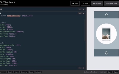
4.1 Getting Started
Let’s begin work on our third and final project. In this lesson, we’ll take a quick look at the HTML and CSS that we will start with for our image slider.
Related Links
1.Introduction
1.1Introduction00:44
1.2GSAP Refresher09:09
2.Project 1: Animated Preloader
2.1The Starter File07:48
2.2Creating a Timeline11:48
2.3Bouncing Circles13:08
2.4Animating the Shadows04:12
2.5Loading Images10:50
2.6Preloading Multiple Images08:48
2.7Animating the Preloader Off12:55
2.8Revealing the Main Content05:28
3.Project 2: SVG Animated Logo
3.1Examining the Logo03:44
3.2Setting Up the Styles04:29
3.3Randomizing Position and Opacity07:29
3.4Animating the Dots06:38
3.5Animating Paths With jQuery DrawSVG06:28
3.6Finishing Touches03:01
4.Project 3: GSAP Image Slider
4.1Getting Started05:21
4.2A Note on Slide Positioning04:59
4.3Setting Up Some Variables08:56
4.4Placing the Slides05:08
4.5On Deck12:24
4.6Setting Up the Animation Array09:53
4.7Setting Up the Animations11:36
4.8Creating the Button Events08:37
5.Conclusion
5.1Final Thoughts00:46
4.1 Getting Started
Hello and welcome back. In our last project, we're gonna be building a GSAP image slider. And this isn't gonna be your typical image slider where you have an image that takes up the full width and height of the slider and you just browse left and right. Instead, we're gonna have more of a product preview image slider. So here we have a set of images inside these white circles and we can click on the up and down arrows to animate these items in a really nice smooth motion. And we're gonna be talking over the next few videos about how we can create this particular slider using GreenSock. So that's what we're building. Let's go ahead and jump over to a new window here where we have our starting pen. And as always, you can find the URL for the starting pen in your course notes. And in this lesson, I just wanna take a look at the HTML and CSS that make up our slider. And then in the next video we'll get started with our JavaScript. So in our HTML, it's a very simple setup. We have a div with a class O slider container and that's going to contain everything including your up and down buttons. In fact, immediately inside that container, you see a button with a class of BTN and another class of PREV for previous. It's gonna be the top button up here. And then down here just before the closing div tag, is our next button. And then in between those buttons, we have a div with a class of slider. And inside that div, we have a number of separate divs, each of which represents a single slide in our slider. So each of these divs has a class of slide as well as a numbered class. So we have slide01, 02 etc. So that's our HTML, that's really all it took to put this together and each of these divs has an image in it. So then let's jump down to our CSS and take a look at that. So we have a couple of basic styles for our body HTML. You’ll notice the slider itself is, remember the slider class is kind of the inner div here, this lighter blue color. The slider container, contains the up and down arrows as well, but the slider class itself is just this lighter blue region here. And you'll notice that it has a height of 300 pixels. And we're gonna have to pay very close attention to our widths and heights in this particular project, because we're gonna need to use those numbers in our JavaScript, as we start laying these items out and animating them around. And that's really gonna be the trickiest part of this whole thing, is just getting all of the slides where they need to be before we start animating them. Because I wanna make sure that this particular slide show loops. So once we get to the very last slide, we can still click on the next button and it will just keep animating as though there were more slides. So it's gonna be a little bit tricky and we need to pay really close attention to our numbers. So again our slider height is 300 pixels. Let's move down now and we'll see the rule for the slide class, which is represented by each of these circular slides inside that slider. So you'll notice that each of these slides again, we have some important numbers here. Each of these slides have a width and height of 200 pixels each. And in order to center them, we're giving them margin top and margin left values of negative one half of the width and height. That way we can do things like this. We can set our left position for our slide to 50%. Usually, if you set the left to 50%, then it would be the left edge of our circle that's over here at the halfway point, and it would extend over here to the right. But since we gave our margin left, a negative value of half of that item's width, then it will nudge itself over just enough to center it. Similarly, we have the top property set to 150 pixels, which, if you remember, our slider has a height of 300 pixels. So this top value is halfway down or half of the height of the containing slider. And again since we have our margin top set to negative half of the height of that slide, it will nudge it up enough to center it. And a key component of this is that, since we need these slides to have a position of absolute, we need to make sure that our slider, its parent has a position of relative. Otherwise this absolute is going to position them relative to the entire browser window instead of relative to its parent item. So again we're gonna have to remember these numbers. We'll come back to them a little bit later. If we scroll down a little bit further, we'll see a rule for the button class which comprises the up and down arrows there. And then a few other items down here at the bottom that we don't really need to concern ourselves with. They’re pretty basic styles. So that's the HTML and CSS for our slider. That’s what we're gonna be using to start with. And in the next lesson, we'll jump into our JavaScript and start making this work. So, thank you for watching and I'll see you then.


