


- Overview
- Transcript
2.1 The Starter File
In this lesson, we’ll jump into CodePen and walk through the HTML and CSS that you will be using as a starting point for the first project.
Related Links
1.Introduction
1.1Introduction00:44
1.2GSAP Refresher09:09
2.Project 1: Animated Preloader
2.1The Starter File07:48
2.2Creating a Timeline11:48
2.3Bouncing Circles13:08
2.4Animating the Shadows04:12
2.5Loading Images10:50
2.6Preloading Multiple Images08:48
2.7Animating the Preloader Off12:55
2.8Revealing the Main Content05:28
3.Project 2: SVG Animated Logo
3.1Examining the Logo03:44
3.2Setting Up the Styles04:29
3.3Randomizing Position and Opacity07:29
3.4Animating the Dots06:38
3.5Animating Paths With jQuery DrawSVG06:28
3.6Finishing Touches03:01
4.Project 3: GSAP Image Slider
4.1Getting Started05:21
4.2A Note on Slide Positioning04:59
4.3Setting Up Some Variables08:56
4.4Placing the Slides05:08
4.5On Deck12:24
4.6Setting Up the Animation Array09:53
4.7Setting Up the Animations11:36
4.8Creating the Button Events08:37
5.Conclusion
5.1Final Thoughts00:46
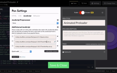
2.1 The Starter File
Hello and welcome back. In this lesson, we're gonna get started on our very first project which is going to be an animated preloader for a web page. And you'll see these animated preloaders usually on websites that have a really long web page with a lot of content that has to be loaded. And usually when you see an animated preloader, you will also see other animated content after the page is done loading. So if you do have a lot of content on your web page, maybe you're creating a really unique animated experience for them on your web page and it's gonna take a while for it to load. It might be a good idea to create a simple lightweight animated preloader that can start running and animating right away, to give your users something to look at while they're waiting. So again in this lesson I just wanna give you an overview of the file that we're gonna be starting with for this particular project. Now what we'll be creating here is an animation and we can see the graphics for the animation here and these are really just divs with drop shadows behind them. But we're gonna animate these circles, and then once our content has finished loading, we're gonna animate the circles off and animate our website on. So it's gonna be a really cool, very practical animation that we're gonna be creating here but again, first I need to show you how it's set up. So let's look at our HTML first, and we're not gonna be making any permanent changes to this in this particular course, I might turn some things off and on so that you can see what we're doing but we're not gonna make any big changes just yet. I just wanna walk you through how I've set up the HTML. So the HTML is very, very simple, we have a div at the top with a class of image container or img-container. And really this div might represent all of the content of your main viewing experience. Either way, this div is going to be covered up by our preloader, until our preloader is finished animating. And then immediately after that, I have a div with a class of preloader and as you can imagine, this is what we're seeing right now. So this preloader div has this gray background, and inside that preloader we have three divs, which are our three circles stacked on top of each other. So let's jump over to our CSS and take a look at how we've put this together. Let's expand this out, actually before we do that, we can go back into our HTML and if we just turn off this preloader div right now. I'm just gonna comment it out by hitting Cmd+slash or if you're using a PC, Ctrl+slash and that'll comment out that preloader, and this is what we're trying to load. So let me go ahead and say that we're not gonna spend any time on the design of the web page itself. All I need is a large image here that's gonna take a little bit of time to load, so that we can actually watch our preloader animate. And then once everything's done loading, we can watch the preloader animate off. So I've chosen a large image here and we'll probably even repeat this image a few times, just so that we can give our page enough to load so that we can watch that preloader and really test it out. So this is what the eventual website will look like. But before we get to that, we're going to take a look at an animation. Okay, so let's jump into our CSS and we can see some basic settings here for the body of our document, no padding, no margin, etc., etc. We have a font-family here of Montserrat and if we go to our Settings and go to CSS, you can see that font right here. And this is pulled from Google fonts and it's very easy to use if you just go to google.com/fonts, or I believe the new location is just fonts.google.com. But either way, you can go there and search through fonts and then you can find a link for it so that you can include it in your own work. And then while we're here, we can also jump over to JavaScript and see that we're using jQuery as well as TweenMax and TimelineMax. Now as I've said before, TweenMax includes everything, so we don't really need to have TimelineMax here. I can't remember why I put it there so I'm just gonna get rid of it. But all we really need is TweenMax because that does include, again, TimelineMax, TimelineLite, and all the rest. So let's just go ahead and close that and then let's look at the rest of our content. So you'll notice that I've set the body and HTML elements to a width and height of 100%. If we don't do this, then we cannot make our preloader take up 100% of the height, at least not in the way that we're setting it up here. So you'll notice also that we have the img-container which is, again, gonna represent the the actual site itself, the website itself, after our preloader is done animating off. And here I've just set the background-image and we'll eventually comment this out because we're going to load this background-image dynamically. But for now, I just have it there because I wanted to see what the site was gonna look like once we got done with it. And then we have a few background properties here, we've also set the width and height of that image container to 100% and we specified the z-index etc., etc., set the position to absolute so that we can stack one thing on top of another. Underneath that we have some textiles here and then below that we have our preloader, which also has a position of absolute and a width and height of 100%. You'll notice that the preloader has a higher z-index value than the img-container because we want the preloader on top of the img-container, we want it to cover up the img-container. And it will probably do that anyways, since the preloader HTML comes after the HTML for the img-container. But I just wanted to make sure, by setting that z-index to a higher value. Then we have a rule for the circles that we see here, each one of these has a class of circle. They all have a large border-radius, so that we can make them into a perfect circle, they all have a box-shadow behind them, their positions are set to absolute, and the top and left values are set to 50%. Now by default, if we just set the top left values to 50% they wouldn't be perfectly centered because that top left value is in relation to the top left corner of that div. So if we put that top left corner at a value of 50% by 50% then the circles would actually end up down and to the right a little bit. So to fix that, we go into the individual circle rules. So, again, each one of these has a class of circle, but then the outer circle, the larger circle, has a class of circle1, the middle circle has a class of circle2, and then the other one is circle3. So you'll notice I've set the margin-top and margin-left values here to half of the width and height. So the width and height of the first circle is 240 pixels, and the top margin is -120 pixels, which is half of 240. And this is a commonly used trick when you want to center something in your browser window. You give it a left and top value of 50% and then you just set the left and top margins to negative one-half of whatever their actual width is, and that will nudge it into place so that they are centered both vertically and horizontally. So since our second circle has a width of 170 and a height of 170, we've given it margin-top and margin-left of -85 pixels which is half of that width and height. And same thing for circle3, it has a width and height of 100 and a margin-top and margin-left of -50. So that's our starting point as we can see in our JavaScript, we've done nothing there yet, but we'll get there very, very soon. So that's how we've set everything up, I hope that made sense. And as we move forward we'll start to look at how we can use GreenSock to create an animation using what we've put here on the stage. So thank you for watching and we'll get started in the next lesson.


