
 Lessons: 16Length: 2.6 hours
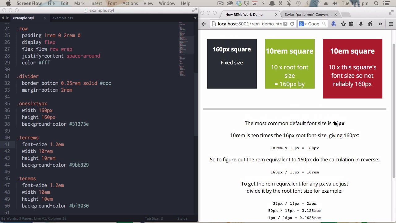
- Overview
- Transcript
3.2 Create a "px to rem" Converter Variable
Coding your layouts to work with `rem` values allows them to remain flexible and scalable. However, it’s a lot easier to plan and visualize your layouts in pixel values. Learn how to create a Stylus `px` to `rem` converter variable so you can think in pixels, but output in `rem` values.
1.Introduction
1.1CSS Needs a Hero01:17
2.Stylus Superhero Basic Training
2.1Quick and Easy Setup09:19
2.2Terse or Full Syntax, Your Choice05:50
2.3Faster Child and Pseudo Element Targeting via Nesting06:50
3.A Practical Intro to Stylus Variables
3.1Create an "Easy Update Color Scheme"08:02
3.2Create a "px to rem" Converter Variable14:35
4.Practical Intro to Mixins
4.1Create a "Zebra Stripe" Mixin12:45
4.2Use CSS3 Easily with Prebuilt "Nib" Mixins09:07
5.Practical Intro to Logic and Functions
5.1Adjust Base Font Size, Perhaps: Using Conditionals and Operators09:38
5.2What Functions Can Do That Mixins Can't06:16
5.3Create a "px to rem or em" Converter Function13:55
5.4Level Up Your Color Schemes With Stylus's Built-In Functions15:13
6.Stylus Superpowers
6.1Variables on the Fly: Property Lookup09:32
6.2Create a "Golden" Layout14:54
6.3Generate H-Tag Styles With a Single Line: Hashes, Iteration and Interpolation16:49
7.Conclusion
7.1Wrapping Up02:34
3.2 Create a "px to rem" Converter Variable
Hi welcome back to Become a CSS Superhero with Stylus. In this lesson, you'll be learning how to create a PX 2 REM converter variable. So creating your layouts to work with rem values rather than pixel values allows them to stay flexible and scalable, but it's a lot easier to conceptualize your designs in pixels, especially if you come from a background where you might be used to designing fixed width sides. You know? For example, it's a lot easier to think about. A space being 200 pixels wide than it is to think about it being 12.5 rems wide. It's just a lot more of a natural way to, to think of things. So what happens though, if you want to make sure that your design stay flexible and scalable, but it's a bit painful, it's a bit time consuming to perform these calculations all the time to figure out what the actual rem value that you should be using ought to be. And this is where Stylus' ability to perform mathematics for you and its ability to hold variables comes in really, really handy. You can set up a calculation once that you can use every time you need to convert a pixel value into a rem value. That's what you'd be learning here. Now, before we get into actually creating that variable and the pixel to rem calculation, I want to go through a couple of points on why rems are important and why you want to use them. And we'll have a, a bit of a look at how rem values compare to pixel values and em values. On the right side of the screen here you'll see three boxes. Now each of these three boxes right now is 180 pixels wide by 160 pixels square. But this box is controlled by this class here and you can see that it's using actual fixed pixel dimensions. The box in the middle is controlled by rem units. And that's using these values here, 10 rem by 10 rem. And the third box is controlled by em values. So that's these values here, 10em by 10em. Now with all things set to default values in the browser itself, and with no extra code added beyond what you're seeing here. Each one of these will appear to be 160 pixels square. However, when those default settings in the browser change, which they will often do out in the wild, then the appearance of these boxes will also start to exhibit different behaviors. Now let's take a look at that. Now, I'm gonna open up our Firefox preferences. And you'll see here, we have the base font size, like the default font size set in the browser. And people will often change this default font size. They'll change it because they may have a little difficulty reading text cuz it's usually too small for them. Or they may change it because they are using the browser on a large display, like a television. There's all kinds of different reasons why a person might change their base font size. Actually delve quite deeply into that subject in my course, Bump Root Web Design. So if you're more, if you're interested in learning more about why people might be changing these default setting, you can check that course out too. Let's have a look at what actually happens when we change this number. So we'll go from 16 let's say, up to 20. Now you can see immediately, this box has not changed in size. This is the one using the fixed pixel width and height val, values. These two boxes, however, have both changed. Rem units and em units are both flexible, scalable units. Now what this means is if a person has increased the font size, they're not gonna end up with a layout that hasn't also increased in size. If somebody has increased the font size and nothing else changes they're going to end up with very cramped text that doesn't have a nice flow of how many words there are per line, and everything's gonna look really squashed up and nasty. So you wanna make sure that you allow people to change that default font size, and keep your layout and the look of your designs, intact. You might be wondering, okay, then both of the, the boxes on the right have scaled up, the rem and the em box, so why not just use ms all the time? Well, the difference between rems and ems is that an em value will be affected by the font size of the element that it's used within. I'll show you what I'm talking about. First, we'll just reset this back down to 16 pixels. [BLANK_AUDIO] Okay, so, now if I change the font size of the ram's base box, [SOUND] it'll scale it up to 1.2 ems, so that'll be 120% of the original font size. Now, you can see that the inbox has increased in size. It has also increased by 120% along with the font size setting for that box. But if we do the same thing on the rems based box, nothing changes but the actual font size itself. And this means that rems are better for container elements. They're better for the pots of your layout that are integral to how the whole thing works together. The way rems work are they're based on the font size that's supplied to the HTML element rather than the font size of the actual element that you're working within. And the most common default font size, that is the font size that is applied to the HTML element, is 16 pixels. Again in my bomb proof web design course, I talk about why it's important to leave the base font size alone, don't try to manipulate it unless there's a good reason to. So, generally speaking default browser settings on most devices will have font size 16 pixels. Now if you then want to figure out if you have a pixel value that you want to create the equivalent for, you will need to do a little bit of maths. You know in this example here I've used a nice round number of 160, because, you know, we have the base value of 16 pixels. Now if I want to create a 160 pixel wide box and I know that the base font size is 16, I then need to use a 10rem or 10em value. And that's what we have done here. Now if you want to reverse engineer that then you have to just do this backwards. So we know that 10 rems times 16 is 160. If we wanted to figure that out the other way, you know, you want to end up with 160, then you would say 160 pixels divided by 16 divided by that base font size will give you the rem value that you want. And that means you can take that simple calculation and perform it for whatever pixel value you want to end up with. So, for example, 32 pixels divided by 16, the base font size, would give you 2 rems. So wherever you used 2 rems, you'll get an approximation of 32 pixels, or something a little bit less round, 50 pixels divided by 16, 3.125 rem. And the smallest value that you're gonna be working with, 1 pixel divided by 16 pixels is 0.0625 ram. Now, it's this basic calculation, the target pixel size divided by the base font size, that we're going to create a little Stylus variable to handle for you. You've already seen in the previous video how to declare a variable. Now the first thing that we're gonna put in place is a variable to hold our base font size. [BLANK_AUDIO] We know that, generally speaking, base font size is 16. Now all we have to do is replicate this little calculation that you see over here. Now, the way I'm going to do that is first by creating a little variable called px, and then I'm going to say px is equal to 1 divided by, make a space actually, this base font size. Now, that right there is the same calculation as this. Because once you know the size of a single pixel, all you have to do is multiply that out by as many pixels as you need. And you'll see that in practice shortly. If that doesn't make sense yet, don't worry about it. You'll see it working in just a moment. Now we have the mask done, but the other thing we need to do is also attach the actual rem, the letters themselves that you need to have output in your CSS to make this work. So I am going to just wrap this little equation in brackets so that it gets performed first before anything else happens. And then I'm just going to finish up by typing rem. And we have our pixel value. So how do you use this? Let me show you. In this second demonstration, we've got a basic you know, content and sidebar, fairly standard layout. We are going to apply our px to rem variable to this part of the demonstration and leave this one as a fixed pixel layer. Now, applying the variable is really, really easy. At the moment, this code is the same as this code. So, the second rem class here will be affecting this top layer up here. Now, all you need to do is write out your code just like you always would, but instead of just writing a pixel unit on the end of the, the number that you're working with, you just multiply with the little stylus symbol by your variable. Save and compile. You can see that nothing changed and that's exactly what we want because we still are trying to have a layout that appears at the same size as it would if you were using those fixed width and fixed height pixel values. Now, I'm just gonna go through and do the same thing with the other values. You don't actually need these spaces, I just wanted to put those in to make it a bit clearer to you what the syntax was. So, basically, you're just adding star, dollar sign, star, dollar sign, star, dollar sign, star, dollar sign. [BLANK_AUDIO] Now still this looks exactly the same. At first it looks the same as long as you have the, that default font setting of 16 pixels. However, if you have a look at the CSS that has been generated, you'll see that the rem class is now all done in rem values. You see it down here as well. While the pixel class is still using its fixed pixel values. Now this makes a big difference when you start to see that, that settings change like we saw earlier. Now, if I increase the font size. Now, just make this full screen so you can see it a little bit easier. Now, you can see that even though the font size is changed here and here, only the rem-based layout has increased in size proportionally. Now, this also works downscaling as well as upscaling. Again, you can see everything in the rem-based value has shrunk proportionally. You can also notice that that includes the width of the borders, and the curvature on the border radius here. The whole thing. So by using this PX to RAM variable instead of just straight pixel units you get the best of both worlds. You can still think about your design in exactly the same way, but at the end of the compilation process your whole design is scalable. Again, just going back to our code. All you need to do is just include that little star and the dollar sign from your variable name and that's it. It's that simple. All right. That's it for your practical introduction to variables. You've learned some really simple, but really useful ways to start getting into working with Stylus variables. In the next section, practical intro to mix ins, you're gonna learn about another one of Stylus's really, really awesome features. And we're gonna kick off with showing you how to use mix ins by creating a zebra striping mix in, and that will let you apply zebra striping to the children of any element with a single line of code. Catch you then.


