

- Overview
- Transcript
3.1 Buttons
Welcome back to the course. In this lesson, we’ll be designing the first patterns of our design system, and we’ll begin with something very simple: the buttons. Let’s begin.
1.Introduction
1.1Welcome to the Course01:55
1.2Design Considerations for WordPress Themes06:36
2.Preparation
2.1A Design System Approach07:43
2.2Defining Colors14:57
2.3Defining Typography21:15
2.4Defining Spacing and Sizing08:07
3.Basic Patterns
3.1Buttons15:42
3.2Forms16:22
3.3Menus08:22
3.4Icons and Images12:24
3.5Tables06:34
3.6Separators and Spacers06:09
3.7Grid System06:23
4.Advanced Patterns
4.1WordPress Widgets06:49
4.2WordPress Posts19:18
4.3Headers and Footers09:27
5.Page Layouts
5.1Creating Page Layouts06:14
5.2Designing a Full Page: The Index08:15
6.Final Words
6.1Conclusion03:36
3.1 Buttons
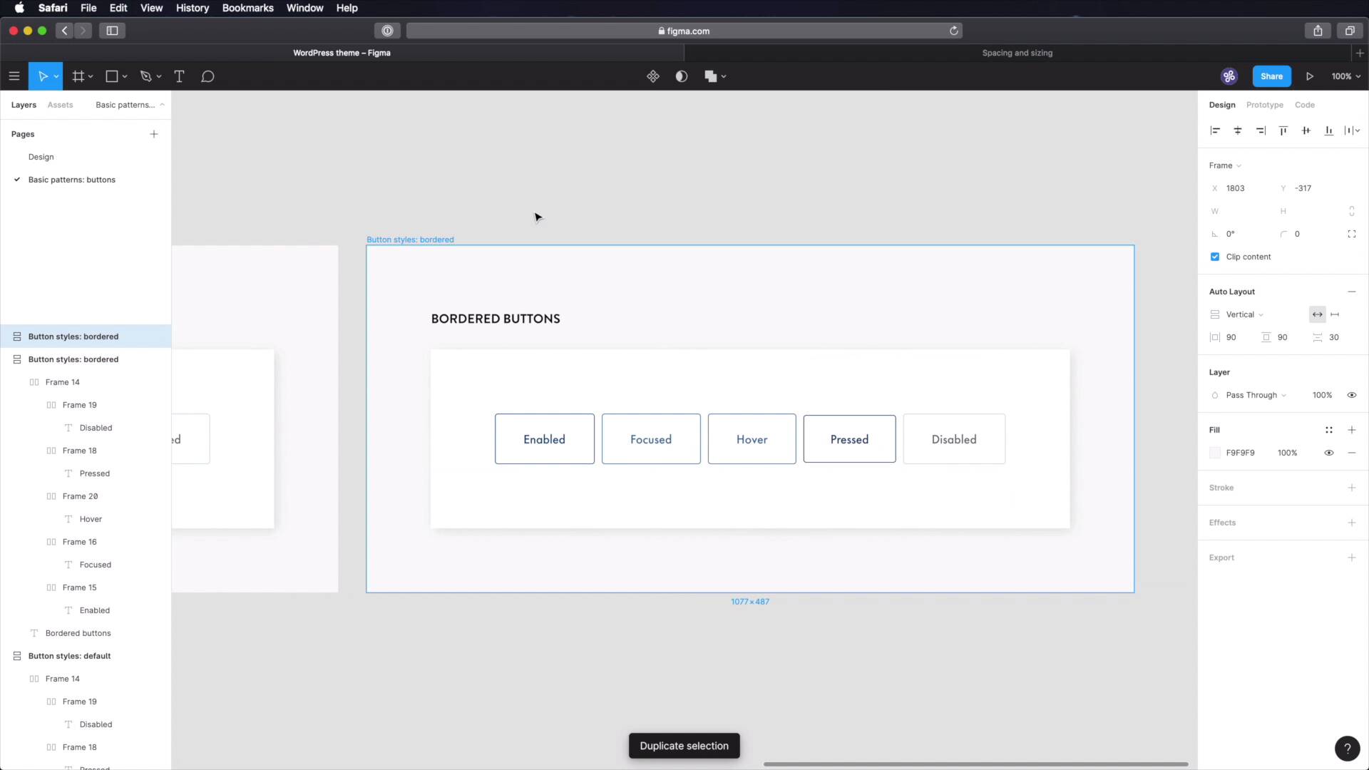
Welcome back to the course. In this lesson, we're going to design the first patterns in our design system. And we're going to start with something very simple, the buttons. Let's begin. I'm going to start by creating a new page here, and figma, and I'm going to call it basic patterns. I'm going to copy one of these frames, and I'm going to adapt it, we're going to call this button, styles default. I'm going to get rid of this, I'm gonna say, default buttons, because we will have two styles, a default and a bordered. And instead of this text, we're gonna create our buttons. All right, so, we're gonna start with a frame, and we're gonna give it a fill, and for the fill, we'll choose the blue 100, which is this. Okay, I'm gonna give it a slight round over on the corners, four pixels there. And I'm gonna create an auto layout for it. It's gonna be horizontal, 40 pixels of horizontal padding 20 for top and bottom, and let's say eight distance between islands, and just quickly, let's check our spacing and sizing we defined here, to see if we got it right. So, let's see, we have 24, 24 on top and bottom, 40 lateral, just like we did here, cool. Now, it's time for the text. So let's grab some text, the style for the enabled button, and we're gonna use Futura medium, the text color is going to be white, font size is going to be 18, and we should be good to go. That's our first button. So we're gonna create a couple of different states for these buttons. The first one is enabled, and we'll also do states are focused, overactive, or pressed and disabled. So, let's select this frame was duplicated it, and this is going to be focused. For focused, we're gonna grab a slightly lighter shade. A tint, sorry, like blue 80, the rest will remain exactly the same. For hover, we're going to have the same style. For pressed or active, we're actually gonna grab the shade blue 120, like that, and we're also going to reduce the padding here a little bit by one pixel on each side. So the button will like shrink just a little bit, and we'll say 38 here, 22 here, and that should stay the same. Let's align this in the middle, and finally, let's do the disable style. For this, we're gonna use a very light tint of our primary like blue 20, so let's grab that > Paste that in, and we also have to change the color of the text. So for this, we're actually gonna grab the main gray. And we'll paste that in, and we'll reduce it's opacity to about 50%, should do the trick. Nice, or you can go directly to grey 50. Select that color and paste it in like that, that also works. Now, it's important with text, that you get color accessibility right meaning you need to have enough contrast between the text and its background, to create a good experience even for people with visual impairments. So, there are lots of ways to do that there are online contrast checkers that will tell you if you're passing the minimum requirements. Personally, I use a Mac app that's called, Contrast. It's a free app, it's in your toolbar on the top. I'm afraid you can't see it right now, but basically, it just reference or sample the background color. You sample the text color, and it's gonna give you the contrast. In my case, it's 2.58, which is a fail, you need to have at least 3. So, we need to bump this up a little bit, and let's go with a grey 60. Okay, so a grey 60, I'm gonna do this test. He had again, and now, I have a contrast of 3.63, which is a pass. So that's the color that I'm going to use. Okay, I mentioned we're gonna create two styles for the buttons, this is the default, and let's also create a bordered style. These will serve as like complimentary styles. Mainly, we will be using these, like the full buttons, but there are cases when we need an additional style, so that's why we're going to create bordered buttons. Okay, so we're going to change things up here, instead of the fill being this color, we're going to change the fill to white and we're going to add a one pixel stroke with that color, and we'll also change the text color, okay? This is the same white stroke, and change the text color, and let's quickly make sure that this is passing our color test. And it does, we have a contrast of 5.36, so that's great. Hover is exactly the same thing. So let's actually make our jobs a little easier. Pressed, same deal, just different color. And disabled. Grab this, Add Stroke, change the background. And I'm actually going to keep this Fill Color. And just for the sake of it, let's also check this with our Contrast Tool, and we are passing, we have contrast of five a contrast ratio of five. Cool, so those are the bordered buttons. Now, we can have different colors for the buttons, right? We have our primaries, but if you remember from the previous lessons, we also have a secondary color and a grey color set, right? So, we need to create buttons for this as well. We might not use them, but just in case we do need them, they're good to have. Now, let's duplicate this bit. I'm gonna call this button colors. So this is primary secondary, tertiary, let's group all of these and let's create the filled versions for each, and actually, I think I'm simply gonna copy one from here. Delete that. And this will be primary. Secondary, and tertiary. All right, so primary, the colors here are okay. For secondary, let's go and grab our orange 100, and we'll use that here. And for text, obviously, this won't pass the contrast check. So, let's go with gray 100, that's going to pass for sure. And for tertiary, we'll also use gray 100 with white. And now to do the secondary button style, we can't actually use, Orange 100 against white, because it doesn't pass the contrast test. Okay, and just as a quick test, yeah, it fails. It has a contrast ratio of 2.12, and sorry, you can see this contrast tool I'm using. I'll put a quick video right now, showing you how to use it and what kind of results it gets you. So, instead of using orange 100, we're gonna use a shade of it, orange 120. See where this color palette comes in handy? We can quickly reference it to build this. So again, let's quickly check the contrast. And we have a contrast ratio of 3.23, so we are okay. Finally, let's change the color here, and the color here, and that is the tertiary, let's call it ghost button style. Finally, we need to create some button sizes. So, button sizes, let's duplicate this bit, we're going to have three sizes. So this is medium, but we're gonna have large and we're gonna have small. All right, so for medium, the properties are already set for small. I'm gonna change the font size to 16, font weight stays the same at medium, and then I'm gonna change the padding a little bit. I'm gonna use 32 horizontally, and 16 vertically, align all these properly, and then for large, I'm going to change the horizontal padding to 56, 32 for vertical, and also the text is going to be 25. Right, and that's it, these are the buttons. So we have two styles, the default, which are full buttons or filled buttons bordered, which look like those ghosts, but my buttons, I was gonna say busters ghost buttons that you see, being used all over the web. Then we have some different colors that we can choose from, but mainly, we will using the primary. And then we have three button sizes, large, medium, small. All right, now in terms of your design system, like your documentation, what do you need to write here, well, let's go back here under design system. We're gonna create a new page called, basic patterns, and under basic patterns, you will then create another page that you will call Buttons. So on Buttons, you can document things like button style,s and you would have default, and then you'd say the characteristics of default buttons. So, what are those? Fill color, border, padding, etc., and then you would have the bordered again, characteristics, then you would have button colors, and here you have primary, secondary, tertiary, and on each one, what do you use it for? Used for primary actions like, Form submit, read more, etc. Secondary button. What do you use these for? Well, secondary actions. Maybe if you have a homepage, and a hero area with a code to action, right? And you have a primary button, and then you have another button that maybe the primary button takes you some place to a buy. The secondary button takes you to free trial. So you have two separate actions, but the main one uses the primary button, the secondary one uses this, okay? Tertiary, and those can go on and on. And then you have button sizes. Again, large, and you would set some characteristics, medium, small. What do you use this for? And the list can go on and on. This is the type of documentation that you need to write. You need to be pretty specific about, okay, this button is for this type of content. Right, and you need to think about these ahead, so the buttons are now done and you can see just how easy it is to build some stuff. Once you have all the guidelines in place, we simply referenced some colors, some sizing information from our design system, and we created the buttons. Next, we're gonna create the form elements. So, I'll see you in the next lesson.


