

- Overview
- Transcript
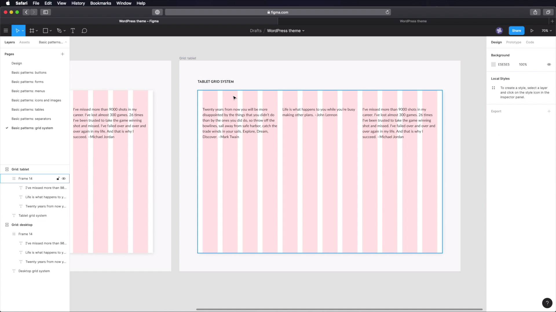
3.7 Grid System
When creating a user interface, especially for a web project, a grid system is a must-have. Grids allow you to create consistent layouts very easily. While we can’t design a grid system, we can document it, so let’s begin.
1.Introduction
1.1Welcome to the Course01:55
1.2Design Considerations for WordPress Themes06:36
2.Preparation
2.1A Design System Approach07:43
2.2Defining Colors14:57
2.3Defining Typography21:15
2.4Defining Spacing and Sizing08:07
3.Basic Patterns
3.1Buttons15:42
3.2Forms16:22
3.3Menus08:22
3.4Icons and Images12:24
3.5Tables06:34
3.6Separators and Spacers06:09
3.7Grid System06:23
4.Advanced Patterns
4.1WordPress Widgets06:49
4.2WordPress Posts19:18
4.3Headers and Footers09:27
5.Page Layouts
5.1Creating Page Layouts06:14
5.2Designing a Full Page: The Index08:15
6.Final Words
6.1Conclusion03:36
3.7 Grid System
Welcome back to the course. When creating user interface, especially for a web project, having a grid system is essential is essential. And this is where I talk about grid systems with like, horizontal or vertical columns. This makes your job of creating layouts so much easier and while we can't design a grid system, we can certainly document one. So let's do that both in figma and in notion here. So in figma, I went ahead and got a head start, I create an a new page for our grid system here. Created this frame, I took out the auto layout on this bit because in figma, we can add a layout grid. So let's do that and we can choose between grid, columns and rows, we're gonna choose columns. But before we do that, let's go ahead and change the width of this to 1200 pixels by I don't know, 800, the height doesn't matter. The width is what's important because 1200 pixels usually means a desktop size, okay? So back here, we're gonna use a 12 column grid. Color is not important. Type, we're gonna use stretch. The column width will be set to auto but we will add 24 pixels of margin 24 pixel gutter. This creates a gap on both sides, have 24 pixels and the gutter is the distance between columns, again 24 pixels. If you were to set this to center, you would need to manually set the width of your columns, just like this, but we're gonna leave it on stretch. And we're just gonna check these measurements. So 24 margin, 24 gutter, 12 columns. So what you can do with this grid, is you can align things to it, right? Let's say this will be on 4 columns, this will be on another 4 columns and this will be on another 4 columns. That's pretty neat, okay? And then you can grab a screenshot of this and move it over to notion. Now because we're not just designing for desktop, we need to create some grids for tablets and phones, right? So Let's go go ahead and duplicate this, this will be tablet. And let's change the size here to 600, the width, I mean, and let's go ahead and change our layout from 12 to 6. So on tablet, we're gonna be using 6 columns instead of 12. But we're going to have the exact same numbers here, 24 margin 24 gutter. So now your content, you can even demonstrate that here, can go like this, or it can go like half half, so 3 columns, And 3 columns, and then maybe 1 or 6 columns. So you'd have 50, 50, 100%, so that's one way you can do things. For the phone, let's change this to 480 and for the layout, we're gonna use 2 columns. But with the same characteristics 24 margin 24 gutter and then your content, it might look something like this, right? Or you can do everything like so, right? It's really up to you but having this visual aid can really help you. And if you insist you can also change the color here from red to something else, let's make this green, right? So you have the phone for different colors for different devices desktop, tablet and phone. Now, in terms of written documentation while you can go to design system, basic patterns oops, create a new page here. Call it Grid system and inside you can put stuff like this. How many columns are you using? You give out some examples of what kind of content or you can put in those layouts like 8 columns plus 4, 4 plus 4, plus 4, 6 plus 6, 1 plus 11 and so on. You specify the properties, what gutter what margin column width, what exactly are you using and then how many columns are you using for desktop? How many for tablet? How many for phone? What are the breakpoints that you're using? So desktop 1200 and up, tablet between 600 and 1199, phone under 599. And as I was saying, you can make screenshots of this and load those screenshots into notion here. So, now that we've designed and documented these basic patterns, we can start working on some more advanced ones. We'll do that in the next lesson and we'll start with WordPress widgets, see you there.


