

- Overview
- Transcript
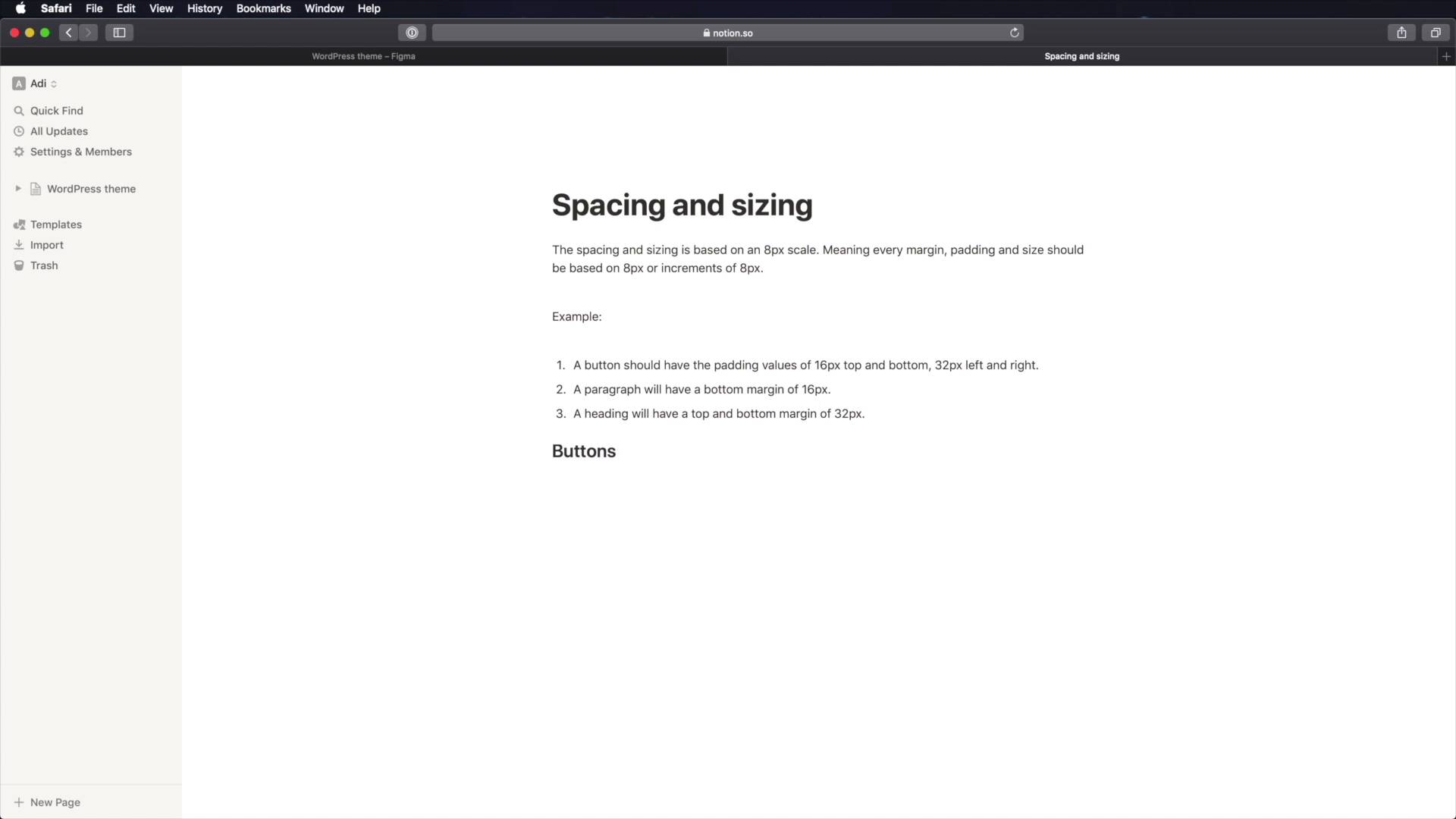
2.4 Defining Spacing and Sizing
Welcome back to the course. So far, we’ve taken some very important steps in defining our design system. We documented the colors we’ll be using and also the typefaces and other typographic characteristics of the WordPress theme we’re designing.
Now, let’s move on to spacing and sizing.
1.Introduction
1.1Welcome to the Course01:55
1.2Design Considerations for WordPress Themes06:36
2.Preparation
2.1A Design System Approach07:43
2.2Defining Colors14:57
2.3Defining Typography21:15
2.4Defining Spacing and Sizing08:07
3.Basic Patterns
3.1Buttons15:42
3.2Forms16:22
3.3Menus08:22
3.4Icons and Images12:24
3.5Tables06:34
3.6Separators and Spacers06:09
3.7Grid System06:23
4.Advanced Patterns
4.1WordPress Widgets06:49
4.2WordPress Posts19:18
4.3Headers and Footers09:27
5.Page Layouts
5.1Creating Page Layouts06:14
5.2Designing a Full Page: The Index08:15
6.Final Words
6.1Conclusion03:36
2.4 Defining Spacing and Sizing
Welcome back to the course. So far, we've taken some pretty big steps into the finding our design system. We defined our colors, and we defined our typography. All the typography styles related to this WordPress theme. The next big step is to define our spacing and sizing. And for this, we're gonna be using a, I guess we could call it a grid system or a scale. But this is not like the grid system that you see other people use with the vertical columns to divide the page into content, sidebar and so on. This is a slightly different system. And it's based on a value that we're gonna use and create increments of it. So let me give you an example. We're gonna use an eight pixel scale. That means that our base value is eight pixels. Any size or spacing will be based on those eight pixels. And increments of those pixels. So for example, when I'm creating padding, I'm gonna use values like eight, 16, 32, 64 and so on. Same goes for words. For example, an image. When I'm setting the height of an image, I'm gonna make it so that it adds an increment of eight, 64, 128, 256 and so on. So, why eight pixels? Well, eight pixels is divisible by two, is divisible by four. And it also works very well with 16 pixels, which is the base font size in pretty much all browsers. So, everything that we'll be doing from here on out will be based on this eight point or eight pixel scale. Now, there's not much to do in figma. But instead, we're gonna jump into notion and we're gonna write some of these things down. So, let's create a new page here. We're gonna call it spacing and sizing. And we're gonna say something like this. So I said the spacing and sizing is based on eight pixel scale. So every margin padding and size should be based on eight pixels or increments of it. As an example, a button should have the padding values of 16 pixels top and bottom. 32 pixels left and right, and this is one example. Another example, would be that a paragraph will have a bottom margin of 16 pixels. A heading will have a top and bottom margin of 32 pixels. And the examples can go on, and on, and on. Now, what you can do here as a starting point, is to go through your list of patterns or components that you're gonna build, and lay down some starting values for the things that I just mentioned here, margin, padding and size. For example, we can say, buttons, margin and we'll be using the CSS notation which is top left bottom right. We can say margin top. Zero. Right zero, bottom, let's say 16 pixels left zero padding. We can say top 24, 32 or we can even go 40, again 24 and 40. Now the size here on the buttons doesn't really matter because, they will be automatically sized based on the text inside them. What else? Well, let's look at some forms. And for forms, we can target the inputs, right? And we can even make this a second header heading. So for this, let's say, padding 24 pixels all around. And then width, let's say 320 pixels. Again, this is divisible by eight. What else, margin 00. So margin bottom should be what, 32 pixels let's say. Then we can have input label, a margin bottom of 16 pixels is usually the best way to go. What else? Well, there are tons of things. Let's do separators for example, let's set a height of four pixels. And let's set padding. padding doesn't apply here but margin does. So I'm gonna say margin. 64 pixels and zero, so 64, top bottom zero, left, right. And the list can go on and on, and notice how pretty much all of these values are based on this eight pixel scale. You don't have to use eight pixels. You can use ten pixels. You can use 11 pixels. Whatever makes your job easier. The idea with using a scale, is that everything will be consistent. You won't have a button with 16 pixels padding, and a button with 13 pixel padding or with 15 pixels padding. Because you know that every measurement you do, every value for padding margin with height needs to be eight or a multiple of eight. You're gonna make sure that everything stays consistent, and because you're documenting things like this, it's much easier to create these components in a consistent manner. So now, what you need to do is just go through all of the other patterns or components that you're gonna be building, and you need to set these initial values. It doesn't matter if they change once you get to the design part. If those change, then you come back to the system and you update them here as well. But having a place to start like this, will just to make your job a lot easier. So the foundations of our design systems are now done. We have the colors, typography, sizing and spacing. With this, we can now start designing our components, and we'll start in the next lesson with the buttons. See you there.


