

- Overview
- Transcript
3.3 Menus
Welcome back to the course. In this lesson, we’ll be tackling navigation menus. Again, this is one of the most popular patterns in UI design, and WordPress actually has a feature for quickly defining these menus. For this reason, we definitely need to include them in our design system.
Let’s begin.
1.Introduction
1.1Welcome to the Course01:55
1.2Design Considerations for WordPress Themes06:36
2.Preparation
2.1A Design System Approach07:43
2.2Defining Colors14:57
2.3Defining Typography21:15
2.4Defining Spacing and Sizing08:07
3.Basic Patterns
3.1Buttons15:42
3.2Forms16:22
3.3Menus08:22
3.4Icons and Images12:24
3.5Tables06:34
3.6Separators and Spacers06:09
3.7Grid System06:23
4.Advanced Patterns
4.1WordPress Widgets06:49
4.2WordPress Posts19:18
4.3Headers and Footers09:27
5.Page Layouts
5.1Creating Page Layouts06:14
5.2Designing a Full Page: The Index08:15
6.Final Words
6.1Conclusion03:36
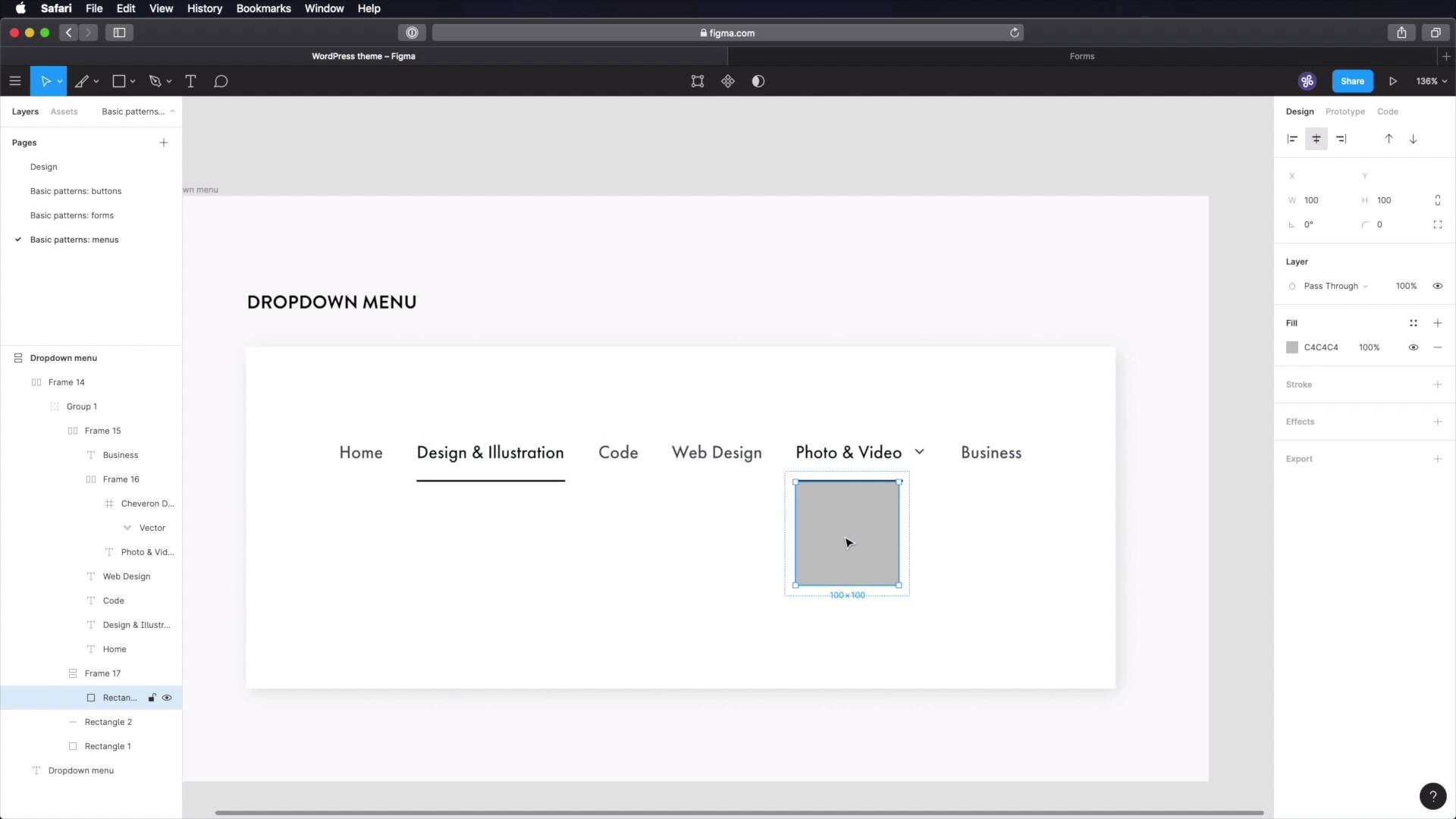
3.3 Menus
Welcome back to the course. In this lesson we'll be designing our navigation menus. And these are or represent another very popular pattern in UI design. And WordPress actually has a feature for quickly defining these menus. So having these in our design system is very important. Let's begin. We start in Figma, where we'll create a new page, called basic patterns menus. And let's quickly grab one of these frames. And let's do a drop down menu, this will be the main navigation menu. Let's start with a piece of text. This is home, we'll be using Futura medium, 18 pixels. And for the color let's go with something like a grey-80. Or grey-70. Paste that in. Okay, let's create a new frame for this, and let's add 003 to pixel spacing between items. So now, we can just do this as much as we want, so let's create the other menu items. Obviously these are just some placeholder items. And that should be enough. Cool. Now photo and video will actually be a drop down menu. So we're gonna put a little chevron arrow and I'm gonna use this Chevron down that I have from our icon set. And what I'm gonna do is group these two up. And create the frame with auto layout, and make sure I set 16 pixels of space in between the two. And actually, I think we need to go half that value, eight pixels. Let's also target the chevron down and change its size to 16 pixels. And make sure it's aligned in the middle and it's aligned in the middle. Perfect. And finally, let's change the color of the icon as well. Now we need to specify a style for hover, and active. So I'm gonna start by sampling our grey-100. So let's say that Design and Illustration is the active page. We're gonna give it a darker colour, and we're also going to add a small line underneath, like an indicator. So let's grab the rectangle tool. And let's have this as one group. So I can freely move this around. Like that, I'm gonna place this at eight pixels. And I'm gonna make it four, sorry. I meant to do this. And let's do two, for height, that should do the trick and also use the same color as before. Okay, let's move this further down a little bit to 16 pixels from the text. All right, it now looks pretty good. And finally, let's style the drop down menu. Let's duplicate this and put it under Photo and Video. Let's also change the color of this, and this will represent an active drop down menu. All right. Now below this, let's create a rectangle. And I'm actually going to make a frame out of it by adding outer layout. And for this frame, I'm gonna choose 24 pixels padding, top and bottom, and 16 pixels of distance between elements. And I'm going to add a drop shadow, 20 blur 4X, 4Y, black 10%, and let's put some text inside. And let's also add a fill color because the shadow wasn't showing up. There we go. For this text, we're going to change things up a little bit, we're gonna get a lighter color like a grey-70 And we're gonna use Book and 16 pixels for font size. Okay and this is a vertical frame, good. Let's duplicate these. And let's say we have some extra categories like editing, inspiration and I don't know, Adobe Premiere Pro. All right, now let's move this whole thing 24 pixels to the left, one, two, one, two, three, four. Okay, so now the text inside matches my text here. We're going to use orange-100. We're going to use orange-100. We're going to use orange-100. We're going to use orange-100. That's how our drop down menus should look like. And finally, we have to create a footer menu. So the menu under it goes, you guessed it, in the footer. This is much simpler. We don't have these, we don't- oops, no, I broke it. I don't have this. I don't have this, and we don't have this. Instead, we just have these items. And let's also use this color for all of them. Okay. And now, we'll select all. We'll change this to Futura PT Heavy. We'll essentially be using the over line Properties that we have here, so we're going to be using this style except a different color. So Futura PT Heavy, let's make this uppercase, and what else, we need a little bit of letter spacing, 5% should do the trick. And let's see what kind of spacing we have here. Let's ungroup this, and we have 32, let's go a bit lower, maybe like 24. And to get the hover state, let's exemplify using this link here, so when you hover on one of these links on the footer menu, the link changes its color to this. How cool is that? Okay. And those are the two menus that we'll be using, the drop down which is the main menu, it goes In the header, and a footer menu, which will find a place for it in the footer. All right, and that's it for this lesson. Our design system is really starting to take shape and that's fantastic, let's continue, in the next lesson, we'll cover icons and images, so see you there.


