

- Overview
- Transcript
2.3 Defining Typography
Welcome back to the course. In the previous lesson, we defined the colors we’ll be using, and we documented everything nicely in our design system. Now it’s time we tackle the typography.
Before we begin, though, I’d like to make a quick note. Just because we wrote down those colors, it doesn’t mean they’re set in stone. We can always change them. A design system will evolve with the product—in this case, our WordPress theme. What we write down initially might not work further down the road, in which case we’ll make the necessary changes and document them. So it’s totally fine to change things up as long as you update the system.
With that said, let’s get cracking with the typography.
Related Links
1.Introduction
1.1Welcome to the Course01:55
1.2Design Considerations for WordPress Themes06:36
2.Preparation
2.1A Design System Approach07:43
2.2Defining Colors14:57
2.3Defining Typography21:15
2.4Defining Spacing and Sizing08:07
3.Basic Patterns
3.1Buttons15:42
3.2Forms16:22
3.3Menus08:22
3.4Icons and Images12:24
3.5Tables06:34
3.6Separators and Spacers06:09
3.7Grid System06:23
4.Advanced Patterns
4.1WordPress Widgets06:49
4.2WordPress Posts19:18
4.3Headers and Footers09:27
5.Page Layouts
5.1Creating Page Layouts06:14
5.2Designing a Full Page: The Index08:15
6.Final Words
6.1Conclusion03:36
2.3 Defining Typography
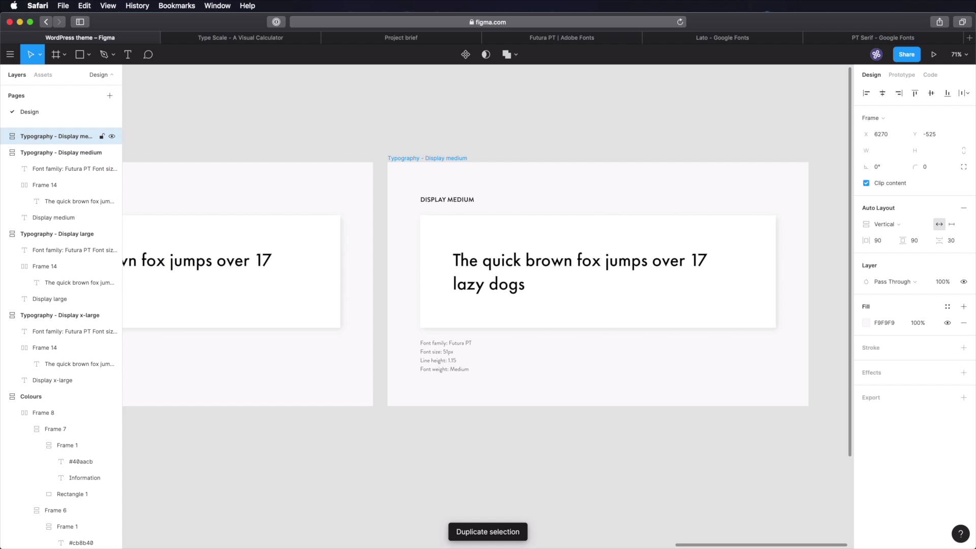
Welcome back to the course. In the previous lesson, we defined the colors that we'll be using. Well, now it's time to tackle the typography, right? But before we do that, I just wanna make a quick note, and this applies to everything that we'll be doing moving forward. Just because we wrote down those colors in both Figma and Notion, it doesn't mean they're set in stone, that you can't use anything else. You can totally change them. If further down the road you considered that, okay, these colors don't actually work that well, for us, it's totally fine. Go ahead and change them, but don't forget to document that change. Okay, so update the design system. The thing with design systems is that they evolve with your product. So as your product grows, so does your design system, right? So every time you make a change to your components, your guidelines, make sure you document that change. With that said, let's get cracking with the typography. For typography, I made a quick template here in Figma. We're gonna be using a bunch of these frames to display the various typeface styles we'll be using here. I just have a display x-large set. Here, we'll have a preview and here, we'll have some basic information about that style. Now, first things first, we need to figure out the type scale that we're gonna use, right? We can't just randomly throw down font sizes and hope everything works. I mean, we can do that, but it's not recommended. Instead, you should use a type or a typographic scale, and a typographic scale, basically it looks like this. Every font size is bigger than the one before it by a certain ratio. So for example, if we start with a base font size of 16 pixels, which is this, you'll see that the next one will be 16 times the scale that we choose or the ratio which is 1.250. And if we do a quick math here, you'll see that 16 times 1.250 is 20 pixels, which is the next font size, multiply 20 pixels by 1.250, you'll get 25 which is the next one that you see here. So this is how a scale works. Now, there are a bunch of different scales or ratios to choose from, from Minor Second which looks like this, to Golden Ratio that looks like this. So these are the two extremes and the bigger the scale, the more dramatic the difference between each font size. For our project, we're gonna stay somewhere in the middle. I usually like to work with Perfect Fourth because that gives us a nice balance, but because this is a blog, it's highly focused on text, and we have a lot of headings and stuff. I decided to use an Augmented Fourth scale which has a ratio of 1.414, and it looks like this. And also, we're gonna make a quick change here. We're gonna change the base font size from 16 to 18 pixels. Now, with that information, we can jump back to Figma. And we can set the font size for this first element to 5.653 oms or 101 pixels. So let's do that, 101, actually we'll round it up to 102. So whatever is above point five here, we'll round up. Anything that's below, like for example this one, we'll keep at 25. So that's the font size all done. Let's also change the text here. And let's also change the line height. But we're gonna stick with auto and we just let Figma do its thing, and then we're also gonna add Like a fixed Size for this box. And once we have that done, we need to set on the font family, right, or the typefaces that we're gonna use. Now, because our brief if you remember, said that the theme should look modern. In terms of typography, I'm thinking sans-serif for the main typefaces. And after looking around, I decided on what are my all time favorite typefaces which is Futura PT, PT stands for Paratype which is the Foundry. This is a Geometric typeface, it's a sans-serif. And it works beautifully for large text, so this is what we'll be using for all of our headings. For the body text, I'm using yet another sans-serif typeface, Lato or Lato. This is from Google Fonts, this you can get from Adobe Fonts. And this is what it looks like. It's a very popular typeface here on Google Fonts. And we're also going to use a serif typeface in the form of PT Serif. Again, this is made by Paratype, and this typeface will be used in very select places for captions, for footnotes, stuff like that. So it doesn't have a big role in the whole typography of the project, instead it's more of an accent piece, I would say. All right, so with that said, I already have all these fonts installed on my system. So I'm gonna change this to Futura PT, great. And for the weight, we're gonna use heavy 102, line height set to auto, and then we're good to go. And now, all that's left to do, is go in here and say font family, just document this here, 102 pixels line height. Now, for the line height, you can calculate it and just write it down manually, or you can use a multiplier. If we go back to type scale, they actually give us some indications here. These are setting the line height to 1.15, okay? So we can say 1.15 here, which is a multiplier, this gets multiplied with the font size, okay? So that would give us what? 102 times 1.15 oops, it will give us 117. And we can put that here or you can just leave the line height. I'm going to leave the line height just like this. Okay, next font weight, we're going to specify heavy. And with that, the very first style is defined. Now, if you worked with typography before in projects, you might have done the following. Create styles for h1, h2, h3, h4 and so on. Lately, I've been avoiding that practice, because if I define a style for h1 like this, it doesn't mean that all h1 elements will look like this. I mean, I can have an h1 inside a sidebar and it's going to be a much smaller font size for that than an h1 displayed in the header or in a hero area. So instead of defining h1, h2, h3 and so on, I do this. Display X-Large, display large, medium, small and extra small. This is not my original idea, I've just looked around at other design systems and this is the way they're doing it. Google material design is doing something similar. So I think this approach works better. All right, now let's move on to the next step, which is display large, oops. Also make sure to update this and we'll grab the next value which is 72 pixels. We're still using Futura PT, but for this we're going to change its weight to medium, and also make sure to update the same information card here. Okay, next is going to be display. Medium, and display medium should be 51. We're gonna keep the medium weight. And make sure you update these, 51, medium, and we're done. Next, see how easier this is in Figma? I created this template and I just keep repeating it over and over, and because I have auto layout applied to this white box here. This gets resized automatically according to the amount of text that's inside. So notice how big this frame is, notice that these are getting smaller and smaller. Okay, this one is for display small and here, we'll be using 36. 36, and we're gonna use, for font weight, book. Let's also shrink this text box a little bit, 36 and book. And finally, we have a display extra small and this will be using 25. And also book. So go ahead and document that. Let's make this even smaller. Okay, next what else do we need apart from headings? Well, we need a style for the body text, right? So, let's create this. And we'll do body one here because we're going to have two styles for the body. I'm just going to paste in some, some text here. Let's make this a little bit bigger. Okay, and for the typeface, we're gonna be using Lotto. It's gonna be 18, we're gonna use the regular weight. And for line height, we'll go with a 1.5 line height. So 1.5 times 18, we can also do this in Figma, equals to 27. So that's what we'll be using. Update this as well, Lotto 18. We can specify the line height here, either like this or you can even put a parenthesis there. And font weight regular. Body two, this we'll be using our serif fonts. So PT serif and I'm creating another style for body two, just in case we need to make an annotation or a sidebar. Something that's like a side note for the main content and for that we'll be using body two. Also we can use this for quotes. So we're gonna be using PT serif regular, a slightly smaller font size here 16, And line height should be 24 and I think we're good to go. So PT Serif, 16, 24 and regular. Great, we just have two more elements. This is for caption. And for caption let's actually do a rectangle here. Let's grab an image. See if I have, yeah. I have this plugin installed here from Unsplash. I'm just gonna insert a picture here. Let's actually make this image a little bit bigger, and we have to redo that. And I'm gonna place my caption, Whoops. Right there, and then we're gonna add a 16 pixel distance between the caption and the image. Now the caption, we'll be using PT Serif and we'll go all the way down to the next step in our scale, which is 13, okay? It's gonna be PT Serif, we're gonna be using italic. And also, let's set the opacity. I can actually go back and just reference one of the gray colors. I'm thinking gray 50, so that works great. And finally, let's update this, 13, line height should be what? Maybe 18 and font weight, regular, italic. And finally, the last element that we'll be creating is an overline. And an overline is an element that goes above other more significant elements. And it looks something like that. Let's actually change this bit. And I'm going to say overline here, And we're going to be using Futura PT, and it's gonna be heavy. It's gonna be 13 pixels uppercase. And we're also going to add a 5% letter spacing. Line height, it can be something like 19 Or let's go with 18, okay? And this is used for example, in conjunction with Other elements like other headings. So this for example, could be an article title, and this could be a category. And let's also Get it a proper color. And finally, let's update it. 13, 18, update the font family, font weight heavy, and also let's add letter spacing 5%, great. So with that, our typography is now complete. We finished everything we had to make in Figma. Now, I can jump into Notion, we can go to your design system. Under design, you can create a new page here for Typography, and can start by defining what's the type scale, right? It's an augmented fourth, you can specify the ratio, you can specify the base font size, what else? You can talk about the font sizes, right? You can create a list of sizes with a table. Right, so font sizes. Again, you can have a name, you can have a size here which is text, you can have usage or used for again, text. So to give you an example, display-x-large, size 102 pixels used for hero area headings. Okay, display large, what was the size here? 72 pixels. Used for what? Maybe, post title, and so on and so forth. You would have what? Overline, 13 pixels size used for what? Form labels and what else? Maybe post categories. Okay, so you document these things. And when you come back next year for example, because you need to add another page to your website, you can open up the design system, and you can take a look at the different font sizes and see, okay, so which size should I use for my form labels? Okay, it's this overline style, that's 13 pixels. Let's go ahead and use that. And then you can go on and document each item individually just like I did with this one here. Now obviously, this content that I have here is very crude. And it's really up to you to write it in any way that you see fit. I'm only giving you some pointers here because this course is gonna be long. And I don't wanna make it super long by documenting every single step. Okay, so I'm just showing you mainly what we're doing in Figma. And just some key points of what you can write right here in Notion or whatever software you're using to write the documentation and guidelines for your design system. All right, and with the typography done, it's time to focus on spacing and sizing, and we'll do that in the next lesson.


