

- Overview
- Transcript
2.2 Defining Colors
Let’s start our design system by defining the colors we’ll be using.
Related Links
1.Introduction
1.1Welcome to the Course01:55
1.2Design Considerations for WordPress Themes06:36
2.Preparation
2.1A Design System Approach07:43
2.2Defining Colors14:57
2.3Defining Typography21:15
2.4Defining Spacing and Sizing08:07
3.Basic Patterns
3.1Buttons15:42
3.2Forms16:22
3.3Menus08:22
3.4Icons and Images12:24
3.5Tables06:34
3.6Separators and Spacers06:09
3.7Grid System06:23
4.Advanced Patterns
4.1WordPress Widgets06:49
4.2WordPress Posts19:18
4.3Headers and Footers09:27
5.Page Layouts
5.1Creating Page Layouts06:14
5.2Designing a Full Page: The Index08:15
6.Final Words
6.1Conclusion03:36
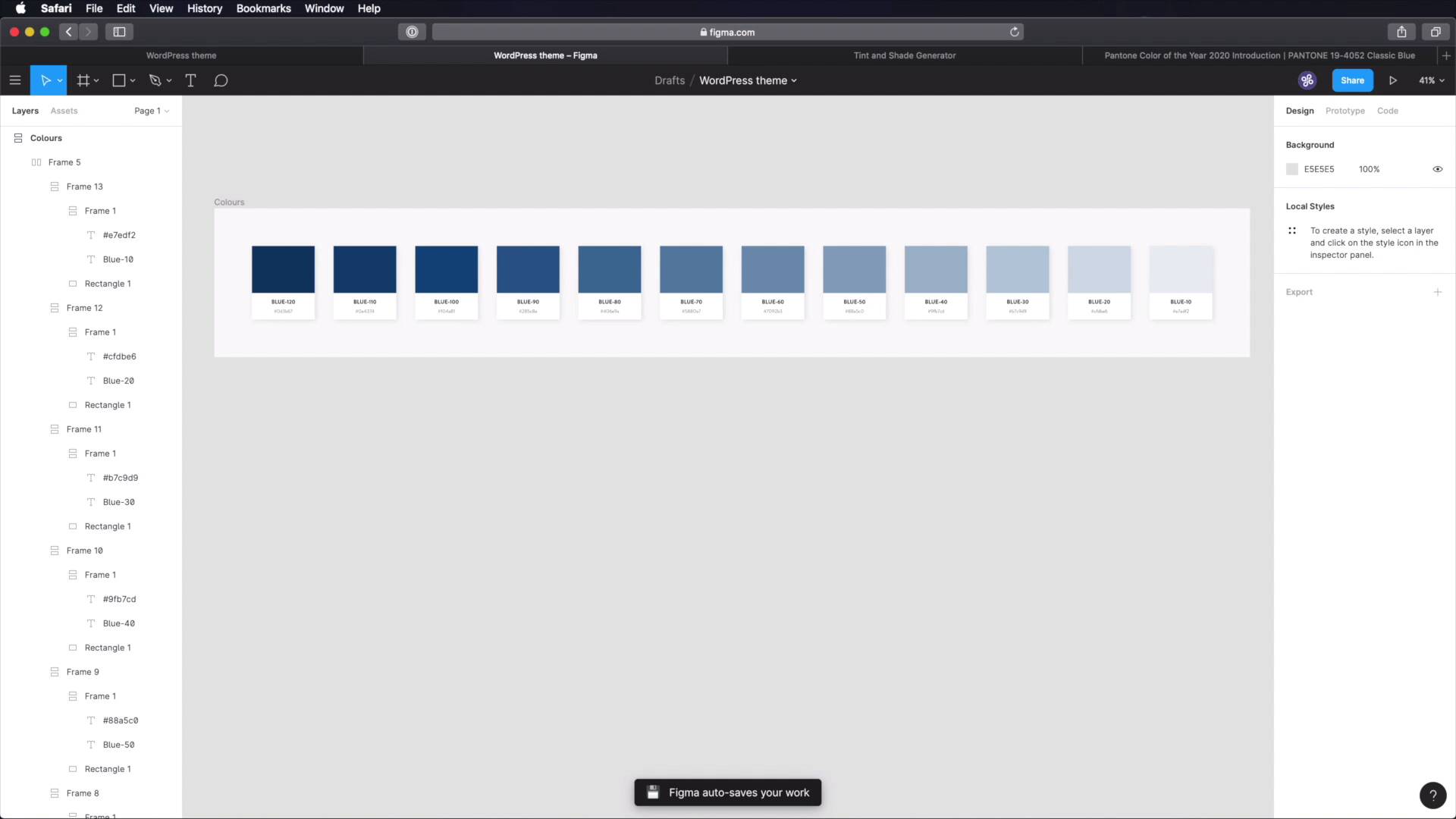
2.2 Defining Colors
Welcome back to the course. Let's start our design system by defining the colours that we'll be using. So, we're gonna start right here in figma, where I've created a new frame called colours. And next, I'm gonna draw a quick rectangle. I'm gonna make it 200 by 150. Obviously, these steps are optional. I'm just trying to define or to create some cards that will allow me to display all the colours in a neatly organized manner. Okay? So let's duplicate that but, and this is gonna be white, and inside here I'm gonna add some text. Let's call this colour. And we'll duplicate this again. And this will be the, hex value. Okay, let's apply a little bit of styling to these. Alright, now here's the cool part about figma. You have this feature called auto layout. Now, which will essentially allow you to automate some of the layout creation processes. So for example here, this created a new frame for me which contains both of these layers. And I can choose where or how to align them. And I can also specify the orientation. In my case I want vertical, and I can specify a horizontal, vertical padding and also spacing between items, so this is just fantastic. So I'm gonna go with 34 horizontal padding. 34 vertical, although that's a little bit too much, let's try 15. And also spacing between items. Let's try like 5. And then I'm gonna take all of this, do another auto layout using shift A, so this is gonna be vertical. And I'm gonna quickly give it a drop shadow. And I'm gonna do 24 blur for x for, y and about 10% opacity. Now with this, I'm gonna select my main frame, and I'm gonna add auto layout to it as well. I'm gonna make it vertical, specify like 90 here, 90 here and maybe around 30 here. All right, so now, the cool thing about figma is that I can duplicate one of these items, one of these frames. And it's gonna maintain the same layout, which is great. Now, I want these colours to be displayed horizontally. So I can select all of these, shift A to create another frame with auto layout, change the orientation to horizontal. And we're pretty much good to go. So, let's talk colour for the main colour. Or the primary colour, I decided to use this blue which is Pantone's classic blue. It was dubbed the colour of the year 2020. So let's quickly grab the colour there, and. We're gonna do it like this. We're gonna colour it. We're gonna colour this rectangle, and we're gonna also paste in the hex code right here. And I'm gonna call this blue 100. And also make sure that these titles are uppercase, all of them. Let's also add a little bit of padding here. And let's remove the spacing on this main one, on this main frame. This doesn't really matter. Now, if you're using Adobe XD for example, you don't have these features, so you would have to do this things manually. But since I'm using figma, it's much easier. Now, based on this colour, we're gonna create some tints and some sheets. Because when working with colour, and we're caught with colour palettes, you need one main colour and then you need variations of that colour. Variations are basically tints or shades. A tint is a lighter version of that colour. A shade is a darker version of that colour. And you can easily obtain tints and shades by overlaying a white or black layer on top of your original colour, and changing the opacity. Or, you can do it the easy way and go to maketintsandshades.com, which is a tint and shade generator. And from there, you just. Grab the colour, click make tints and shades, and then you have the shades here and the tints here. So for this particular example, we're gonna do two shades, and a few other tints, I believe it's like 8. So the process is actually very simple. Let's do the shades first, copy that. Come back here, duplicate this. Oops, duplicate this bit. Based the colour in there, and base the color in there. And we're gonna call this BLUE-110. So I'm doing these in increments of 10, just to know that okay, BLUE-10 is bigger than BLUE-100. That means it's the immediate next level of tint, or shade, or whatever it is that I'm doing. Let's duplicate the process. Let's grab this third one. This is gonna be BLUE-120. Paste in the colour, and paste in the colour. So like that, we have the main colour, and then two shades. Now let's make a bunch of tints. So we're gonna grab the first one. Based on the colour. We're gonna call this BLUE-90. So we're going down from BLUE-100. Duplicate, grab the next one. This will be BLUE-80. See how easy this is in figma. Duplicate. And we're gonna go all the way down to BLUE-10. Okay, so let's actually do that. So we have blue 90 AD, this will be 70, 60,50, 40, 30, 20, ten. Okay, so now all that's left to do is fill in the rest of these elements. And that's it for the blue. This is our primary colour. Now we also need a secondary colour. So what I'm gonna do, is I'm gonna duplicate this first row, and where it says here, our BLUE-100. We're gonna define our secondary colour. And for that, I decided to use something like this, which is kind of a mix between orange and yellow. It's kind of a mustard colour. It's a DAAC55. It's a relatively complimentary colour to the blue. So I think it's gonna work just fine. So grab that. Go ahead and define our tints and shade for it. And just repeat the same process, grab two shades. And a whole bunch of tints. And also, we're gonna rename these, instead of blue. We'll say orange. Just to keep things simple. In a design system, you should always name your colours. So don't refer to them by their hex code or their RGB code. Instead give them names, it's much easier to talk about them with other people. Let's grab our second shade here. And now it's time for the tints. Now, we've defined our primary colour and our secondary colour. The third step in defining our colour palette, is to create the grays or the neutral colours. So here's my process for that. What I do is I create a rectangle or whatever shape, then I fill it with my primary colour. I duplicate it, and I make sure that the new shape is on top of the old one. I fill that with black, just 00000, and then I just lower the opacity of this to about 75 to 80. So now if you reference that colour, you'll see that it's not black anymore. Instead it's a mix between black and whatever colour you chose. Essentially, we're creating a shade for it. Now alternatively, you can just grab this colour, go to this website and just pick one of the shades from here. So in my case it would be this one, okay? So I'm gonna copy that colour, make sure I delete this, I'm gonna duplicate this row and I'm gonna paste it in here. And this will be my base Grey colour. I'm gonna call this GREY-100. And for it, we're gonna create some tints, not shades because this is the darkest colour I will use. So we don't need shades anymore, but we will create some tints, okay? So. Let's delete those. Let's sample this colour, paste it in here, and I'm gonna grab these tints right here. Starting with the first one. It's the same process that we're just repeating. Okay, and this is called GREY-90. Next one, GREY-80. And the reason I'm also using the hex codes here, is that I can export this as an image and someone can print it right. If they don't have access to the design system right at that time, they can print this sheet, they can see okay, so these are the colours that I need to define. Pretty cool. And finally, we need to define some contextual or semantic colours. And these refer to colours that are specific to certain contexts, like for example, error, success, warning information, we're gonna find four of those colours. So let's duplicate this, and we can delete a bunch of these elements. First, we have the error, for which we're gonna use cb. 5940, then we're going to use this green for success so 96cb40. Next, we have this orange for warning. This is cb8b40. And finally for information, we're gonna use this colour 40aacb. And with that our colours are defined. Now, what can you do with this in terms of your design system? Well you have the file here in figma or whatever software you're using, but he can also document it in notion, right? So what I usually do, is I create a new page called Design System. And then inside that, a new page called design. So I kinda separate the design from the components, and then inside that, a new page that I call colours. And inside colours, I do this, primary. And then I specify a short description for those colours, something like this. And then what you can do with notion is you can create a table. Let's call it primary colour variations. And you can have the name of the colour, you can have the hex code, and you can have the usage. So where are you using that colour? It's very helpful information. So, where do you start? Well, you then go back to figma your reference, your file here. So BLUE-120 grab the colour, paste in the hex code. BLUE110. Paste in the hex code, BLUE-100, grab the hex code. And so on and so forth. So you do this for the primary, you do this for the secondary colours, and then for the greys, and then for the contextual. It's super, super easy. All right, so that's the colour palette, and with it a huge part of the project is already done because colour is just so important. In the next lesson, we're gonna tackle another very important aspect of any design language and in particular of our design system, and that is typography. So I'll see you there.


