

- Overview
- Transcript
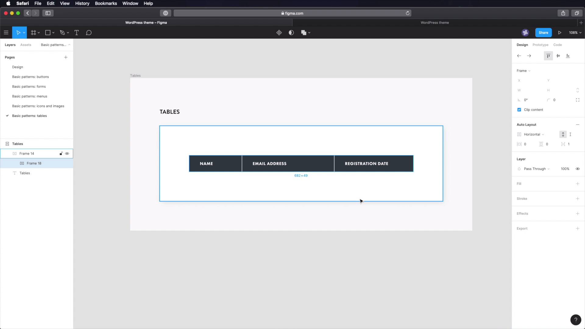
3.5 Tables
In this lesson, we’ll be designing and documenting tables. You might think that HTML tables are obsolete now, but that’s not the case. WordPress still uses tables for some default widgets, and they're still the best way of displaying tabular data. So we definitely need to include them in our design system.
Let's begin.
1.Introduction
1.1Welcome to the Course01:55
1.2Design Considerations for WordPress Themes06:36
2.Preparation
2.1A Design System Approach07:43
2.2Defining Colors14:57
2.3Defining Typography21:15
2.4Defining Spacing and Sizing08:07
3.Basic Patterns
3.1Buttons15:42
3.2Forms16:22
3.3Menus08:22
3.4Icons and Images12:24
3.5Tables06:34
3.6Separators and Spacers06:09
3.7Grid System06:23
4.Advanced Patterns
4.1WordPress Widgets06:49
4.2WordPress Posts19:18
4.3Headers and Footers09:27
5.Page Layouts
5.1Creating Page Layouts06:14
5.2Designing a Full Page: The Index08:15
6.Final Words
6.1Conclusion03:36
3.5 Tables
Welcome back to the course. In this lesson we're gonna design tables. And you might think that tables are obsolete by now, but that's not true. WordPress still uses table markup for some of its default widgets. And tables are still the best way to display tabular data. So it's important that we include them in our design system. So let's go. Back in Figma we'll do the usual thing, basic patterns, tables and let's just copy one of these frames, rename it Tables, Tables. Let's delete that image and let's start with a rectangle. And this rectangle will actually be deleted, and we're gonna create a frame instead. Just like that, so we can add auto layout to it. We're gonna make it vertical. We're gonna give it a fixed width of, let's say 160. And as for the padding, let's go with 32, 16 vertically, and we can leave this to zero or let's put 8. Now, let's fill this with a nice gray colour, let's choose gray 80. Okay, great. And now let's put some text inside, like for example name. Let's align this to the left. Let's make it white and we're gonna use Futura PT. Heavy I believe it was but let's reference that. We're going to use the overline characteristics. So futura 13, heavy, 5% letter spacing 13 pixels, 5%, fill is white. Okay, great. So this is a table header, if you're wondering, and we're going to duplicate it and then we're going to come back to these to this frame. And we're going to say distance between items, one pixel. So we get this nice separator here in between. This can be used for an email address. And let's actually make this a lot bigger. 280, let's duplicate that and use it for, I don't know, a registration date for instance. Let's make this 240. So now because we have this group of table headers, let's group them all up in another frame, and let's duplicate it. And now we're gonna go to the parent frame and switch this to vertical, okay? So what we can do now is change these to this Grey 10, change the color of the text to, This, and also we're gonna change from Futura to Lato, which is the body typeface, regular 16 pixels, 04 letter spacing and let's also change the case to this. And let's do another one where all of these are white. So now we can grab these, duplicate them, and we have our table. Now all that's left to do is just grab some names. I have a plug in here, called Content Reel, this is made by Microsoft. And I can select multiple text layers, and I can do names. I can select these, I can do email addresses. I can select these and I can do dates. Actually, I don't want the time, just the dates. Cool, so now we have a table that's populated, With some text and it's ready to go. The last thing you have to do is go into your design system here, basic patterns, create the new page, tables. What to use it for. These are used for tabular data, do not, and let's do this, do not use tables for layout. We have much better options for that. And then you can go into details like table headers, right? What kind of style do you have here? Table rows. So let's put in style, meaning, background color, text color, padding, etc. Table rows, we need to do the same thing. We can also show some examples here. Make some screenshots from Figma. Bring them over to do whatever software you're using to create these documents, right? Have examples, have use cases. Those are things that should go into a design system. All right, and the tables are done. Now, another very useful component in any UI is a separator. And we'll design and document that alongside spacers in the next lesson. See you there.


