

- Overview
- Transcript
4.3 Headers and Footers
In this lesson, we’re going to design and document two components that are present in every page of our WordPress theme: the header and footer.
1.Introduction
1.1Welcome to the Course01:55
1.2Design Considerations for WordPress Themes06:36
2.Preparation
2.1A Design System Approach07:43
2.2Defining Colors14:57
2.3Defining Typography21:15
2.4Defining Spacing and Sizing08:07
3.Basic Patterns
3.1Buttons15:42
3.2Forms16:22
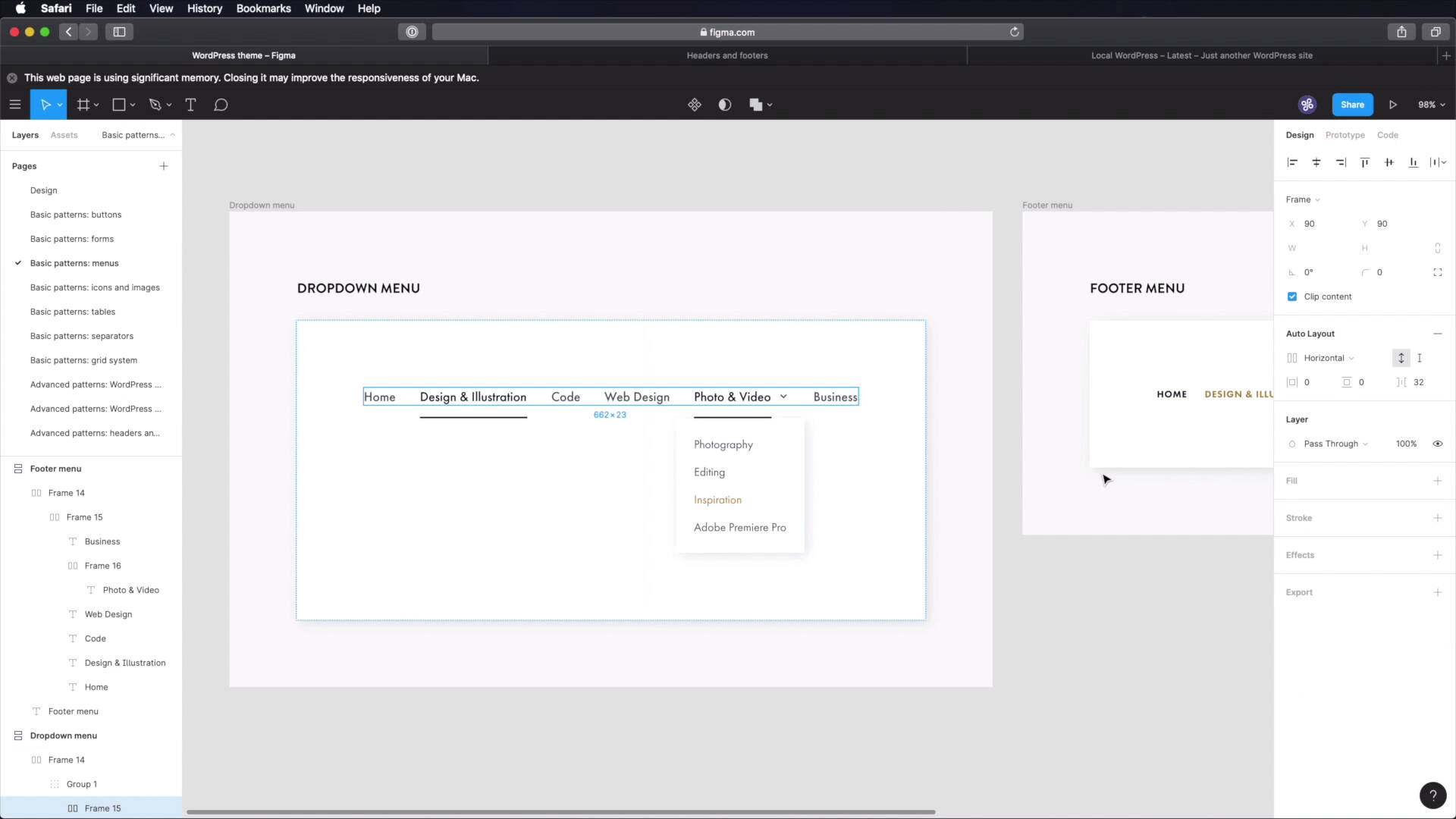
3.3Menus08:22
3.4Icons and Images12:24
3.5Tables06:34
3.6Separators and Spacers06:09
3.7Grid System06:23
4.Advanced Patterns
4.1WordPress Widgets06:49
4.2WordPress Posts19:18
4.3Headers and Footers09:27
5.Page Layouts
5.1Creating Page Layouts06:14
5.2Designing a Full Page: The Index08:15
6.Final Words
6.1Conclusion03:36
4.3 Headers and Footers
Welcome back to the course. In this lesson, we're going to design and document two components that are repeating themselves in every page of our WordPress theme. And those components are the header and the footer. So let's begin. I got a head start in Figma and created a couple of different frames. We're gonna build each component in two versions, one for desktop, one for phone. So, let's begin with the header desktop. I'm gonna start by making another frame inside this one and I'm gonna make it 1,200 and I'm gonna add a layout grid to it. That's gonna be columns 12, let's change this to a nicer color. So, 24 margin, 24 gutter, all right. So now, our header is very, very simple. We're gonna have a logo on one side, a navigation menu on the other. For the logo, I'm gonna use very simple placeholder logo that I've been using in my projects. Let's add a height of 48 pixels to this one. And we're gonna move it to the top and then for the menu, let's just go ahead and grab this menu right here, paste it in. Let's update some of these links to have the correct color. Let's move this to the right and let's align these like so and now I can hide the layout, and we're good to go. This is our desktop header. Now, on the phone header, let's do the same thing create a frame. We're gonna make this 500 pixels at a layout grid. If you remember on the phone, we have two columns. Again, 24 margin 24 gutter. So now we got to fit this into a much smaller format. So I'm gonna paste in the logo and instead of the menu, we're gonna use a hamburger menu icon, so let's go back to our icons. We're gonna grab this, copy. Paste it in. Align this to the middle. Align it like this, hide our grid, and there we go. That's our phone header. Now, let's move on to the footer. Our footer will have some widgets. We're gonna put two for now. A menu and a copyright notice. So let's again start with a frame, and we can actually go in here. Oops, sorry about that. We can actually go in here and just copy this frame because it already has our grid. We can delete these two. Let's hide the grid again. And the first thing we'll do is start with a separator. So let's jump to that page. Let's grab this separator, paste it in here. And let's make its width 1,200 minus 48. So that's gonna span the exact width of our columns here. Next, let's add some widgets. We're gonna put maybe recent comments and recent posts. So let's copy these. Paste them in, like so. And let's make these or make sure they fit six columns each. So let's copy recent posts and line up like that. Cool. Next, let's create another separator in here between the widgets and the footer menu. So, let's go back to separators, grab this, paste it in, align it like that. Next, let's grab the footer menu, paste it like so. Let's fix this link here. And finally, we're gonna add a small copyright notice. So let's grab a paragraph and let's position this paragraph 64 pixels from the footer menu like that. And inside, simply say Copyright 2020 all rights reserved, you know, the usual drill. Okay, let's hide this. And now our desktop footer is done. Now we got to fit all of this into the phone footer. So, let's start by copying this frame, pasting it in. Let's get rid of these elements. And we're gonna start with the first element here, which is the separator. Let's make this a bit longer, paste that in and we'll make it's width 500 minus 48. And if you're wondering why 48 because I have 24 pixels on the sides here as the margin for the grid. Next, let's grab this widget. Let's make it smaller, like that. Just make sure it matches our columns there. Let's grab recent posts. And I'm gonna position this 64 pixels from the other widget. And what else? We have a little separator here. So let's grab that, paste it in. And then we have the footer menu and the copyright notice. So let's paste those in as well. Now on this footer menu, we're gonna make it vertical instead of horizontal, and we just have to make sure that all the items are aligned to the left like so. And then for the copyright notice we're gonna position it 64 pixels from this menu. And let's do a quick resizing here. And we should be good to go. Let's resize this frame. And let's hide the grid. And there we go. We now have two versions for the header and the footer. One for desktop, one for the phone. And this will come in very handy later when we build our pages. Now, for the actual documentation, you can jump into your chosen software and you can create a new page here in advanced patterns, headers and footers. And inside, well, you can document the header and the footer and for each, you can write stuff like its structure, like so what do you have in the header? What do we have in the footer? What are the dimensions and measurements for this? How tall is the logo? What's the distance between, I don't know, this menu item or this menu and the copyright notice? What's the distance between these two widgets when they're in footer when they're in phone mode, right? Can write down all of these things. What are the differences between desktop versus phone? What happens on tablet? Does the layout change? So, you need to document all of these important things so that when you come back later on you'll know exactly what's going on there. And with that, we've finished designing and documenting all of our patterns, all of our components. Next, it's time to define some page layouts and then design a demo page in the final lesson of this course. But for now, I'll see you in the next lesson where we'll just quickly sketch out a few page layouts. See you there.


