

- Overview
- Transcript
3.4 Icons and Images
1.Introduction
1.1Welcome to the Course01:55
1.2Design Considerations for WordPress Themes06:36
2.Preparation
2.1A Design System Approach07:43
2.2Defining Colors14:57
2.3Defining Typography21:15
2.4Defining Spacing and Sizing08:07
3.Basic Patterns
3.1Buttons15:42
3.2Forms16:22
3.3Menus08:22
3.4Icons and Images12:24
3.5Tables06:34
3.6Separators and Spacers06:09
3.7Grid System06:23
4.Advanced Patterns
4.1WordPress Widgets06:49
4.2WordPress Posts19:18
4.3Headers and Footers09:27
5.Page Layouts
5.1Creating Page Layouts06:14
5.2Designing a Full Page: The Index08:15
6.Final Words
6.1Conclusion03:36
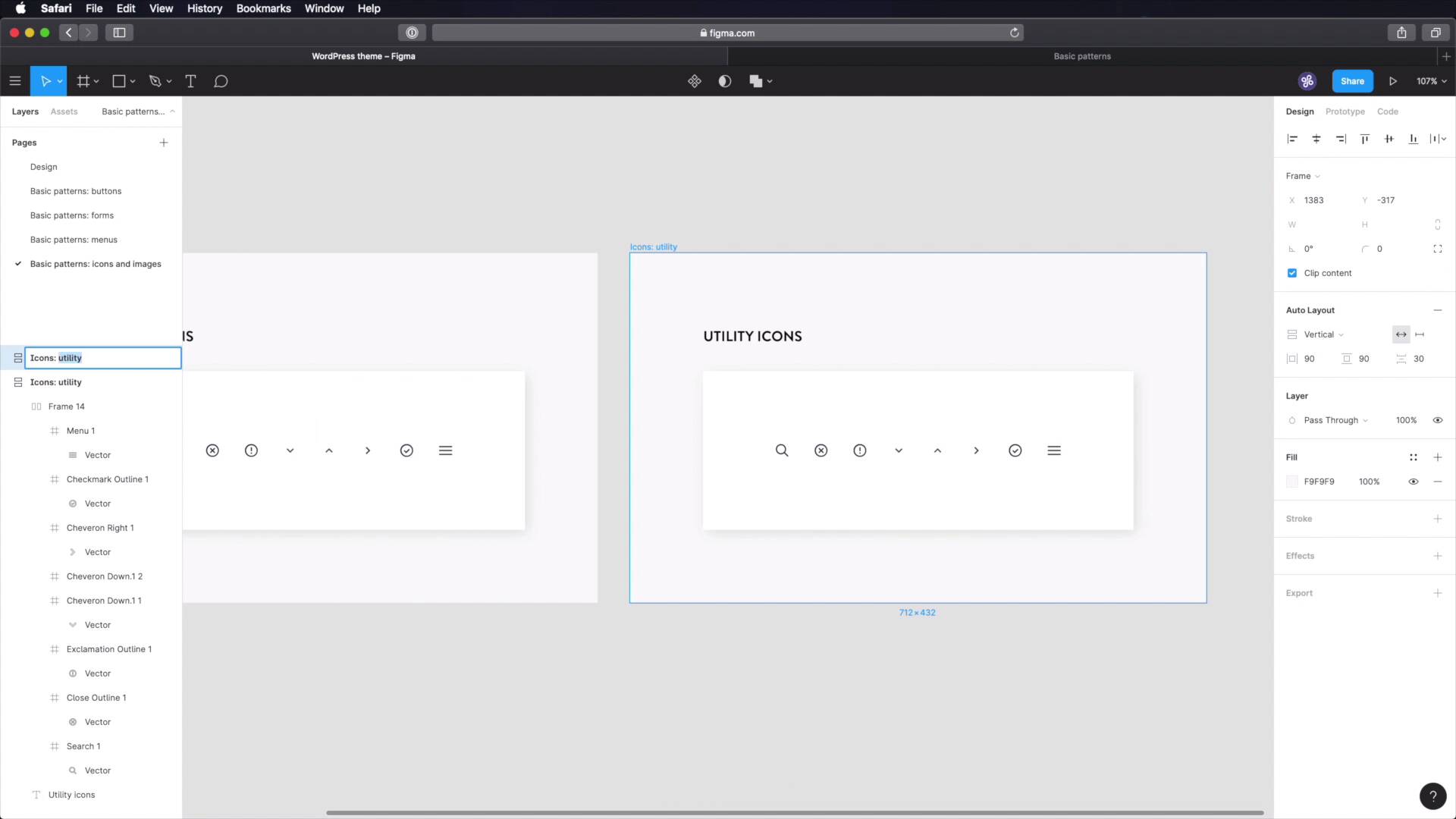
3.4 Icons and Images
Welcome back to the course. Let's continue building our WordPress theme design system by documenting how we're gonna use icons and images. Let's begin. As per usual, we're gonna start with a new page. We're gonna call it Basic patterns, Icons and images. Let me just copy one of these frames to make things easier for us. And we'll start with Icons utility. So for this theme, I'm breaking down the icons in two types. One is utility and two is decorative. Utility refers to icons that are used in very specific context like a search icon. Or one of those loop icons being used in a search form, or the chevron down icon that you saw me use in the drop down menu, okay? Or the contextual icons that I used in the form design with the x for error, check mark for valid. Or actually, I didn't use the check mark. Or the exclamation mark for warning, right? Those are the types of icons that I consider to be utility icons. Decorative icons on the other hand have, well decorative roll, right? And they're meant to be used alongside text to create a feature or a walk-through, stuff like that. This is a very common practice in web design, right? You have three columns of content, an icon on top, a title and a small description, and possibly a link or a button, right? Those are the types of icons that are consider to be decorative, okay? So we're gonna start here with utility icons. Let's delete that and let's delete that. And let's delete that. And inside, well, we're just gonna put all the icons that we're gonna use or plan on using in this project and of course the list will grow over time. But at the end, you'll have a clear list of, okay, so here are all the icons that I used in this project and I can just export these as SVG. And don't worry about it, I won't have to load an entire icon library just to use these five or ten icons so it's always a good thing to have. So now, we're gonna, [COUGH] excuse me, we're gonna go through the list here. And we're gonna grab the ones that we're using. Paste them in. What else? We have these two. So copy that. Paste it in. Copy that, paste it in. And what else? We have one on menus here. Copy it, paste it. And we'll have some other ones. We're gonna grab the reverse of this, which actually we'll just duplicate and we'll rotate by flipping it. And then we'll grab a new one, we'll paste that in. And what else? I think we got all of them, right? So let's also do a check mark. You never know how you're gonna need that. And let's grab a menu icon. And by the way, these are all from the same set. They're all from here zone icons. And I think we're done with utility icons. As I was saying, if we're gonna have more then we're gonna add more. So just to clear things up a little bit, let's make sure all of these have the same characteristics, which means 16 pixels size. And actually, because I had to make that change it means that on the forms side, I actually didn't size this correctly, did I? No, I forgot. Excuse me. I'm sorry. There you go. There you go, now that's cool. So let's also change the color of these, and let's change the color, Of this. I love Figma, it's so easy to work with. So that's 16, 16, 16, this needs to be fixed. 16. So line it like that. And let's change the color. 16, align it in the middle. Change color. Same goes for this, 16 middle color, and we're done. Just for the sake of it, let's add a little bit more spacing between these. Yep, that looks pretty good. So, Now we're done with utility icons. Let's duplicate this and create some decorative icons. Now, another difference between utility and decorative is that these utility icons, they have the same size pretty much all the time, 16 pixels. But decorative ones we'll make them in three sizes small, medium, large, just because at some points we might want a small icon but other times we might want a large Icon. So it's good to have these in your system, it makes your job easier in the long run. So we're gonna say icons decorative, small. And I'm actually gonna remove all of these. And I'm just gonna grab some new ones. And I'm gonna use another set. It's these icons, a free icon set from theme aisle. They're pretty nice. They're outline icons. I really like the style. So I went ahead and downloaded a couple from here. They're just for demonstration purposes. You should tailor these icons to your content because they're decorative, right? They must fit with whatever other content you're associating them with. So I grabbed a couple, and I'm just gonna bring them in here. I'll just actually change their size to 32 each. And let's also, Grab our color and apply it to all of them, cool. The next size is medium, and for these we'll actually double their size, We'll make them 64. And we'll also, Add a bit more space in-between them, this is just for show, really. And finally, let's make the large ones. And these will be 128. And let's also change the space in between them to 72. Finally, let's look at images. And for images, we're just gonna use a demo image in here. And we got to make sure that the height, Is a multiple of eight. So 560 divided by eight gives us 70. So this is a correct height. And again, this is just for demonstration. We can show the proper height, and also the style of the image, right? We're gonna keep it really simple. We won't be rounding off any corners on this one. And we're not gonna add any shadows or borders or stuff like that. So let's actually grab an image from Unsplash. That should do the trick. And yeah, I think we are pretty much done in Figma. Now, the next thing you have to do is go in to your text editor here, add a new page for icons and images. And you can write content like this. I just quickly filled this out. So I can give you an example of what you can write in this document. So I said there are two types of icons, utility and decorative. So what are utility icons? I give an example. I show an image. I set a caption for this and then I talked about sizes, so utility icons have a size of 16 by 16. If you don't have a square icon, then set the height to 16 pixels. The decorative icons, what are they used for? What are their sizes, small, medium, large? And again, I'm using the theme aisle free icon pack that's found here. And then we have images, some information. Wherever possible images for the post and page cover should have a ratio of 16 by nine, and also they should be sized in multiples of eight. Square images should have both dimensions in multiples of eight, and so on, and so forth. And since I'm here and because we're dealing with these links to various resources we're using, we're gonna go back to WordPress theme here to the root document. I'm gonna create a new page and I'm gonna call this Resources, right? So for icons we are actually using this link here. And in notion at least you can create a bookmark or an embed, but I usually just go for bookmark and it gives you this styled link with a preview taken directly from the website which is just fantastic. And that's how we're gonna use icons and images. Now, in the next lesson we're going to design and document a pattern that a lot of people think it's outdated, but that's not true. Tables are still being used in WordPress, even for a widget, the calendar widget that still uses table markup. But for tabular data, they're still the best pattern to use. So in the next lesson we're going to cover tables. See you there.


