

- Overview
- Transcript
5.2 Designing a Full Page: The Index
In this final lesson, we’ll take the design system we’ve built and design our first full page: the index. This process will show you how you can design the rest of the pages in your WordPress theme while adhering to the same guidelines.
1.Introduction
1.1Welcome to the Course01:55
1.2Design Considerations for WordPress Themes06:36
2.Preparation
2.1A Design System Approach07:43
2.2Defining Colors14:57
2.3Defining Typography21:15
2.4Defining Spacing and Sizing08:07
3.Basic Patterns
3.1Buttons15:42
3.2Forms16:22
3.3Menus08:22
3.4Icons and Images12:24
3.5Tables06:34
3.6Separators and Spacers06:09
3.7Grid System06:23
4.Advanced Patterns
4.1WordPress Widgets06:49
4.2WordPress Posts19:18
4.3Headers and Footers09:27
5.Page Layouts
5.1Creating Page Layouts06:14
5.2Designing a Full Page: The Index08:15
6.Final Words
6.1Conclusion03:36
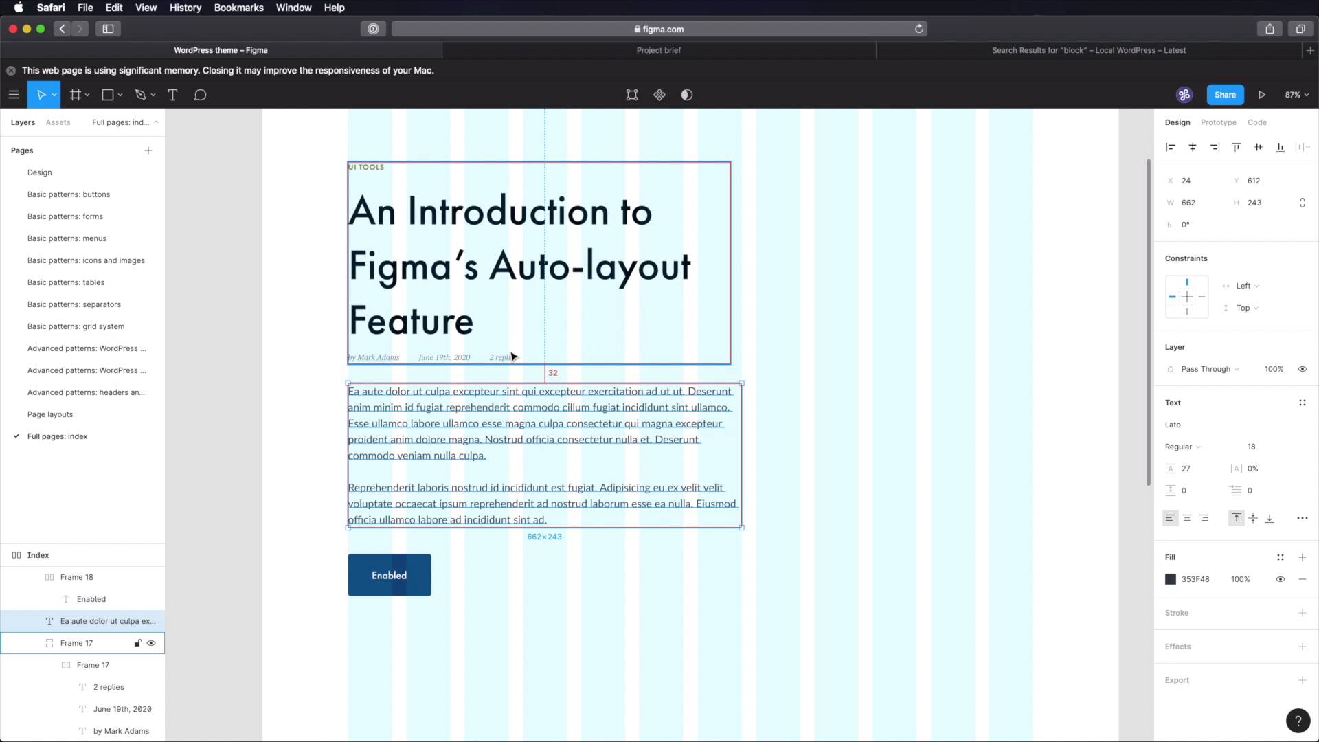
5.2 Designing a Full Page: The Index
Welcome back to the course. In this final lesson, we're gonna take the design system that we've built and create a full page, the index. And hopefully this process will show you how to create the rest of the pages based on the same design system. So, let's go. I'm gonna start by creating a, New page here in Sigma. I'm gonna call it Full Pages Index. Create a frame, let's call this Index. And inside of it, let's create another frame, 1,200 pixels. Let's do like 2,000, for the height. And let's add a layout of grid, columns 12, Something like that. 24 margin 24 gutter, okay? So with this, let's align it in the middle and at the top, and let's actually add an Auto Layout, to this parent frame so that it resizes automatically with my inner frame. Okay, so where do we start? Well, with our little sketch here, right, the index page. First, we have a header. So let's go ahead and grab that. We'll go to Headers and Footers, we'll grab the one for desktop, copy, paste. Let's align it properly. And let's leave about 64 pixels from the top. We can also use auto layout for this frame, but that takes a little bit longer to set up. So I'm just gonna do it the old fashioned way, just in case you're using some other software that doesn't auto layout. All right, so that's the header, what's next? We have post and sidebar. Okay, let's start with the posts. So we're gonna grab, This post right here, or actually we don't need all of it, we just need the first part. So we're gonna grab this, this and this. Copy, paste, and let's position these at about 128 from the header. Just leave lots of room for for breathing there. Now as a small change, compared to what we did here, we're gonna remove the separator, just to keep things a bit nicer. And we're gonna position the set about 48 pixels from the post intro. And also, we're gonna make this a bit smaller because I want my sidebar to fit in four columns and I also want one column of empty space between the two sides. So, let's change this. All right, let's bring this back up to 48 pixels, like so. And we also need to add a little button here for Read More. So let's go to Buttons, we'll grab one of these medium buttons, paste that in. And, now that I think about it, I think a little bit more or a little bit less space between these two elements is probably a good thing. So let's go 32 pixels here, and also 32 pixels here. All right, let's take a look at it without the grid. That looks pretty good. So now we have this, this and this. We can do an auto layout for them. Also, let's make this a little bit bigger. All right, so now I have this, this and this. Here we can do an auto layout, it's gonna automatically switch to vertical with 32 pixels between items, so that's cool. And now, what we can do is just duplicate this bit, move it down, leave 128 pixels between these two. And now I can also select these and hit shift A to create another frame with auto layout. Notice that it automatically added 128 between items. So now what I can do is just command D, duplicate, a post here and it's automatically gonna be positioned correctly. Now let's move on to the sidebar. For this, we're gonna add two widgets and let's see where those are, right here. We're gonna use the search widget and categories. So, grab the Search, position it right there. Like so. And we gotta do a quick change to the width of this element. Let's change that width, so that it matches our four columns. And we're gonna skip the widget title on this case, but we will use it on the Categories here. So let's grab that copy, paste it in. We're gonna leave 64 pixels between these two. And we can also Shift+A these into a new frame with auto layout. So then when I create another widget, it's automatically gonna be positioned correctly. Okay, so far so good, we have the header we have the content or the posts and we have the sidebar. Finally, we got to add the footer. So let's go grab our desktop footer, copy that, paste it in. Okay, and, Let's make sure we have 64 pixels of space here, let's hide our columns, and here we go. This is our index page, created in a matter of minutes, simply because we used our design system and we had those components already built. Final thing to do here, which I forgot is to change the text on these buttons. They should just say Read more. Like so. All right, and that's how you can use the design system to create a page for our WordPress theme. And you can apply the same process to the rest of the pages and I guarantee you'll get great results. Now please join me in the next lesson for the conclusion of this course. See you there


