

- Overview
- Transcript
3.6 Code the Contact Page
Let’s finalize our site by coding up our simple contact page.
1.Introduction
1.1Welcome to the Course00:43
2.The Design Phase
2.1Design the Master Layout19:04
2.2Master Layout: Thin Width08:59
2.3Design the Home Page12:54
2.4Home Page: Thin Width05:03
2.5Design the “Accommodation” Page05:31
2.6Design the “Rates” Page03:41
2.7Design the “Guest Comments” Page03:33
2.8Design the Contact Page04:59
2.9Export Images03:43
3.The Coding Phase
3.1Code Up the Master Layout24:37
3.2Code the Home Page16:05
3.3Code the “Accommodation” Page04:50
3.4Code the “Rates” Page02:33
3.5Code the “Guest Comments” Page04:28
3.6Code the Contact Page06:39
4.Conclusion
4.1Wrapping Up04:35
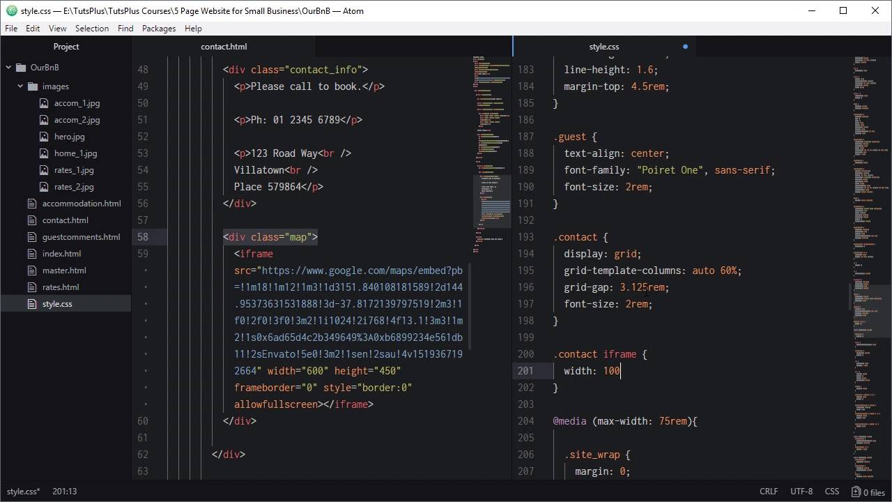
3.6 Code the Contact Page
Hi, welcome back to build a classic five page website. We're now on to coding out the last page of our five page website, and that is the contact page. What we're gonna do with this one, is just add some contact details on the left, and an embedded Google map on the right. So we're gonna make this in the same way that we made our last page, by duplicating the master page. Gonna name that contact. So we want to set the correct link as the active link, change that onto contact down here. Now, we need to add in our page section wrapper. We'll add in our heading H2, plus page_heading, and we'll set the heading to read contact. And we're gonna be using our ever-helpful CSS grid to handle the layout of this again. So we're gonna add a dev with the class contact, this is gonna be a grid wrapper. Every time you use CSS grids you need to have a container element for it. Inside we'll add the children that are gonna be turned into grid cells. So the first one is gonna be a dev with the class contact info, it'll be contact_info. And then we'll have another one with the class map. And in here we're just gonna add in a few paragraphs. Each one of these paragraphs is gonna have each of three blocks of text. And we're just gonna use breaks to put each of these lines of the actual address onto a new line. We'll do that with this code. You just go to paragraphs and our breaks here. And then for the map what we're gonna do is just drop in an IFrame. And this IFrame code just came from going to Google Maps hitting the share button, and then grabbing the embed map code here, so that's all we needed for that. Because we're just doing a static website, something that can be just embedded in a IFrame like this is perfect for what we need. So now we'll add in our code that's gonna turn our contact element into a grid. Above our media queries gonna target our contact class, so to be display grid, like we did for our other classes. Set up our columns for our grid with grid-template-columns. Now we want our map to take up 60% of the width and our address details to take up the rest of the amount. So we're going to say order, so orde width on the first column, and 60% width on the second column. But we want some space in between that text and the map, so we're gonna say grid gap is 3.125 rem. And we want to have our font size be a little bit larger than default, so it's nice and easy to read. So we're gonna change the font size up to 2rem. And we also wanna make sure that this IFrame is always filling out this grid cell here. So, we're gonna do that by targeting our contact class and any iframe that's a child of that contact class, and setting it to width to 100%. All right, let's see what we've got. We'll hit our contact menu item. There we go. So now we've got our text on the left, that's all good, and we've got our map on the right. So that is excellent. Now, we need to check how it looks when we shrink down the layout. As we shrink this down the text starts to get a bit crowded, and then there's definitely not enough room for two columns as we go down, so we'll five that up. So in our 55 room media query, target our content class. And we're gonna drop the font size down to 1.5 rem. We're gonna do the same thing, for our 45 rem media query, and this time, we're going to drop that font size down to 1.25. Let's see what we've got. All right, so let's trunk there, that's still looking good. And so now we also need to add in a collapse point where this goes down to a single column. The next media query that we have in is 22 rem. So it's probably gonna happen a little bit too late. We have a media query there at 45 rem, that's a little bit too early to stack these elements on top of each other, but 22 rem Is a little bit too late. So what we are gonna do instead is we are gonna add another media query at 40 rem. And here's where we're going to collapse that grid down so that both becomes 100% which forces them to sit on top of each other. And now, because that text is gonna be on top of the map, we're gonna center align and so that the look could be later. So we shrink it down, and there we go so now that's collapsed down. We've got our center text, and that's gonna be fine as you continue to shrink that down. All right, so that is all done, we've got our contact page. And that is the fifth page of our hand coded static website. We've got our homepage all looking good, we got our accommodation page, Our guest comments page, Our rates page. And our contact page. So these are a type of site that I actually still see around a lot. Especially in smaller towns where you have businesses that don't have a $20,000 budget to put in to a website, but they do want to have a web presence online. So these types of static sites they might not be the most prevalent website that you find out there like they used to be some years ago. But they are still there, they are still needed by a lot of people, and they're definitely something that you should feel confident that you can do yourself as a web designer. Sometimes it's a good idea to just boil everything back down to basics and to see what you can produce, with just those fundamental tools of HTML, CSS, and a couple of photographs. Now we've got just one more video in the course. What we're gonna do is extract the key points that we've covered here, put them into a bullet list, so that you have everything down in a nutshell. You can come back and refer to this video any time you need a refresher, on what we covered with this topic. So we'll see you in the final video


