

- Overview
- Transcript
2.4 Home Page: Thin Width
As we did with our master layout, we’ll now need to design the thinnest version of our home page content.
1.Introduction
1.1Welcome to the Course00:43
2.The Design Phase
2.1Design the Master Layout19:04
2.2Master Layout: Thin Width08:59
2.3Design the Home Page12:54
2.4Home Page: Thin Width05:03
2.5Design the “Accommodation” Page05:31
2.6Design the “Rates” Page03:41
2.7Design the “Guest Comments” Page03:33
2.8Design the Contact Page04:59
2.9Export Images03:43
3.The Coding Phase
3.1Code Up the Master Layout24:37
3.2Code the Home Page16:05
3.3Code the “Accommodation” Page04:50
3.4Code the “Rates” Page02:33
3.5Code the “Guest Comments” Page04:28
3.6Code the Contact Page06:39
4.Conclusion
4.1Wrapping Up04:35
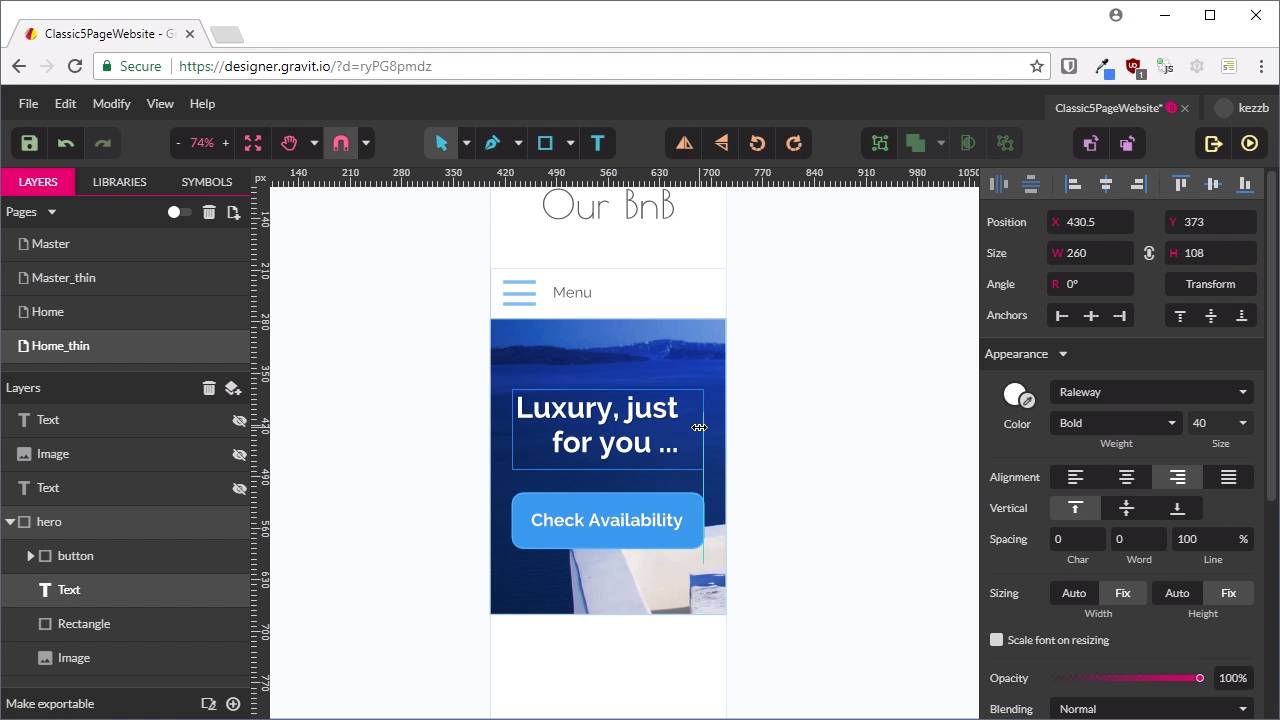
2.4 Home Page: Thin Width
Hello, welcome back to Build a Classic Five Page Website. In the last lesson, we put together the content mockup for our homepage that was in the widest possible version of that layout. Now, we're just gonna do a thin version of that layout. So what we're gonna do is duplicate this page by switching into Multipage Mode. And with this selected here, we're gonna press Ctrl+D for Duplicate. And then, with our duplicate, we're gonna rename it so that we put _thin on the end. And then, we'll go back into Single Page Mode. Now, this should actually be kind of straightforward, because we can just use that thin master layout that we created before. So from this Master drop-down here, we'll choose Master_thin as the master page. And there we go, that has taken care of half of the job for us. So now, what we're gonna do is temporarily hide the main content until we're ready to deal with that. And we're gonna start, By reworking this hero unit. Okay, now, at the moment, we've still got the menu showing in Open mode. So we're just gonna go back into the Master area here, and switch that so it shows the closed version of the menu instead. All right, now, we need to have our hero unit lined up just underneath our menu. Once again, don't worry about being too precise cuz this will all work out in code. Now, we're going to shrink down our hero unit, So that it's the same width as the site, which is going to be, actually, 319 will be just fine. Now, we should be able to just select our button, and then hold down Shift and hit the arrow keys to realign that right here. In fact, we should be able to just hit this button. There we go, so that's nicely aligned. And do the same thing for our text. Now, we're just gonna need to reduce the size of this text. So right now, it said 60 pixels, and we wanna take that down to 40, so there's lots of room for it. And we're also gonna wanna bring this text onto two lines. Go with about the same width as this button, and we're gonna center-align that text. So that is all we're gonna do with the hero unit. Just make the text a bit smaller, and center the button, and just shrink the whole thing down. Now, let's position our content. So we're just gonna show all this again. So for this content, we know we're gonna want this to be narrowed down here. That gives us a rough idea of how that needs to look. In fact, I think we'll give our thin master layout a little bit more height. So we've got a little bit more room to work with on our mockup. Let's move the footer all the way down as well. That'll give us room to map out a little bit more. I'm gonna show our image, Just over here. I'm gonna have that position itself down below. The text, just like that. And down a little bit now that we've got a bit more space. And now, we're gonna need to shrink down our heading text as well. And we just need to find a good comfortable size for this heading text. And I think 40 is gonna do the job here as well. There we go, that looks like a pretty comfortable fit. Just give it a little bit more space. All right, so now, we've established the sizes that we're gonna have all of our fonts shrink down to. And we know that when we shrink down this layout to a single column, we're gonna push this image that was over on the right, that will go down below on the homepage. And that's it, that's all you have to do for this particular mockup. And as you'll see later, what it really comes down to is just having a plan for how you are going to handle all the different types of layouts. And roughly what text sizes and adjustments you're gonna need to make. And that is all we need to do for the homepage layout. Now, we're ready to move on to the second page that we're gonna put together, and that is for accommodation. We'll be doing the same thing again, working with that master page as a background of our accommodation page, and then adding in some content over the top. So for the accommodation page creation, I will see you in the next lesson.


