

- Overview
- Transcript
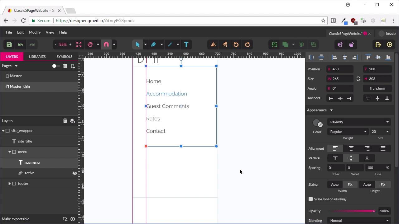
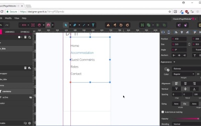
2.2 Master Layout: Thin Width
Now let’s modify our master layout to a narrower version that will work on the smallest size screens. We’ll handle all the layouts in between our two extremes later, during coding.
1.Introduction
1.1Welcome to the Course00:43
2.The Design Phase
2.1Design the Master Layout19:04
2.2Master Layout: Thin Width08:59
2.3Design the Home Page12:54
2.4Home Page: Thin Width05:03
2.5Design the “Accommodation” Page05:31
2.6Design the “Rates” Page03:41
2.7Design the “Guest Comments” Page03:33
2.8Design the Contact Page04:59
2.9Export Images03:43
3.The Coding Phase
3.1Code Up the Master Layout24:37
3.2Code the Home Page16:05
3.3Code the “Accommodation” Page04:50
3.4Code the “Rates” Page02:33
3.5Code the “Guest Comments” Page04:28
3.6Code the Contact Page06:39
4.Conclusion
4.1Wrapping Up04:35
2.2 Master Layout: Thin Width
Hey, welcome back to build a classic five page website. In the last lesson, we created the master layout that is going to be common to all of the pages on our site. But that layout is how the site's going to look at its maximum possible width. Now we need to make a thin width version that's going to look good on small screens, like those for mobile phones. Now, sometimes, you might find that you want to make a whole bunch of other widths as well. So, here's how it's going to look on a tablet, here's how it's going to look on a 1024 laptop screen. But typically, those types of extra phases will be if you need to show somebody else. Who needs to check off that that design's going to be fine. When you're coding something up yourself, you don't always need to do that. Because, when it comes to the coding phase, you can just handle all of those in between stages yourself. By adding media queries and adjusting your layout as is necessary. And sometimes the best place to actually find out where those adjustments are necessary is in the coding phase. So that's why we're only going to be doing the widest possible layer and the thinnest possible layer. All right, so let's get this going. What we're going to do is duplicate our master layout and then we're going to crunch it down to this thin size. So to do that, we need to flick this little switch here that lets us see multiple pages at once. Now if we scroll up, you can see that this goes pink when we hover over the name of this page that we have already created. So we'll click on that when it's pink in order to select it. Now we'll press control D or command D to duplicate the page. And now we've got another layer that we can work with. We're going to double click on that to rename it, and we're going to add thin on the end, _thin, so we've got the master thin layer. Now, turn off that toggle again, and now we're inside the master thin layer. The first thing that we're going to do is select our site_wrapper, and we're just going to shrink the whole thing down. Now you remember in the last lesson, we added some constraints to our footer text here, we added some anchors. That's going to let this part of the layout to just automatically adjust itself when we shrink down our site_wrapper. Right now, it's at 1,200 in width, and we're going to shrink this down to 320 pixels in width instead. All right, so there we go, if we scroll in here, you can see that the footer has already adjusted itself. The text is still in the middle in both directions, so that doesn't need any extra attention, we'll mock up this thin version of our layout. However, our top section here does need some work, so the first thing that we're going to do is adjust the menu we have here. Just scroll down a little bit. Okay, so, for the purpose of what we're doing, we're actually going to take the site title and drag it out of our header. That's because this header box here, we're actually going to convert that into a box that's going to handle our menu instead. So I'm just going to rename this to menu. And then we are going to make sure our Pointer is selected, we're going to grab this whole menu, and I'm just going to drag it down. We're going to resize it so it's got more room to work with, now we want to select our navigation menu. And we're also going to drag this out so that it has about the same amount of size. For a moment, we're just going to hide this active underline, we'll turn that back on again in just a moment. But now, what we want to do is instead of having all of our menu items running from left to right. We want to have them going from top to bottom, so to do that, we're going to left-align all our menu items. And we're just going to put each one onto its own line with a space, add a space in between each line. And that's got the basic layout for our menu items in place. Now we can adjust this so that our spacing is a bit more accurate, so we're going to hit control + comma to turn our guides back on. And we'll just pull this into the side so that we have that offset correct, and now we'll just shrink this down a little bit. So that it looks a bit more well balanced with this layout. So as you can see, like I mentioned, I'm not being too particular with how this is laid out. And now I can drag this up so that we get blue lines above and below our menu items. Now we can turn our active underline back on, scroll in a little bit, and we'll just move our active underline. Up underneath our currently active menu item and we're just going to stretch it out a little bit by grabbing that node on the right hand side. And we're just going to pull that over to the side. That gives us a rough concept of how the active underline is going to look when we're on a thinner layer. So that is pretty good, that's good to go, now we're just going to adjust this site layout so that that's working properly also. We're just going to drag the whole box out so that it fits this whole top section, and we no longer want this title to be left aligned. What we actually want to do is make it smaller and centered, so everything looks nicely aligned and balanced. So now, we're going to center the text, and we're going to reduce the font size down to 54, all right, so that is looking pretty good. This is what the menu should like when it's expanded. But we don't really want to take up that much space on a person's phone screen when they first enter the site. So what we're going to do is create a closed menu icon as well. That people will know that they can click on if they want to see the whole menu. So to indicate that this is the open menu, we're just going to rename this to menu_open. We'll duplicate the open menu by selecting it and pressing control + D, we'll hide one of these where it can't be seen. And we'll rename the other one to menu_closed. I'll expand this. So now what we're going to do is select this whole text content that we've already got in here and just replace it with the word Menu. And now we're going to resize- This text up here. We're going to repurpose our little line here and we're going to turn into a burger menu. Now this rectangle, because we just duplicated our menu, has been offset a little bit. So to fix that up, we're just going to hit shift, and press the arrow key up and to the left, and that'll put it back into alignment. And then we're just going to reduce the size down a little bit. Now we're just going to make a couple of adjustments to get this all looking nice. Finish converting this active menu line into a burger menu, so we just need three lines, one stacked on top of the other. We want our lines to be 40 pixels in width. So now what we need is to make two duplicates of this line. We'll select all three, and we're going to hit this button here to vertically align them to one another. And then we're just going to roughly- Position these lines to create a burger menu. And once again, these don't have to be super precise because we're actually going to be recreating this burger menu. By doing a little tiny bit of hand coded SVG, it's quite straightforward, and you'll see that a little bit later. The one thing I will do is just bump the border size on this up to 5, so that we can get some nice chunky thick lines. And now just a previous alignment here for this menu. So that's pretty rough, but that is really all we need to do, all we need is an approximate visual guide. To make sure that we have a bit of an idea of what we're going to do when we get to the coding stage. So, there is our closed menu, when somebody hits on this menu item here, it will be replaced by the open menu, we have our smaller title. And our footer, which is just closed down in size. So now that takes care of everything that we need to map out for our basic layout, both at its widest size and its thinnest size. Now we can start designing up the content that's going to appear on each of our five pages. And we're going to start that process with the home page, which we'll do in the next lesson, I'll see you there.


