

- Overview
- Transcript
2.3 Design the Home Page
In this lesson we’ll create a hero unit for our homepage and define how our headings, default text, and images will appear.
Related Links
1.Introduction
1.1Welcome to the Course00:43
2.The Design Phase
2.1Design the Master Layout19:04
2.2Master Layout: Thin Width08:59
2.3Design the Home Page12:54
2.4Home Page: Thin Width05:03
2.5Design the “Accommodation” Page05:31
2.6Design the “Rates” Page03:41
2.7Design the “Guest Comments” Page03:33
2.8Design the Contact Page04:59
2.9Export Images03:43
3.The Coding Phase
3.1Code Up the Master Layout24:37
3.2Code the Home Page16:05
3.3Code the “Accommodation” Page04:50
3.4Code the “Rates” Page02:33
3.5Code the “Guest Comments” Page04:28
3.6Code the Contact Page06:39
4.Conclusion
4.1Wrapping Up04:35
2.3 Design the Home Page
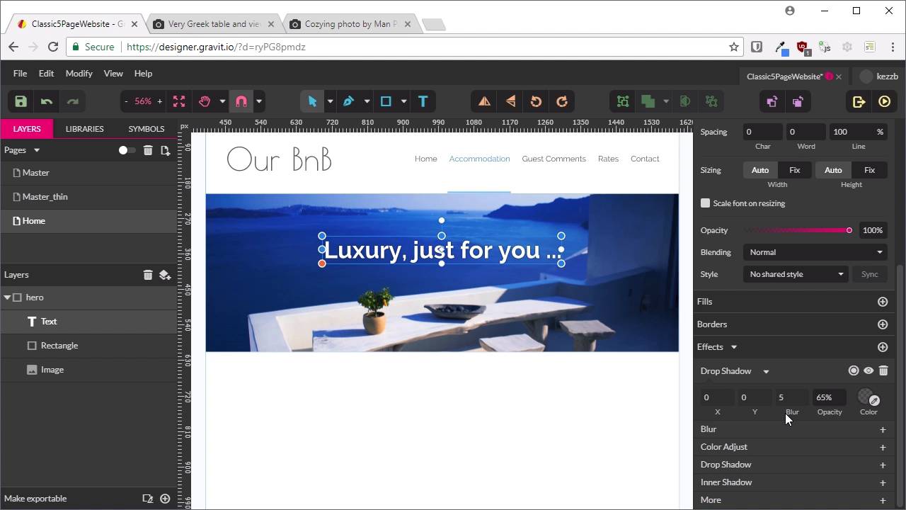
Welcome back to Build a Classic Five Page Web Site. So far, we have created the master layout for our web site, so that's everything that's gonna appear on every single one of our five pages, all the common elements. We've done that in both the, just show this, the widest possible layout and the thinnest possible layout. So now, we can start designing each of our five pages, and we're gonna start with the home page. Now, the cool thing about GrabIt is what we can do is take each of these master pages and we can bring all this content into a bunch of other pages without needing to recreate it. So I'll show you how that's done. First up, we're gonna make a new page by hitting this button here. And we're just gonna call this one Home. Now, all we have to do is go to this drop-down list here that says Master, and we choose one of the two pages that we've made so far. And it's just gonna bring in everything from those pages. So we're gonna choose just Master. And there we go, that's brought in everything. But none of this, you can't click on any of this, you can't select any of this. So it saves you accidentally messing anything up, and then you can just design your content right on top. It's super, super handy. What we're gonna do with this home page is we are gonna put a hero across the top. So we're gonna put a nice big image here to represent our BnB with a little tag line and a button to check on availability of rooms. And then, we're just gonna put a little bit of content here with a headline and some text and an image. So let's start with the hero unit here. First up, we're gonna create a rectangle that's gonna hold our hero unit. So grab the Rectangle Tool. Just gonna draw out a rectangle here. Now, just make sure that on the top edge, it just lines up with the header, that it's 1200 wide, so it's the same width as our overall site design. And we're gonna for 400 pixels in height. The background color here doesn't actually matter because we're gonna be filling up this space with an image. However, we will add in a border. So we're gonna go down, create a new border. One pixel again, and we're gonna use the same color we've been using a couple time so far, that is 7BBFFB. And one thing that we wanna do there is control where this outline is falling. You can see how this sort of falls in a funny spot here. If we hit this little button here, that's gonna allow us to determine where the border falls relative to the square itself. And we want to change this so that instead of the border aligning itself on the center of the edge, it just goes all the way around the outside. And it's still a little off, so we're just gonna move it up by one pixel. And there we go. Now, we have that looking right for our mockup. That has actually made that stick out a little bit over the edge there, sorry. So we're just going to trim two pixels off the outside of this to make up for that border going around the outside. So now, we're gonna rename the rectangle we just created to hero. And we gonna get an image put on inside here. And we're gonna go with this image from Unsplash. If you haven't used Unsplash before, it's a fantastic site full of images that you use freely in commercial and non-commercial projects. And all we're gonna do is just make life really easy and just right-click this image an copy it. And we're just gonna paste it straight onto our canvas. All right, so now, we can just hold Shift to constrain the proportions of this image, and just drag it down until it's the same width or just a little bit wider than our site. Now, we're gonna drag it inside this hero image, and just rearrange it, reposition it, until it looks like it's got some nice alignment. Now we're gonna want put some text over the top here, and right now, even though this image looks nice, it's not gonna quite give us enough contrast to make the text readable. So we're gonna put a little color overlay on top of this image. The way that we're gonna do that is by creating another rectangle. That we then nest inside inside our hero image. And we're going to create a color overlay with this. So if we look down on the fields here, if we click on this color circle, and then we look up here, we can see a linear gradient. So we're gonna switch to a linear gradient, and then we're gonna add in some new colors to this gradient. So we'll select this leftmost color, we're gonna change that to 022340. And then, on the other end, we're gonna change this color to 425D6F. Now, we want this lighter end down the bottom of the gradient, and this dark end up the top. And again, if I hold down Shift, I can constrain the angle to make sure that that's a straight gradient. That's the colors that we need. Now, we're gonna switch the blending mode from Normal to Overlay, and we'll set the Opacity here to 80%. Now, that gives us a nice darkening off of our image so that when we put some text in, we're gonna be able to read it. So if we turn that off and on, you can see the difference that it makes there. It just darkens everything but still keeps things nice and atmospheric. All right, so now, let's add in our tag line. Gonna add some text in here, and we're gonna say luxury comma just for you dot dot dot. Just click away. Drag this inside our hero unit, and that will allow us to align it. And we're gonna change the type up here. We're gonna go with a 60 pixel font size. And we're gonna change the white to bold. Re-center that. And now, to make that a bit easier to read again, we're gonna go down here to Effects, and we're gonna add a drop shadow. And this drop shadow is gonna be something we can translate into CSS, so we won't need some type of image-based text to do this. We're gonna change the x and the y position of the shadow both to 2. We'll have a blur of two pixels as well. We can have an 80% opacity. And the color for our shadow, so that it looks a bit more natural on that blue background, is gonna be a shade of blue, and it's gonna be 092666. So there we go. Now, you can see we've got a nice subtle shadow, just enough to make the text readable, but it still looks nice and natural in that area. Might just nudge that up a little bit. Again, this layout is something that's gonna sort itself out in CSS later, so just has to be rough putting down this design. Now, we're gonna create a button that's gonna be down here below the tagline that's gonna say Check Availability, that's gonna link through to the Contact Us page. So were gonna make a rectangle. We'll nest that down here again. We'll name that button. We want to keep 260 pixsels wide, 75 pixels high. And then, just center that. Nudge that down a little bit. And we're gonna round off its corners by 15 pixels. We're gonna give it a fill color. That's a lot of blue, so we're gonna say 3C99EC. We'll give it a border. This time, we're gonna have a 2 pixel border. And this border color is going to be 47B5FF. There we go. So that's the basic button shape. We're just gonna keep it very simple. Now, we're going to create some text inside this button. Just drag that in here and nest it. And we're gonna say Check Availability. And we'll just click off here so that we get access to all of these Alignment Tools. We want this text to be centered in both directions. I'm gonna change that so that it's bold white, and at a size of 24 pixels. And again, to make things readable, we're going to go down to Effects and Add a Drop Shadow. This one is going to have the values 1, 1, 1, 50%, and then the color is going to be 1F4897. All right, so there we go. That's our hero unit done. We'll just scroll out so we can see it all at once. All right, so that's looking pretty cool. Now, we can start mocking up how the page content is going to look. So we have down here a heading, some text, and an image. So we're gonna turn on our guides again with Ctrl+comma, and we're going to draw out a Text Box to help us align our heading. And then, we're gonna add the text Welcome comma enjoy your stay. And that's still just defaulting to white text, but we want this text to have a color, 595C5E. And now, let's switch this over to Poiret One. We want it to be centered. We're gonna go with the font size of 60, and that is all we need to do for our heading. We can just sort of nudge it up a little bit so that we get it roughly where we think it's gonna be on the page when we code it up. Now, we wanna bring in an image that's gonna go on the right side here. We're gonna use this one. The links for these images will be in the notes below this video. Once again, we'll do the same thing. Copy the image, and we're gonna paste it right in here. We're gonna resize that down. We wanna bring it down to about 445 pixels in width. So I'm just gonna hit this little button here to lock in the aspect ratio of this image. And just replace the width to be 445 pixels. And now, it's gonna drag this so that it aligns with our right guide. Now, we just need to put some text in on the left side here. So grab our text tool, once again. We're gonna draw out a Text Box. We want this to be the same size as the image that we've got. We want this to be left-aligned. I'm gonna set it to Raleway. And change this so that it's light, so we're gonna have some nice subtle text. And a font size of 18, make sure it's nice and readable. And now, to fill this placeholder text in, there's a function in Gravit that's really cool. What I can do is just type Lorem, L-O-R-E-M, and just hit space. And then it just adds a paragraph of placeholder text for us that's super handy. And can just copy and paste that a couple times so that it fills up all the space that we need. And you can see that this line height is fairly compressed. We're not gonna want to keep the line height that close in. So we're gonna change the line height up to 160%. And now, we'll just delete the excess. All right, so just like that, we have our Home page. And that's all we needed to do to get that Home page content mapped out. So we've got our hero unit, and we've set up our typography basics here. We know what our headings are gonna look like and what regular text is gonna look like, and we've got our layout for our Home page. In the same way that we had to make a thin version of our master layer, we're also gonna need to make a thin version of this layout so that we know how we're gonna handle things when there's not enough room to show this whole hero unit the way it is here. And so we know what we want to do when there's not enough width to show all of this content. So in the next lesson, we're gonna make a thin version of our Home page mockup. I'll see you there.


