

- Overview
- Transcript
2.5 Design the “Accommodation” Page
In this lesson we’ll start defining how normal content will look on all four sub-pages.
Related Links
1.Introduction
1.1Welcome to the Course00:43
2.The Design Phase
2.1Design the Master Layout19:04
2.2Master Layout: Thin Width08:59
2.3Design the Home Page12:54
2.4Home Page: Thin Width05:03
2.5Design the “Accommodation” Page05:31
2.6Design the “Rates” Page03:41
2.7Design the “Guest Comments” Page03:33
2.8Design the Contact Page04:59
2.9Export Images03:43
3.The Coding Phase
3.1Code Up the Master Layout24:37
3.2Code the Home Page16:05
3.3Code the “Accommodation” Page04:50
3.4Code the “Rates” Page02:33
3.5Code the “Guest Comments” Page04:28
3.6Code the Contact Page06:39
4.Conclusion
4.1Wrapping Up04:35
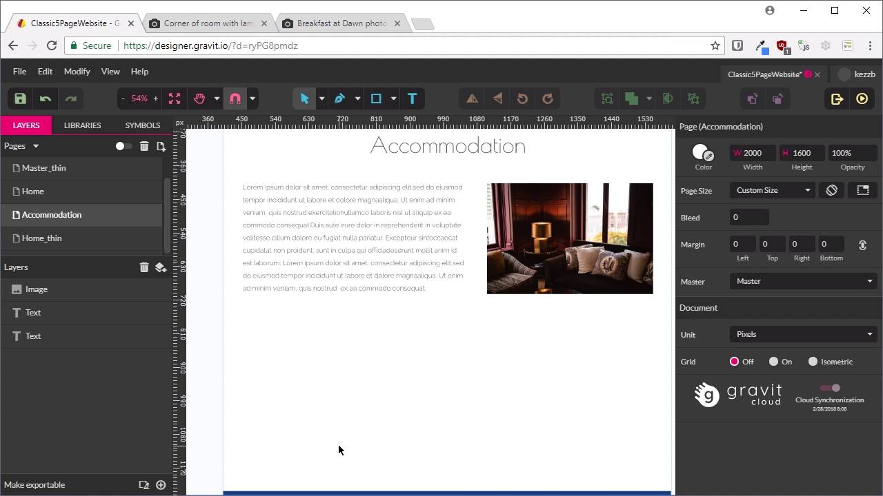
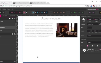
2.5 Design the “Accommodation” Page
Welcome back to Build a Classic Five-Page website. We've been going along pretty well so far. We have created our Master layout, a thin version, our Home page, and a thin version of the Home page. Now we're ready to create the second of our of our 5 pages, and that is the combination page. Now, with our Home page, we've already laid out how our headings are gonna look, how normal text is gonna look, and we've got a nice layout with this image. And what we wanna do is use this part of our content again in the Accommodation page. So the easiest way to make that happen in an efficient fashion, is we're gonna go back into multi-page mode. And we're gonna duplicate our home page. We'll select it, duplicate it, And now we're gonna rename this duplicate to accommodation. And we'll go back into single page mode. I'm gonna reselect the Master as our page layout. And now all we want is this part of the content, we don't need this hero unit, so we're just going to delete that. Now we'll select all these three things, and move them up, so they're appropriately positioned for page content. And like I've been saying, don't worry too much about this being perfect. We'll perfect all of this during the coding phase. This is just for a mock up. Just to get your concepts down. Now we'll change this heading so it reads, Accommodation. This text is just placeholder text, so it's perfectly fine how it is. We don't need to put in new text. We are gonna replace this image though and we are going to replace it with this image. So do the same thing again. We'll copy the image and we're gonna paste it in. We do want it to be the same width as this image, which was 445. So let's make sure our aspect ratio is locked. And then we're gonna change this so the width is 445. And then position it in the same place on this right hand side. Now we're gonna delete that image under here. And what we do want, though, is our text to not be higher than this image here. So we're just gonna bring that up by a line. We might just trim off some words off the end here. So that's all good, that's a pretty good start. Actually, I am just gonna move this up just a tad. Just get that looking a little bit more balanced. And now what I wanna do is put another image in on the left side. And on the right side, we're gonna have a bullet list. So we're gonna take this image. Once again, links to these images are in the notes below this video. We'll copy that and we'll paste it in. The width that we want for this one is 606 pixels. Which is gonna show our guide, so we put them before and we're gonna put this image over here on the left. So what we're trying to achieve here is having this block of text be the same width as this image. So we have got a nice grid system coming together here. So now you probably guessed it. We are going to have another set of text here, finishing up our grid and what we are going to do is put in a bullet list here. We are actually going to duplicate this text because it already has the topography that we need. So it's already got the right fonts and colours and sizes. Just gonna align it here, bring the left side in, align it with this image, and there we go. So that's what we want here and l am just gonna add in a bullet list. So this is just some example placeholder bullet list type of information that you might see on a bed and breakfast, just totally fabricated, made up. But it'll give us an idea of what this layout might look like in application. And that is all that we need to do. Just move this around a little bit so you can see it more clearly. And it's set straight forward, really not needing to put in a lot of time into this type of a simple bay. With a static website, you don't want to have too much complexity because we do need to come back and update it, that's gonna be a pain. And typically, the kind of client that wants a static website also doesn't want to have too much fuss on their site. They just want to get across the basics of their business in a simple way. Now, you might think that the next step is to do another themed version of this layout. But we actually don't need to, because when we created the inversion of our home layer, we've already decided what we wanna do with headings when this shrunk down. We've already decided what we wanna do with multiple columns when this shrunk down. So basically, the treatment that we've applied to this bit of text here, this bit of content rather, we're gonna do the same thing with this. So this heading will be shrunk in the same way, and these grid cells here will all be just stacked on top of each other in the same way that we've done in this layout here. So that is all that we need for the accommodation page. Next up, we're going to do the rate page, which is going to be almost identical to the accommodation page. So that's one's gonna be very quick. And I'll show you how to do that in the next lesson.


