

- Overview
- Transcript
3.2 Code the Home Page
Now it’s time to start coding in our content, starting with the Home page.
1.Introduction
1.1Welcome to the Course00:43
2.The Design Phase
2.1Design the Master Layout19:04
2.2Master Layout: Thin Width08:59
2.3Design the Home Page12:54
2.4Home Page: Thin Width05:03
2.5Design the “Accommodation” Page05:31
2.6Design the “Rates” Page03:41
2.7Design the “Guest Comments” Page03:33
2.8Design the Contact Page04:59
2.9Export Images03:43
3.The Coding Phase
3.1Code Up the Master Layout24:37
3.2Code the Home Page16:05
3.3Code the “Accommodation” Page04:50
3.4Code the “Rates” Page02:33
3.5Code the “Guest Comments” Page04:28
3.6Code the Contact Page06:39
4.Conclusion
4.1Wrapping Up04:35
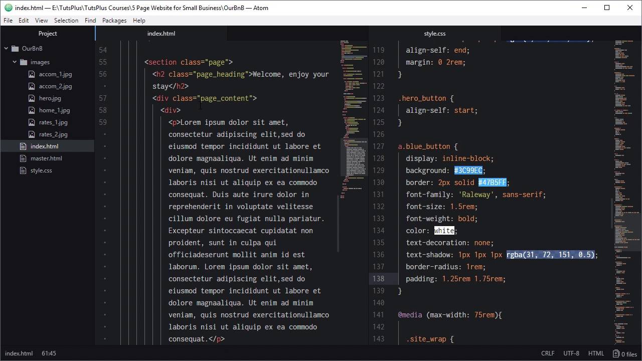
3.2 Code the Home Page
Hello and welcome back to build a classic five page website. In the last lesson we started the coding process, so we've created our master layout here. It is working both at its widest possible layout and also all the way down to the thinnest possible layout. So now that we've got that ready, we can go ahead and start creating each of our five pages. And the first one that we're gonna create will be the home page and we'll be putting it together based on the markup that we did in graphic designer. So we're gonna open up this project window here again and what we're gonna do is duplicate the master HTML file that we made. So we'll go ahead, right-click and duplicate that, and we're gonna call our duplicate index.html and this is gonna become our homepage. First, we just check to make sure we've got the right menu item as active, which we do. And the home page, so that's the one we want, close this down, we don't need it open right now. And now, we can start filling in content inside our main element here. The first thing that we're gonna do is code up that hero section that we just designed. So we'll do that by adding a section element with the class hero, actually just make some space for that. Section.hero tab, now what we're gonna do is we're just gonna add this image in directly, we're not gonna use it as a background image. And then this content, we're gonna add that into a div that will absolutely position over the top of our hero unit. So we'll add an image element, we'll set the source to images and then just double-check on the names. Here, I've given this image the name hero.jpg, you might have given it something else, so just put the name in that you've given that file here. I'm gonna fill in this alt attribute, say Ocean view from accommodation. Now to get the content into this section, we're gonna create a dev with the class hero content. So that's gonna be hero_content, inside that we're gonna need another two divs. The first one is gonna be hero_tagline, that's gonna hold the text that we added before and then we need another one, hero_button. And that is gonna hold the blue button that we created earlier, so our tagline, we'll just add that in, Luxury, just for you. And then, for our button we're gonna add a link, we're gonna make the link go through to the contact page, so contact.html. We'll be creating that page a little bit later, we'll give it a class that we can tag it, Make that class blue_button and then for the text, Check Availability, so now that's all the HTML we need, we're ready to start sewing that up. First thing we'll do is make sure that this image can't overflow the size of our hero container. So when we are shrinking down the overall width of the site, any excess on this image is just gonna be hidden. We'll do that by adding a hero class and setting overflow to hidden, now we know that we're going to want to absolutely position this hero content in here. That means that this parent needs to be relatively positioned, set the position to relative. Now what we're gonna do is apply CSS grid to this div that we have wrapping these two elements here. And that's gonna help us position the menu fairly the easy way, so I'm just gonna copy and paste in this whole class and then I'll explain it. All right, so here we're setting the position of this div to absolute, we're setting it to align to the top-left corner and to be full width and height. We are setting any text that's inside this container to center align, that will automatically center align our button and our tagline. Then we're setting the display to grid, this time using grid template rows. So rather than turning each of these child items into columns, they're turning into rows and each row is gonna be 50% height. And then there's gonna be a gap in between those rows of 3 RIM, now we'll style up this tagline. So here, we're just setting the font parameters that we set in our design and then we're also adding in the texture that we added in in. If you have a look at the drop shadow here, each of these numbers can be directly used inside a CSS text shadow. So here, we've just got the same numbers, 2, 2, 2%, and then the only difference is that we're expressing the colour as an RGBA colour. We jumped in here and I can see the RGB and A values here, so just copy those from here manually. But otherwise, these numbers are straight out of those fields and then just adding in the RGBA color. Here, I've said align self = end, and that means that this content is going to push itself down to the bottom of the grid row that we just created. The button, on the other hand, we want to align itself to the top of the grid row, so we do that with align self start and that's gonna apply to this div. And we also added a little spacing on the right and left side of the hero_tagline. So that when we crunch down the width of the side there's a little bit of spacing on either side of that tagline that is not flush with the edges. And now we're gonna style up this link and turn it into a button style, we'll do that with this, CSS. So here we're setting the display to inline block which lets it still behave like text but it gives us a little bit of extra control over layout. Most of this you should understand pretty much what it is, we're just setting up the background and border colors that we had in our design. We're setting up the font styling also for design, we're overwriting the underline that normally appears on a link. And certainly, there has to be no text decoration, so no underline. Once again we're carrying a cursor text shadow, we're curving the border radius, we're setting it to one rim. And adding a little bit of horizontal and vertical padding so there's gonna be some space around the inside of the button. Let's check out our results, right now this preview's still on the master HTML file. So we're just gonna get rid of that file name from the address and just go to the index page, there we go. So now we've got our hero unit all setup and our button is working just fine, everything is looking nice. We haven't added in the responsiveness yet for this but we would do that after we've finished adding in the main content, which we'll do now. So underneath the section that we just added, you're gonna need another section. We're gonna call this one Page, we're actually gonna reuse this class page on the other pages that we use as well. Now we're gonna need a heading, so let's add in an h2 element with the class page_heading. And a heading for this page is, Welcome, enjoy your stay, that's our heading. Now we're gonna need a div to control the content on the page, we're gonna add page_content. In here, we're going to have the paragraph of text and then the image on the home page. And then in our other pages we're also gonna have another row under that that's gonna have an image on the left side and then text on the right side. So I'm gonna use css grid again here to make it easy to organize that layout. For that reason, we're gonna need a child element that's gonna hold whatever text that we might put into the first grid cell. So we're just gonna add an empty dev to act as that child element and in here we'll be adding a paragraph of text and for that we're just gonna use a lorem ipsum. And then to the next child element we're gonna add in our image, we're gonna use the file home_1 and we'll set the alt to just Bedroom. So now we need to style up the page, page heading, and the page content class. For the page class, all we need is a little bit of spacing around the inside for our page heading. This is all pretty self-explanatory as well, we're just setting up our font styling here, we're making sure our font is centered. We're eliminating all of the default margins on this h2 element. We don't need any margin at the top of our heading because we've already applied padding on the inside of the page with our page class. We don't want some spacing below the heading though, so we've added a margin at the bottom of 4.5 rem. Now by the way, these numbers didn't come out of any type of formula. I put a little bit of time tweaking these numbers and coming up with this basing that seem to work well for the layout. So that's pretty much all you need to do is just play around with the numbers until you get a layout that looks right for you. Next up, we're going to style our page content class, this one here that's wrapping our different cells of text or images. So we're setting the default font size for our text in here and we're setting our line height to 1.6. You remember we were setting our line height in to 160% so that is the same thing, 1.6 is the same thing as 160% of the font size. Now we'll set it to display grid, so any child elements that turn into grid cells, we want the grid cells on the left to have an automatic width. We want the grid cells on the right to be 37% of the overall width that's available. So it'll allocate 37% to that right side and then whatever's left over will be allocated to the left side. And then we're adding a grid-gap in between all the cells of 3.125 rem, and then we've got a couple of extra bits of code to add for this. So this code here, what we're doing is looking for the first paragraph tag, so p first of type that is a child of the page content class. So this will target every one of these paragraph is first here, you might have multiple paragraphs in here. Like we will have in a page that we're gonna be making a little bit later. And then it sets the top margin of that paragraph to 0. So what that's gonna do is make sure that the top of the paragraph lines up perfectly with the top of the image that's in the cell on its opposite side. If you don't have that, then the default spacing that you get above a paragraph is going to push that text down so it is not quite lined up with the image. But, by only targeting the first paragraph, you make sure that the second and third paragraphs have their normal spacing in between. And then with this code, we're setting the maximum width of any images that are inside this page content class to 100%. So that makes sure that as we collapse down the size of our layout, the images that we're entering are also gonna shrink down. To go along with whatever amount of space they have in the grid cell that they're in. And now we're just adding a little light blue border around the image at the same time. So let's check out what we've got, looks like I've made a mistake there, I have just not included the images folder there, these things happen in coding all the time. There we go, that's all fixed up, now we've got our heading, all looking good, we've got our image over on the right side. Our text on the left side, styled just as we wanted it to be, you'll notice that it's lined up with the top of the image. So that is the full width version of the homepage all done. Now we just need to add some adjustments as we shrink this down because if we test out what happens now, you can see this ends up looking cramped at a smaller width. This is too big, this is off to the side, all of that needs to get fixed up, so we'll scroll down into the media inquiries, we're gonna need to add a couple of media inquiries. Now the approach that I like to take this, people have different ways of dealing with responsiveness. But what I like to do is just manually decrease the width of a page, and every time it breaks I add a breakpoint. So if I decrease it and now things are looking too cramped, then I pay attention to what width the viewport is at that point. I create a breakpoint at that point, I adjust the layout, the font sizing, whatever else needs to be fixed, then I keep shrinking it down until the next point that it breaks. I add a media query, adjust it and that way I can fill in all of the middle points between the widest point and the thinnest point. And I'm not trying to stick to a strict idea of, there has to be a breakpoint. At this exact width and another one at this exact width, I can just go with what the design needs. So for this layout, the first point that it broke at was a point at around 55 rem. That's when it started to be too narrow to fit both the text and image side by side, and they really need to be collapsed one under the other. That is done with this code here, so we're changing the grid template columns to be 100%. We're decreasing the grid gap size, and then we're adding this code in to center the image. So let's have a look at that, so we'll bring this out, we'll scroll down and take a look at this content here. So now as we shrink these down, there we go, that's the 55 rem point, and at that point we go from two columns to one column and we center the image. And at about the spot that this starts to get to be a bit too cramped, where this text here is too large. If we scroll down, we're also hitting a point where there's really too much spacing around the inside of this page. It's not really necessary anymore, and we're starting to see this heading look a little bit cramped as well. So we're gonna make another media query, this time at 45 rem, here, we are reducing the font size of the tagline and here, our unit, to make sure it fits easier. We're reducing the size of our page heading and also shrinking down the spacing, so we're reducing the size of the spacing around the inside of the page. And also the spacing in between the heading and the content below. Now when we get here we can see our font starts to shrink down, so then that stays looking comfortable for longer. And we see our heading shrink as well, so that's also looking comfortable. And if you pay attention to the amount of space around here and in here when we shrink down. You can see that that drops also and just makes things look a little bit more snug. So from here, now if we keep shrinking down, it's still getting cramped right at the bottom there. So we're just gonna add a little bit more code to shrink things down in the 22 rem media query that we already created, scroll down in here, I'm gonna add these adjustments. Now we're gonna use one of those VW based one siders that we talked about before, applied to the hero tagline. So that'll keep it looking right from this 22 rem breakpoint to anything smaller than that. We're doing the same thing with our button ticks and our page heading, and then we're just shrinking down the spacing. That's around the page and in between the heading and the content down to its smallest amount that we're gonna have in this design. All right, so now let's see what we've got when we shrink these down. There we go, now everything just smoothly shrinks down and stays a comfortable fit. Have a look at the rest of this content, so again, everything just smoothly shrinks down, so there's always enough room for that heading. Remember that generally speaking, you're not gonna get any smaller than 320 width. So that is all looking just fine, that is our homepage all done and fully responsive. In the next lesson, we are going to put together the accommodation page that we designed in the last section of the course. And just like we did with this page, we're gonna duplicate the homepage that we already created and adjust it to turn it into our accommodation page. So we're gonna do that in the next lesson, I'll see you there.


