
- Overview
- Transcript
3.1 Backgrounds and Textures
Lesson Notes * Create Your Own Sexy Background Patterns * Subtle Patterns
Transcript Hi guys, welcome back to 30 Days to Your First Website Design, a Tuts+ Premium course. I’m Ian Yates and today we’re going to jump into the site elements section of this series – we’re going to start off by looking at backgrounds and textures.
Before we open up Photoshop, let’s take a quick look at what we’re going to cover in this video:
- To kick things off, we’re going to ask ourselves what we mean by backgrounds and textures, and why we should pay attention to them.
- We’ll then quickly examine how to go about building your own tessellating patterns in Photoshop.
- And then we’ll kick off our design layout by grabbing some free pattern resources and building up our document.
- Lastly, as ever, there’ll be an assignment for you before we tackle the next video in the series.
Now, patterns and backgrounds fall under the whole theme and style category we discussed in an earlier video. They help a design gain character and define mood, hopefully, in the process, helping to make the design memorable, whilst not detracting from the main content.
Flat colors work fine of course, and we’ll discuss in a minute how hierarchy can be aided by blocks of contrasting color, but by using a subtle texture or pattern you’re giving your design a sense of being tactile. Textures can be luxurious, add dimension, and the user will likely find it easier to connect with what he or she is looking at.
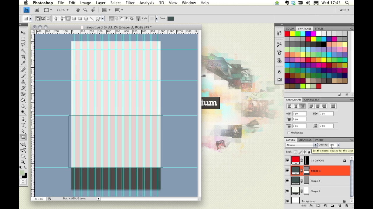
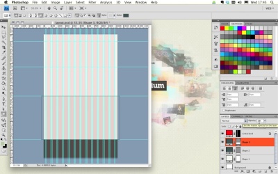
Your Layout Let’s examine our own layout. You’ll hopefully have taken on board all we’ve talked about regarding wireframes, grids, conventions, and the flow of information. Well, here’s a quick mockup of what I envisage our layout to be like. You can see we have a logo in the top left, then some persistent navigation top right. Underneath there’s a section with testimonials to draw attention to what our company does.
Underneath that there’s a small features section which we’ll use to introduce our team. Under those three columns we have a two column section, with contact information, a map and a contact form. Then, finally, we have the footer at the very bottom, with some copyright information and social links.
So we have a few quite distinct regions, and it’s important that we visually clarify which sections relate to each other, and which should be separate. We can use color for this; contrasting areas of background color, which will instantly divide up our layout.
We’ll be visually determining the hierarchy; highlighting the most important sections, and letting the less important regions dim slightly out of the spotlight. Let’s do that then; quickly, and using blocks of color.
Firstly, let’s choose a limited range of swatches on which we can base our design. Often this decision would be dictated by the existing brand colors of your client, but we’re in the luxurious position of being able to do that ourselves. We mentioned Adobe’s Kuler a while back, and you can access it via the browser or directly through Photoshop. I’ve browsed for “stylish,” which has brought up a number of palettes. I’m looking for a selection of subtly related shades, plus a highlight color which we can use for things like our Call to Action button.
Let’s now distinguish the header region, from the contact, and the footer regions. We’ll also frame the more important areas by duplicating the footer color in a small band at the top.
So we’ve done the brunt of the work, but we can soften up the aesthetics by using a pattern for our main background.
Making a Pattern How do we make a pattern?
Well, we begin with a small tile, and make sure that whatever we place on it, tessellates – the edges must meet left and right, and top and bottom. Once we’re happy with the results we can go Edit > Define Pattern. Now, when we return to our document, we can apply that pattern by entering the layer styles of our objects.
Patterns and textures can be as complex or as simple as you want to make them, but we’re going to make use of one of the many great free resources on the net: Subtle Patterns. You can browse a ton of patterns online, or just download the Photoshop patterns file and browse them in your application.
I’ve opted for “subtle freckles,” as it compliments my color scheme and lends a nice tactile surface to the main section of my layout.
[Live screencast demo portions available in transcript.]
Next Steps OK, it’s time for some further reading: There are a few tutorials on Webdesigntuts+ which cover building your own patterns, this one kicks off a series of several, to break you in gently. Create Your Own Sexy Background Patterns.
And before we jump into the next video, I have an assignment for you: I want you to make your own textured tile. Create it, save it, and use it in a mock up layout to see how it fares as a pattern.
Next time on 30 Days to Your First Website Design we’re going to take a look at navigation and buttons. I’m Ian Yates and from all of us at Tuts+ thanks for watching!


