
- Overview
- Transcript
3.3 Web Typography
Lesson Notes * FontSquirrel * LATO web font * Droid Serif web font * Choosing the Font: A Practical Guide to Typography on the Web.
Transcript Hi guys, welcome back to 30 Days to Your First Website Design, a Tuts+ Premium course. I’m Ian Yates and today we’re going to talk about web typography.
We’ll begin as always by taking a quick look at what we’re going to cover in this video:
- To start off we’ll look at the state of typography on the web at the moment, and why it’s so exciting for you as a designer.
- We’ll look at some examples.
- Then we’ll source some interesting fonts of our own to use in our design.
- Then, as ever, you’ll find yourself a little assignment.
We live in exciting times where web typography is concerned! For as long as the web can remember we’ve been almost entirely limited to using the fonts which our users have on their systems. Browsers have always needed to grab the users’ own fonts for displaying content. We couldn’t therefore get much more adventurous than using Arial, or Times New Roman, or Georgia – and if we did, the most reliable way was to use images.
As more browsers adopt CSS3 however, we’re able to use what’s called @font-face, and grab fonts from remote locations. The technology has actually been around a long time (in CSS2 for example), but only now are we starting to see browsers implementing it.
There are several services you can use to benefit from @font-face, some require you to host your font files on a web server, others (such as Google’s Web Font API, which we’ll be looking at) host the files for you, so all you have to do is point at them when it comes to building your web page.
It’s great news that we can get creative with font choices; we can use type to grab attention, to add style to a page, to create a unique look, but don’t forget what it’s there for in the first place: to be read. Don’t attack a page with all manner of elaborate fonts, only to neglect the basics; color and contrast, font size, line-height. Remember to keep your typography legible.
Let’s look now at some examples of effective typography on the web:
- ThriveSolo – understated and graceful
- Ryan Scherf – rich and intriguing
- JRVelasco – grungy, moody and impactful
- Galp.in – another rich and varied, experimental site. Visually very engaging.
- DesignInfluence – you don’t even have to go fancy – web typography is about selecting the right combination of fonts to achieve your communication aims.
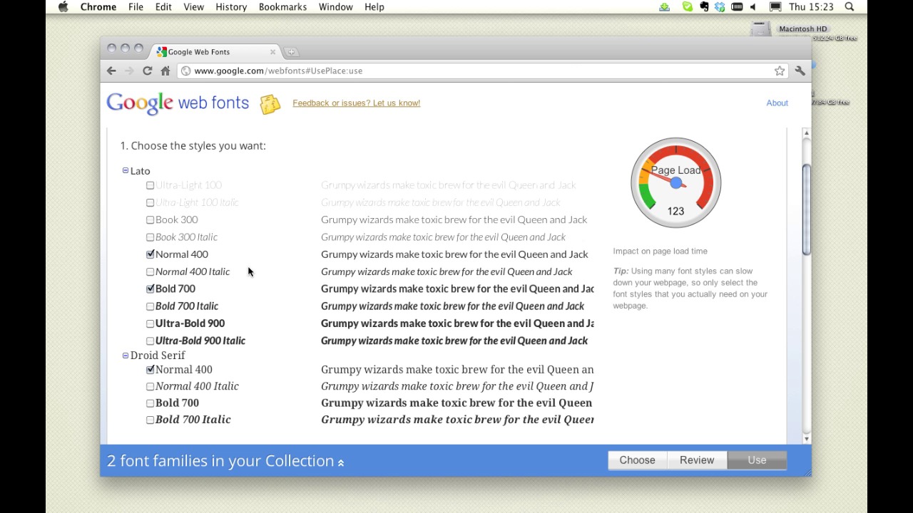
We’re going to use Google Web fonts to spice up our design, so let’s head on over there right now. Our body text is going to be displayed in standard Arial. It’s legible, it’s clean, and it’s familiar. But we’re looking for two things to add some relish: We could do with a striking, solid, but clean non-serif font for our testimonial, plus a decorative serif typeface for the occasional flourish. I’ve chosen LATO, for our testimonials – a slightly more refined non-serif than Arial. Then increasingly popular Droid Serif for our decorative bits and bobs.
Now, we can use them easily enough when it comes to building our HTML and CSS, but for now we need to grab them and put them on our own system in order to use them in our design. We can do that here at Google, or we can head over to another service, such as FontSquirrel, where we can grab the fonts for download. Select the font variants you want to use, then hit download.
Next Time OK, it’s time for some further reading: Choosing the Font: A Practical Guide to Typography on the Web. Now this article by Max talks about fonts on the web, where to use them and how to select them properly.
And before we jump into the next video, It’s assignment time again: As expected, I want you to go and grab the two typefaces we talked about: LATO and DROID SERIF, then experiment with adding a testimonial to the upper region of our layout PSD.
Next time on 30 Days to Your First Website Design we’re going to continue with the Site Elements stage and look at our features section. I’m Ian Yates and from all of us at Tuts+ thanks for watching!


