
- Overview
- Transcript
2.6 The Anatomy of a Webpage
Lesson Notes * Introducing the F Layout
Transcript Hi guys, welcome back to 30 Days to Your First Website Design, a Tuts+ Premium course. I’m Ian Yates and today we’re going to talk about the anatomy of a webpage.
We’ll begin as always by taking a quick look at what we’re going to cover in this video:
- We’re first going to examine the idea of conventions
- We’ll then open up Photoshop and take a look at what we’re accustomed to as the anatomy of a webpage
- We’ll then look at a few common examples
- And before we jump into the next video, I’m going to set you a small assignment.
So let’s just consider this idea of conventions. And no, I’m not talking about Star Trek conventions. What I mean by that is behavior and structure which we (as users) have come to expect over the course of time.
I’m not just referring to web design here, I’m including all graphic design. As I’ve mentioned, web design is the offspring of print design and has inherited a lot of its practices from its parent. We are, for example, accustomed to visiting a website, and seeing a logo, primary navigation, perhaps a heading of some kind, all at the top of the page. It’s logical we should do this – particularly in the West, where we read a written page from the top left, to the bottom right. It’s comfortable for us and it’s instinctive. Therefore it’s become common practice to place important elements (those at the top of the information hierarchy) at the top of the page.
Often, as we’ve mentioned in previous videos, the logo will be placed top left, the first thing our eyes meet when they enter the page. So that’s what conventions are, and their reasons for being, but how about the why?
Well, there’s nothing to say you have to lay out your page just like the majority of web pages. As someone clever once said (and I’ve no idea who): ”Rules are for fools to follow and to guide the wise.”
As I’ve said, there’s no right or wrong in web design, but there is reaction and opinion. By sticking to conventions, you’re removing some of the mystery from your page. The users will be familiar with what they’re looking at, and how they should deal with it.
As we’ve talked about before, users have a habit of scanning a page, rather than examining it. Familiar layouts take far less time to decrypt than alternatives. In following conventions you’ve removed another hurdle between them entering the site and completing whatever action it is you expect of them.
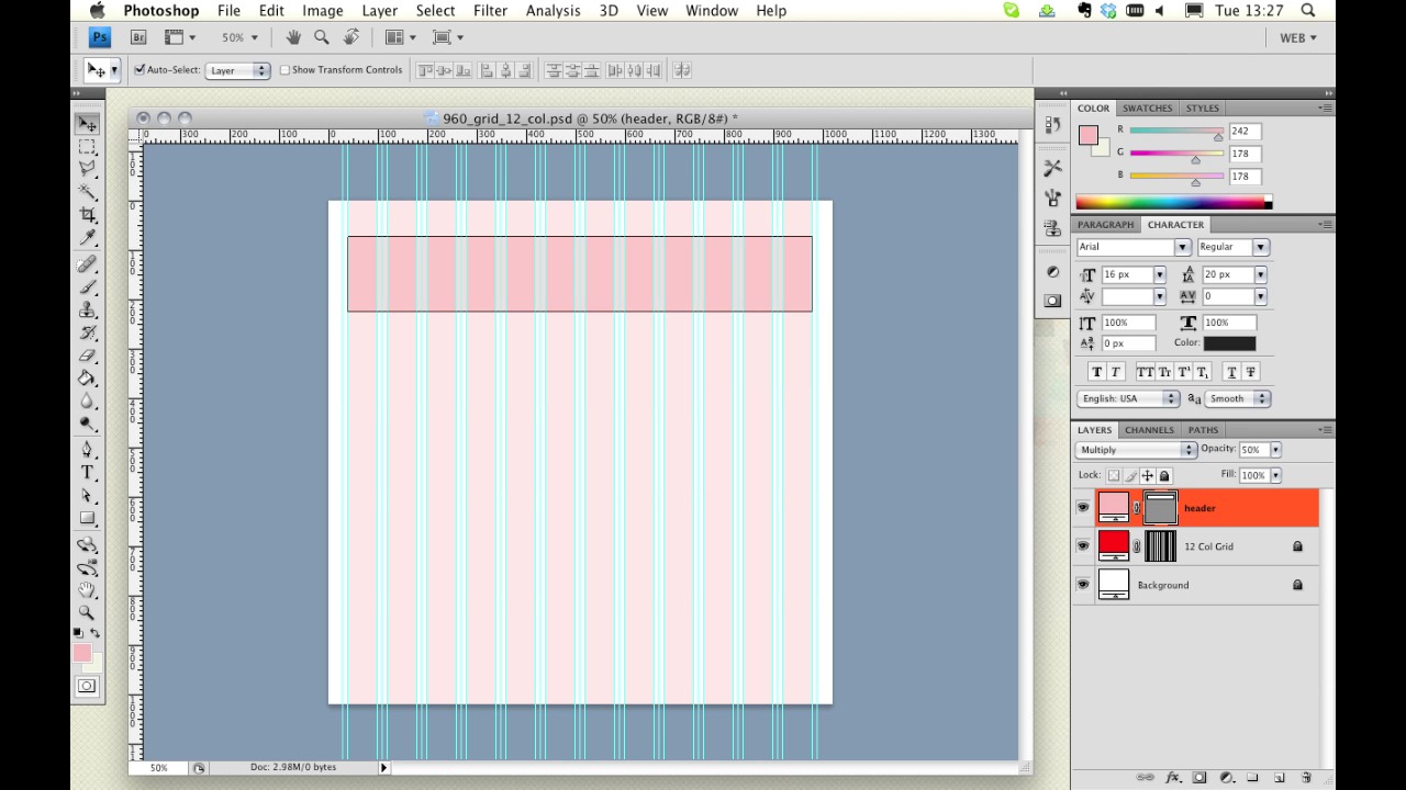
Let’s open up Photoshop and construct the typical anatomy of a web page. I’m going to open up a 960 grid template.
[Live screencast demo portions not available in transcript.]
As we looked at in our last video, and begin with..
- Header region
- Logo
- Persistent navigation (by persistent I mean that it’s present throughout the site)
- Possible search
- Content and features
- Sidebar
- Footer (which contains, copyright, secondary calls to action, useful links, contact information)
So there we have it – a typical web page anatomy.
Let’s take a look at a few examples.
- collisionlabs.com
- thecombine.org
- beta.bbc.co.uk
- epic.net
- evernote.com
- indubitablee.com
- 3dtron.com
- 6wunderkinder.com
Now what you’ll notice, as we browse through these various examples, is that, in spite of their varied styles, they all follow (firstly, a grid, as we discussed in our previous video) but also adhere more or less to the anatomy we’ve been talking about. Even if you’ve never seen some of these sites, they’ll feel oddly familiar to you.
Next Steps OK, it’s time for some further reading:
I’d like you to take a look at this Webdesigntuts+ article on the “F Layout.” It demonstrates, using heat-maps which highlight areas of attention, how a user’s eye typically scans certain layouts. It talks further about the Western convention of beginning top left on a web page and working downwards.
And before we jump into the next video, I have an assignment for you:
…Actually, there’s no assignment on this occasion, I’m going easy on you.
Next time on 30 Days to Your First Website Design we’re going to round off all this theory we’ve been covering by taking a look at whitespace. I’m Ian Yates and from all of us at Tuts+ thanks for watching!


