
- Overview
- Transcript
2.5 Designing with Grids
Lesson Notes * 960 grid system * Using the 960 Grid System as a Design Framework
Transcript Hi guys, welcome back to 30 Days to Your First Website Design, a Tuts+ Premium course. I’m Ian Yates and today we’re going to talk about Designing with Grids. We’ll begin as always by taking a quick look at what we’re going to cover in this video:
- What’s so great about grids? What are they, where did they come from?
- We’ll then look at the anatomy of a grid
- Before checking out the 960 grid system
- Lastly, we’ll touch upon Baseline grids
- Before I set you, as usual, a little assignment
Importance of Grids So, what are grids, and why do designers rave on about them so much?
Well, grid systems have been around for centuries and have been used as the basis for layouts since the earliest days of print. They form vertical and horizontal guides within which a layout can be composed. Designers rely on grids to lend structure to their layout. Grids bring order to chaos, AND they take a load of the decision making out of your hands which allows you to get stuck in to the creative aspects of designing. Newspaper layouts are clear examples of grid usage, but designs based on a grid don’t have to be always so obvious.
The anatomy of a grid is very straightforward. The proportions can alter hugely, depending on the framework, or your personal approach, but the composite elements remain the same:
- Margins form the space between the container and the content of the grid
- Columns are the vertically running bands within a grid
- Gutters are the spaces between them.
- Then we’re left with the Rows and Flowlines which run horizontally across the grid
So those are the bits and bobs which make up a grid. Adhering to these guides will help bring order to your design, which helps the flow of your layout, clarifies relationships between design elements, and strengthens the hierarchy (the level of importance) attached to individual components.
Improperly aligned objects might not sound like a big problem, but they can be subconsciously distracting for the user, making for a less pleasant User Experience. Then again, deliberately breaking the boundaries of a grid can bring instant attention to a detail.
Now, you can design a grid yourself – open your graphic application, be it Photoshop, Fireworks, Illustrator, whatever, then use the native grid, ruler and guide tools to build a grid on which to base your design.
Grid Frameworks Where web design is concerned however, it’s often easier to grab one of the many available grid frameworks. They more often than not come with a variety of graphic templates, backed up by CSS frameworks for making the transition to the browser straight-forward. Let’s have a look at the 960 grid system, on which we’re going to base our layout.
We’ll firstly visit the website, which contains a load of documentation, plus examples of sites built with the 960 grid. It also has a BIG OLD DOWNLOAD button – a great example of a call to action if ever I saw one. So, we’ll download that, and while that’s downloading I just have time to recount a funny story which happened to me at scout camp when I was younger – Oh, it’s finished, we’ll have to save that story for now.
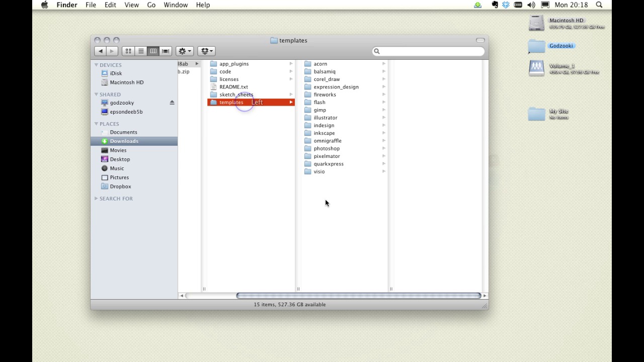
So, we’ll open it up, there it is uncompressed in my downloads folder and you can see it comprises a few different resources; the CSS frameworks I was talking about, plus some great pdfs for printing out and sketching on. However, we’re more interested in the templates for now, so let’s grab one of them – they’re available in 12, 16 and 24 column variants, so let’s open one up in Photoshop.
You can see, that with a combination of guides and the column shapes, we can build a clear grid-based structure. Getting rid of the grid is simply a question of ditching the guides and hiding the grid layer. So that’s 960.gs and we’ll be coming back to it when we design our site.
Designing to a Grid You may focus largely on the vertical layout of a design, but (certainly in terms of large bodies of text) a Baseline Grid, which runs horizontally, can be equally useful. Conforming to a Baseline Grid means regulating the line-height and vertical spacing of your text. Regardless of the font-size, the line-height of all elements must stick to the grid.
Now we have here an example which I mocked up earlier and which is available in the download files for this video. It comprises paragraphs and headings – various font sizes, but crucially they all share line heights and vertical spacing which fit to the grid, whether that be 20px or 40px. You can see where we have two columns adjacent to each other, that the text is all nicely aligned along the baseline. by the time all the text reaches the bottom of the page, it’s still perfectly aligned.
Big deal? You might say, but here’s an example of exactly the same text, exactly the same font sizes, but headings with slightly different line-heights. Suddenly that’s a bit irritating.
Next Steps OK, it’s time for some further reading:
Firstly, check out The Grid System, which has a ton of grid resources and references in one place.
Secondly, to go further into using the 960 grid system, have a look at this article on Webdesigntuts+ – it covers using the 960 grid system from a beginner’s perspective.
And before we jump into the next video, I have an assignment for you: You might be able to guess this one – I want you to download the 960 grid system, open up a template in your application of choice, and practice laying out columns of text and headers. That’s it.
OK, that’t it for now. Once again, you’ve been watching 30 Days to Your First Website Design. In our next video we’re going to take a look at The Anatomy of a Web Page. I’m Ian Yates and from all of us at Tuts+ thanks for watching!
1.Introduction
1.1Introduction02:44
1.2What is Web Design?06:01
1.3Usability06:07
1.4Content05:20
1.5Goals05:27
2.Planning
2.1Three Don'ts of Design Theory02:48
2.2Inspiration05:45
2.3Style and Theme06:05
2.4Conceptual Sketching11:12
2.5Designing with Grids09:01
2.6The Anatomy of a Webpage05:44
2.7Whitespace05:03
3.Design Concepts
3.1Backgrounds and Textures10:18
3.2Navigation08:31
3.3Web Typography09:12
3.4Features Section16:04
3.5Contact Form12:25
3.6Footer Section09:05
3.7Prepping Your Design05:23
4.Site Elements
4.1Sprite Sheets14:07
4.2Project Organization04:47
4.3Code Editors14:45
4.4Web Standards Model16:25
4.5Semantics14:36
5.Prepping Your Design
5.1Further into CSS12:49
5.2Browsers16:50
5.3Behavior: jQuery slideshow12:43
5.4Form Validation13:23
5.5Cross Browser Testing11:21
5.6Google Analytics07:25
6.Conclusion
6.1Conclusion00:48


