

- Overview
- Transcript
3.4 Photoshop Design: Homepage Header
Let's kick off the design process with the homepage header.
1.Introduction
1.1So, You Wanna Be a Web Designer?01:15
2.Web Design Fundamentals
2.1What is Web Design?04:03
2.2A Brief History of the World Wide Web03:32
2.3What is HTML?14:10
2.4What is CSS?14:17
2.5Tools of the Trade06:30
3.The Design Stage
3.1Always Plan Ahead04:23
3.2Create Some Sketches10:42
3.3Introduction to Photoshop09:30
3.4Photoshop Design: Homepage Header12:01
3.5Photoshop Design: Portfolio Area (Part 1)11:04
3.6Photoshop Design: Portfolio Area (Part 2)07:21
3.7Photoshop Design: The Portfolio and About Pages07:45
3.8Slicing the Images05:09
4.The HTML Stage
4.1HTML: Homepage (Part 1)08:11
4.2HTML: Homepage (Part 2), Portfolio and About Page09:46
5.The CSS Stage
5.1CSS: Reset CSS and Typography Rules12:41
5.2CSS: General Positioning09:01
5.3CSS: Page Headers10:20
5.4CSS: Final Touches10:34
6.Conclusion
6.1What You've Learned01:30
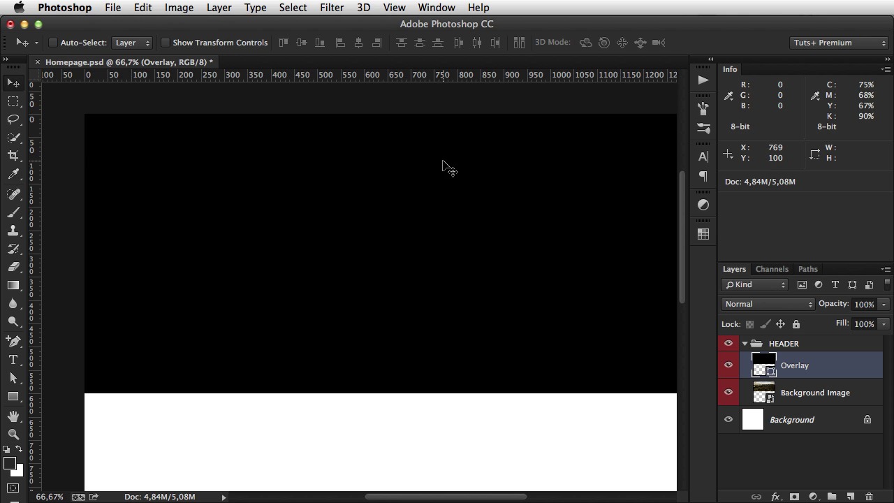
3.4 Photoshop Design: Homepage Header
Welcome back. Based on the wire frames I created in lesson seven, and the quick intro I gave you on Photoshop, it's time to get busy and start designing. And this lesson it's all about the homepage. Now go to Photoshop, hit File>New 1300 by 1300 pixels and 72 DPI, on name simply say homepage and hit OK. Now we're just going to zoom in here a little bit, you can do this by using the Command plus, to zoom in and minus to zoom out. So, the first thing I do when I start a design project is figure out the color scheme. And I'm using the Photoshop swatches panel. If you don't have it, you can go to Windows>Swatches. Now this gives you a way to save, or create a color pallet for for your project. So, if you're just opening up the swatches panel and have all of these colors here, you can simply click and drag each one to, to this bin icon to delete them, or you can hold Alt and then left click on each icon to delete it. This way you get a clean slate and you can start adding your own Swatches. Now, adding Swatches is really simple. You go to this foreground color selector, you click it once, and then you start typing the actual colors. So the first one is the text color, and I'm gonna keep this dark gray. And I'm gonna hit Add To Swatches. And it's gonna give me a dialog where I'll say Text color, OK. Next one, is gonna be a color for a dark background. And I'm talking about this dark background here on the footer. So, let's create that. And that's gonna be 333538. Add to Swatches again. Call it Dark BG. Next, we need the color for the links, or the buttons. So, that's gonna be the first color is F2E5D, and that's kind of a bright yellowish color. Add to Swatches, Color 1. Next, we need a secondary color, maybe for using it on normal links, for example. That's gonna be F46151. Add to Swatches, Color 2. And finally, we need the color for. A lighter text. And that's going to be 5C5D60. Add to swatches, light text, hit OK. And hit OK. Now i'm going to select. This text color as a, as my foreground color. So any text or any shape that I'm gonna draw, will have this color. So I'm just gonna hide this for now, and go back to the wire frame. Now the first thing I gotta do is this header which is a common element for all pages. And this,. This banner with a project name and button. And of course we have an image in the background. And what i'm going to do here is actually combine these two. I'm going to make the header transparent so it overlaps with this background photo. So let's get started. Now I have a few photos here that i'm going to use. I'm going to use this one. As the main background image. All right, so, let's drag this into Photoshop. Let's resize it until it's 1300 in width. And then what we're gonna do is make this image 600 pixels in height. Now, 600 pixels in height would mean- [BLANK_AUDIO] About this much, and that's all I gotta do really. The rest of the image is hidden because it's off canvas. So now I can go ahead and group. Create a group with this layer by hitting Cmd+G. And we're gonna name this header, and right click on it. And you can't actually see it here, because it's a very low resolution. But right at the bottom of this pop up window, there are a few colors. So I'm gonna click Red, and that will color the group and all of its content. That way you get a much better organized PDF file. And the next thing I have to do is. Darken this image a bit more. Because if I leave it like this and start adding text on top of it there isn't enough contrast. So what you can do is, grab the rectangle tool. Click once in the canvas and make a rectangle that's 1300 by 600 which is the exact, size. Let me just close this. Which is the exact size of our image. So position this on top of the image. I'm gonna call this Overlay. And I'm gonna double-click it, make it black, and start lowering the opacity. And to do that, you can either double-click here and enter a value manually. Or, you can drag, click and drag the slider here. And you can see the changes in in real time. Me, I'm just gonna leave it at about 70%. That looks pretty good. Also a cool way to change the opacity is. By hitting a number from one to ten. So for example if I want 10% opacity, i'm going to hit one. 20% is 2,3,4,5,6,7 and so on. If you type them really close to one another. For example, 2 3. It's gonna be 23%. But if I type 2 and then 3, it changes to their, their respective values. Now this is the overlay. I'm gonna create a new group here, called logo. Let's just gonna be a simple text with my name, I'm gonna fill it with white and you can do this by selecting the text tool and then going to this icon here, which opens the color picker. Now this text, I'm gonna use a font called Georgia Bold. This is a standard font, and I don't wanna get into custom fonts right now since that's a bit more advanced. So I'm just gonna make this. Upper case, there is an auto panel for this, the character panel which I recommend you have it open all of the time. So you just hit this, this icon all caps and it transforms the text, it makes it upper case. Now i'm going to change the font size, again with the text tool selected, simply select the text, and you can choose the new font size from this drop down here. I think I'll go with 24 pixels. Okay. And I'm just gonna align it from the top. And then holding Shift and dragging, I'm gonna drag it until I reach about 48 pixels. Pretty much all websites that you see now days, have their content centered. On the page they're not left aligned. They are not right aligned. They are aligned in the center. So, we gotta do the same for our website. For that, we're gonna use guides. Now guides, you simply click on the ruler that you have on the left and on the top. And if you don't have it, you go to view, rulers and click and drag until you get this line here. So what i'm going to do is, create a rectangle which is 1,200 pixels in width. I'm just gonna move this right here, so it doesn't bother us again. And I'm gonna hit command A to select the entire canvas and then I'm gonna choose this line horizontal centers and that will effectively align this rectangle I just drew on the page. Now I just have to click on these handles, and position them at each end. So now I can delete this and I have a very nice guide on either side, and I can base my design on that guide. So I'm gonna zoom in and nudge this into place. And that is the logo. Now, the menu, the menu is gonna be on the right side, and it's gonna say Home, Portfolio, and About. I'm gonna use a different font here. It's gonna be Helvetica. Maybe Helvetica New. It's gonna be bold. We're gonna make it about 14 pixels. That sounds about right. And we're gonna make it aligned to the right. Okay. Zoom in a bit. And I'm gonna move it, in such a way that, its aligned with the logo. Notice that pink line, that crosses their vertical centers. That means its positioned correctly. Okay. Now the last thing I gotta do for the header is draw a simple line. So grab the line tool. And draw from end to end, from guide to guide. Move it up, until it snaps with the bottom of the logo. And then move it down 48 pixels. So now, this logo. Is right in the middle of the section. All right now, on the shape, we're going to call it HR which stands for horizontal rule. We're going to make it white and lower it's opacity to about 10%. And let's see the result so far. All right so that is the header of the page. That's the common elements. In the next lesson, I'll move on and create the rest of the elements on the homepage.


