

- Overview
- Transcript
3.6 Photoshop Design: Portfolio Area (Part 2)
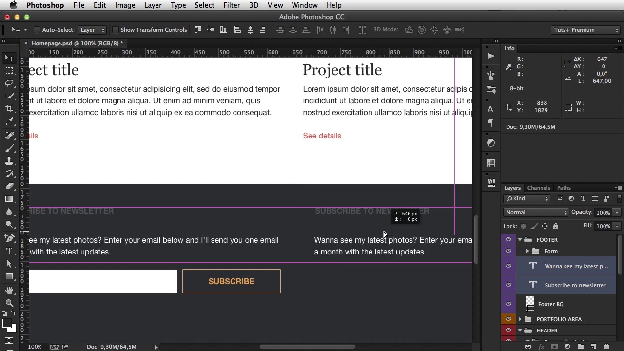
In this lesson, we’ll design the footer, which is a common element for all pages.
Related Links
1.Introduction
1.1So, You Wanna Be a Web Designer?01:15
2.Web Design Fundamentals
2.1What is Web Design?04:03
2.2A Brief History of the World Wide Web03:32
2.3What is HTML?14:10
2.4What is CSS?14:17
2.5Tools of the Trade06:30
3.The Design Stage
3.1Always Plan Ahead04:23
3.2Create Some Sketches10:42
3.3Introduction to Photoshop09:30
3.4Photoshop Design: Homepage Header12:01
3.5Photoshop Design: Portfolio Area (Part 1)11:04
3.6Photoshop Design: Portfolio Area (Part 2)07:21
3.7Photoshop Design: The Portfolio and About Pages07:45
3.8Slicing the Images05:09
4.The HTML Stage
4.1HTML: Homepage (Part 1)08:11
4.2HTML: Homepage (Part 2), Portfolio and About Page09:46
5.The CSS Stage
5.1CSS: Reset CSS and Typography Rules12:41
5.2CSS: General Positioning09:01
5.3CSS: Page Headers10:20
5.4CSS: Final Touches10:34
6.Conclusion
6.1What You've Learned01:30
3.6 Photoshop Design: Portfolio Area (Part 2)
Welcome back. In the previous lesson I did the portfolio area in the homepage. Now it's time to finish this homepage with the second common element, which is the footer. So the footer, if we take a look at the wire frame, has this dark background and two columns, one for newsletter subscription and the other for contact information. So, create a new group here called Footer. For a footer I always use the violet color, grab the rectangle tool. Where is it? There it is. 1300 by I don't know about 500. Align this on the center. Make sure you properly distance it from the content above. 96 pixels. Call it Footer BG. And for color, select this one, dark BG. Now inside. Well, I'm gonna have some text. So the first one is gonna say, subscribe to newsletter. It's gonna be Helvetica New, 16 pixels. The font color, the text color is gonna be light text. I'm gonna make it bold and uppercase. I'm gonna bring it down 48 pixels. Now, the text, 576 pixels in width. Okay, now the text color is gonna be white. And it's gonna be regular 16 pixels, and of course lowercase 48 pixels from the top. Now, what else? We have an input and a button. So for the input, grab the rectangle tool again, and draw one that's 48 pixels in height and about 230 in width. Make it white. Call this Input BG, and next to it, I'm gonna grab this button. So BTN details. I'm gonna select it from from the Layers panel. And by holding Alt and clicking, I'm gonna duplicate it in my footer. [BLANK_AUDIO] Now I just gotta move it down. [BLANK_AUDIO] And nudge it to the right about 12 pixels. And here it's gonna say subscribe. Alrighty. Now, this BTN details, we're actually gonna call it BTN Subscribe, coupled with the Input BG. I'm gonna group these and call it Four. And since we have quite a bit of room here to work with. [BLANK_AUDIO] Why don't we move this button all the way to the right? Like that. And make this a bit bigger. So select the layer, Command+T to enter transform mode. And then just drag these handles. Something like that. Okay, finally I'm gonna duplicate these two. And one of them is gonna say get in touch, and we're gonna have Address line 1 followed by Address line 2, followed by an email address. For example, john@company.com [BLANK_AUDIO] Which is actually a link so, I'm gonna use that color. [BLANK_AUDIO] All right, and then we have two icons for Twitter and Facebook. So for the icons, I'm gonna use some custom shapes in Photoshop, and you can find a link to these shapes in the in the lesson notes. So, select Custom Shape Tools, scroll all the way down until you find the Twitter icons, and make one that's about 24 pixels. Okay. For color, I'm gonna choose the yellow color right here. About 48 pixels from the top. And then do the Facebook icon. You can't see it, it's all the way down here. Let me just see if I can resize this. There we go. So Facebook. There it is. 24 pixels again. [BLANK_AUDIO] Okay, something like that. Now, I just wanna point something out. Notice that I"m working kind of fast here, and not really paying attention to all the minor details. That's because most of the margins and paddings and stuff like that are going to be made in CSS. You're much more precise in CSS. So it's, there's no point in spending a bunch of time aligning everything perfectly in the PSD when you're just gonna do that in CSS later on. Now I'm gonna resize this to 312 pixels in height. Now the last thing you gotta do here is the copyright information. That you have here on the bottom. So, copyright information. For text color I'm gonna choose this dark text color. Align it in the center. [BLANK_AUDIO] 48 pixels from the top. [BLANK_AUDIO] And you're done. That's all there is to it. That's the homepage design, the entire thing. So just a quick recap. We have the top part with the main banner and the header with logo and menu. Then there's the portfolio area. And then there's the footer with the two columns and the copyright information. Now in the next lesson, I'm gonna do the other two pages. The portfolio, single page, and the About page, so I'll see you there.


