

- Overview
- Transcript
3.5 Photoshop Design: Portfolio Area (Part 1)
In this lesson, we’ll design the portfolio area from the homepage.
1.Introduction
1.1So, You Wanna Be a Web Designer?01:15
2.Web Design Fundamentals
2.1What is Web Design?04:03
2.2A Brief History of the World Wide Web03:32
2.3What is HTML?14:10
2.4What is CSS?14:17
2.5Tools of the Trade06:30
3.The Design Stage
3.1Always Plan Ahead04:23
3.2Create Some Sketches10:42
3.3Introduction to Photoshop09:30
3.4Photoshop Design: Homepage Header12:01
3.5Photoshop Design: Portfolio Area (Part 1)11:04
3.6Photoshop Design: Portfolio Area (Part 2)07:21
3.7Photoshop Design: The Portfolio and About Pages07:45
3.8Slicing the Images05:09
4.The HTML Stage
4.1HTML: Homepage (Part 1)08:11
4.2HTML: Homepage (Part 2), Portfolio and About Page09:46
5.The CSS Stage
5.1CSS: Reset CSS and Typography Rules12:41
5.2CSS: General Positioning09:01
5.3CSS: Page Headers10:20
5.4CSS: Final Touches10:34
6.Conclusion
6.1What You've Learned01:30
3.5 Photoshop Design: Portfolio Area (Part 1)
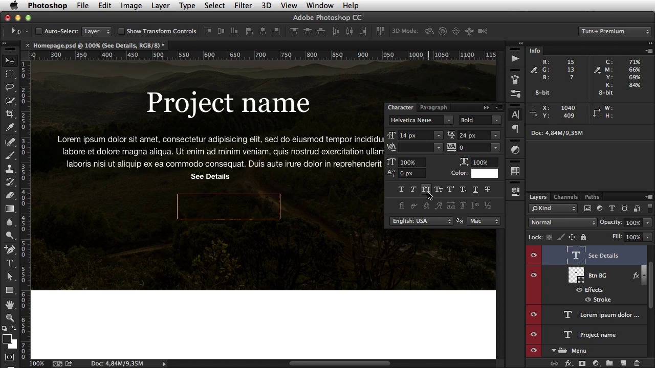
Welcome back. In the previous lesson, I started designing the homepage and I finished the header. So looking back at the wireframe we made. We can see that we need to add the project name, description, and a button for additional details. And we'll add that on top of the on top of the header image. So inside, we're going to create a new group called Banner Contents. And I'm going to start with the main heading. Which is project name. And then, I'm align this to the center. Gonna make it a lot bigger, around 50 pixels, something like this. And irregular instead of bold. And also, I don't need it to be uppercase, so I'm just gonna remove that. And increase the font size a bit more, align it in the center, move it up. And then move it down by 48 plus 48 which is 96 pixels. Now why did I choose 96 pixels? Well, to explain it, I'd have to explain some more advanced stuff. But for your information, it's about the baseline you're using. Let me give you an example. You start always with the base font size. Your text default font size. And in our case that is 16 pixels. Now in a paragraph that has a 16 pixel font size, the line height. Yeah, so each line of text will have 1.5 times that value. So 1.5 times 16 is 24. Now, this 24 is what I call a baseline. It's a number which you can use to, which you can multiply and use it to set distances, to set margins, paddings, and so on. So that's what I did here. The distance from up, from the top of the page to the logo is 48 pixels. So that value times two. Same as this, and when it comes to this, it's the baseline times 4, 96 pixels. So I hope that makes sense. okay. So project name, I'm gonna grab the text tool. I'm gonna click and drag a text like this and I'm gonna paste some some Lorum Ipsum. Go to Type > Paste Lorum Ipsum. For text I'm going to use Helvetica New. Font size is going to be 16 pixels. The leading or the line height is what I was talking about earlier so set that 24 pixels. Okay, and that basically does it. [BLANK_AUDIO] HIde some of this text cuz you don't need that much in there. Maybe a bit more. And now, click and drag. And position this at about 48 pixels from the main title. Okay. Next up is the button that that you see here, See Details. So for the button, I'm gonna create a new group called Btn Details, and I'm gonna select the Rectangle Tool. And I'm going to draw a rectangle that's about 48 pixels in height and about 200 in width. So, something like that. I'm going to rename this layer to Btn BG. So the button background. Align it on the center. Move it up. And then, down 48 pixels. Just like that. And now, I'm gonna create a border for this button. So I'm gonna go here and double-click the layer, and it brings me the Layer Style Pad. Now, I'm gonna go to Stroke, Stroke stands for border basically. One pixel size position outside and for color, we are going to choose this color one. So hit this and then hit that and OK. Great. Now I'm gonna go here on the Fill field and drag this all the way down. And this gets, gets rid of the, of the layers fill. It only leaves it's border. So inside, i'm simply going to say see details. And I'll just the exact same font that I used for the menu, which is Helvetica Bold 14 pixels. So Helvetica Bold, 14 pixels. And of course, make it upper case. And actually I'm just gonna bump up the font size a bit here to 16 pixels. As for the text color. I'm going to choose the same color as the button. Select these two, align them on the center, Save, and our banner is now complete. Okay, next up is. This this area here, which has four different projects. So, let's take care of that. I'm gonna close this header group, and create a new one, called Contents, or actually let's call it portfolio area, since it makes more sense. Give it a color, orange for example. And for this, the idea is to have an image first and then a title, description and a link. Now, these images should have about half the width of a page. The width of the area that we're working with is 1,200 pixels. But I also want a gap between those two columns. So I would have an image going something like this. And then, the other image something like this. So, that gap will be again, a multiple of our baseline, 24 pixels. So, with some simple math, we're going to have 1200 minus 48 pixels. So this is the space that we get to work with divided by 2. And that gives us the column width, which is 576 pixels. With that in mind, I'm going to grab an image, for example this one. And I'm going to bring it to Photoshop and from this image I'll extract only the size that I need. And I'm going to press C for the crop tool. And notice I have 576 by 250 pixels for width and height. So now by clicking again, I can select which portion of the image I'm gonna use. So I'm gonna hit OK when I am done. I'm gonna hit Ctrl+A or Cmd+A. And then Cmd+C to copy the image and Cmd+V to paste it. I'm gonna place it there and then from the banner I'm gonna do 96 pixels. Okay? I'm gonna call this Portfolio Item Image. Group this layer. Create Portfolio Item. And then add some text, a heading for starters. It's gonna say Project Title. Grab the swatches here. I'm gonna use the text color. And I'm gonna use Georgia as the font family. Regular. About 24 pixels. Okay, align it on the left, and no upper case. And maybe a bit more, maybe 32 pixels in the, in font size. Again, move it 48 pixels from the image and now I'm simply going to copy this text right here. You can do that by selecting the layer and then holding Alt and left clicking. And that's gonna duplicate the text box. Okay. For text I'm gonna select the text color, align it on the left, move it there. Make it a bit smaller, 24 pixels. From the top and at the very end, we'll add a link for for the details. See details, select it. Use Color 2. Hit OK. Oops. I actually, I moved it in the wrong group. So simply drag it up here. All right. So that's one of the portfolio items. Now I can simply duplicate it. [BLANK_AUDIO] Like that. And if I make the canvas bigger. I can duplicate these as well. Making sure I leave plenty of room above them. So 48 pixels. Okay. And that is the portfolio section. Now. Of course when I get to the HTML part, I'm gonna add different images here. But for now, these will do just fine. In the next lesson, I'll take care of the footer.


