

- Overview
- Transcript
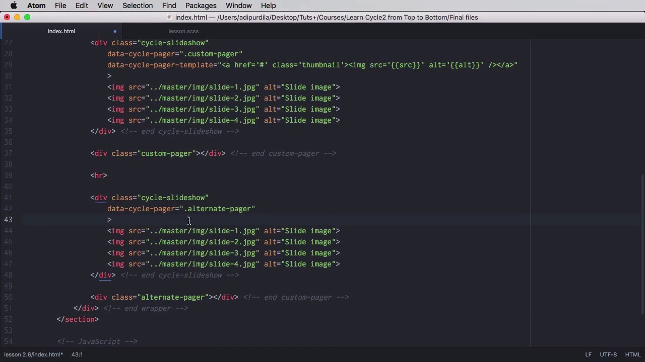
2.6 Using Pagers
Pagers are controls which allow you to skip to a specific slide. They can be anything you want: images, text, or even icons. So let’s see how you might use them.
1.Introduction
1.1Welcome00:34
1.2Why Cycle2?02:22
1.3Plugin Installation and License01:30
1.4A Basic Example03:19
1.5Settings Options04:42
2.Basic Usage
2.1Captions04:58
2.2Using Navigation Controls04:42
2.3Slideshow Effects and Options04:36
2.4Continuous Slideshow03:49
2.5Using Overlays04:32
2.6Using Pagers08:34
2.7Using Non-Image Slides03:34
3.Advanced Usage
3.1Auto-Height06:27
3.2Image Loader05:19
3.3Progressive Loading08:54
4.Optional Plugins
4.1Carousel09:04
4.2Flip and Shuffle05:53
4.3ScrollVert and Tile03:29
4.4Caption2 and Center05:55
4.5Swipe02:12
4.6YouTube05:22
5.The API
5.1Options09:45
5.2Commands07:15
5.3Events04:09
5.4Cycle States and Hash04:51
5.5Template Customization02:27
6.Conclusion
6.1Final Words00:42
2.6 Using Pagers
Pagers are controls that allow you to quickly navigate to specific slides, and that can be anything you want, images, icons, even text. So let's find out how you can create pagers. The most basic example is to use IDEF, or a class of cycle pager inside the slide show, right? So the cycle pager and also look. So right now you can see four little bullets. That's what the plugin generates by default, right? So we have the do of that we've just created with spans inside. It. And the currently active spam has the class of cycle page are active. Now of course, if we click on one of these we'll be taken to the corresponding slide. So, let's go ahead and style this a little bit. So, we've positioned us absolutely at the bottom of the slide show set the usual Z index align everything in the center. Set the width to one hundred percent and then we're targeting each span each bullet each page or number if you want. Set a color, set the size because they are bullets sold or text. Basically you set the font size, some margin and some hover and the active class. So now they look something like this, right. So hover, click. And that's how they work. Now you can also create a custom pager. For that, let's go ahead and duplicate our slideshow, add a separator there. Okay, well, we're gonna remove this one, and we're gonna position it outside. Yeah, outside our slideshow element, and we're gonna call this custom pager. Now, we'll go in here. and we're going to say that a psycho pager custom pager right. And this will actually create the same pager but in a different location. we can also specify a pager template. So instead of those bullets, we can put our own code. So we're going to say data.cycle page or template. Let's put for example, anchor tags with images, for this, right? Because the code that we we're going to put here is the code for each page or item, right? Each one of those spans. So we can do something like a href. Let's give a class of thumbnail so we can style it properly and then put an img src. Now of course we need to use different kind of quotes here. I will do src like this and here as well. Like that and here is well, alt. We can actually use the alt of the image. And let's have a look. These images will serve as pagers for the slide show. So if I click on this one. Let's wait for it to change. It takes us to that slide. Now let's do a bit of styling to this custom pager now. So what do we do? We aligned everything in the center. We set a margin top so we give it a bit of distance from the actual slide show. And we made the images in the thumbnail smaller. So now it looks something like this. Something else you can do is to use a different template for each slide. So for example, let's duplicate this instead of custom pager, let's do alternative pager. Just the natural class there. We'll remove this bit and instead we're gonna place the template on the slides themselves. Right? So we can do something like data. Cycle-pager-template and we can do anchor tag, and we can say whatever we want, i'm gonna say trees, and i just filled in the rest. So now, our alternate slider looks like this. Now if you want you can also use other elements as the page or elements in other words you can create an external page or so it goes something like this. Lets say for example that you would duplicate this but you also cycle slide show. You would set the pager or to for example my-pager and I were gonna create that element in just a little bit. You would set the data-cycle, this is important pager-template to none and optionally data-cycle-pager-fx. We'll set it to scroll horizontally. Now pager-fx means that this effect will only be used when we use the pager to switch slides. Okay, so here we have the slides. We don't need these attributes now. And the div with the idea of my pager will actually look very similar to this one. We'll give it an ID. "my-pager", the class, Is gonna be "cycle- pager", again this is important, and external. We don't need these options. So now the only thing that's left to do is simply, Do a quick Specification here my-pager img and then I'm just gonna comment this really quick because there are some styles here that we don't want to inherit. So now our pager looks something like this, right, and it works. So this is how you can use different markup as your pager. And you would do this instead of declaring a template like we did here. Now before we wrap up. I want to quickly mention two options here for the pager and I'm going to show them right here on this initial slide show. The first option is called pager event. So you would do data cycle page or event. By default this is set to click, that means use the pager when you click on each one of those little round items. But it can also specify something else for example mouse over. So right now instead let's redo these. Instead of clicking on each bullet point here you'll simply hover your mouse, and the pager event will be triggered all right and the other option. I wanna show your little quick is called pager active class. And you say data-cycle-pager-active-class. Now by default this is set to cycle-pager-active but you can name this whatever you want for example my-active-pager. And that will, let's see create the new class to the current page or element as you can see here. That's it for pagers now all of the slide show examples you've seen so far use images as slides but cycle also supports non image slides such as divs or lists or whatever you want. So you'll learn more about those in the next lesson.


